3 Merchants Winning with Mobile

In just four years, the mobile commerce industry grew at a dramatic rate - from a $2.2 billion industry in 2010 to a $42.8 billion industry in 2013 - and it shows no signs of slowing down.
What's more, the mobile commerce market is predicted to reach $50 billion in sales by the end of this year. To get their share of this revenue, merchants across the globe are competing to deliver the best mobile experience possible.
Internet retailers whose mobile presence scores points with consumers are those that satisfy their customers' needs and deliver consistent experiences across screens. Discover some effective techniques from three well-known digital merchants that are winning in mobile today:
Walgreens Assist the Customer Experience
Even though mobile users spend significantly more time interacting with apps than they do with the mobile Web, MarketLive's Founder and CEO Ken Burke advises that the vast majority of retailers should not spend resources on creating native apps. That is, unless there is a demand for them - as is the case with Walgreens.
While the U.S. drugstore chain offers a mobile site that enables users to complete a variety of common tasks (in addition to actually shopping), the retailer's branded app is the real star of its mobile presence. The Walgreens app, for example, offers a plethora of features that assist shoppers with recurring tasks, like refilling their prescriptions, collecting coupons and printing photos.
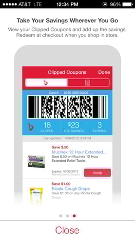
For instance, a Walgreens shopper can refill his or her prescription by simply scanning the label's barcode with a phone's camera (Image A). That same shopper can then view weekly ads and virtually "clip" coupons and save them to his or her loyalty card. The Walgreens app also enables a user to print images from a phone's photo library or from Facebook and Instagram accounts. Once the photos have been selected to print, the photos are available for pick-up in about an hour.
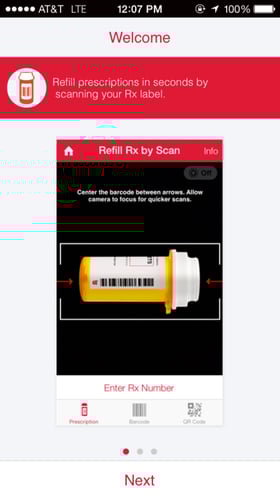
Walgreens' app helps users complete recurring tasks like refilling prescriptions and collecting coupons.
Party City Aim for Frictionless Navigation
Despite its expansive inventory (ranging from Halloween costumes to wedding supplies), Party City offers a mobile website that any shopper can navigate with ease.
The site greets shoppers with a menu bar that offers a sign-in option, a location finder, access to the shopping cart and a more detailed sliding menu. The sliding menu is definitely the strength of this retailer's site, as shoppers can use it to filter Party City's massive inventory to find specific products.
For example, if a visitor selects the "Halloween" category, he or she is directed to choose a subcategory like "Boys' Costumes," "Girls' Costumes," or "Women's Costumes." Once a category like "Women's Costumes" has been selected, visitors can further filter their searches with options like "Unique Costumes" or "Exclusive Looks." Although this may seem like a lot of steps, the filters are intuitive and provide shoppers with a limited set of results, which is a much better experience than delivering hundreds of listings on a small screen - and may also lead to greater in-app engagement.
It is also worth noting that Party City makes it simple for shoppers to add items to their shopping carts. The retailer uses "-" and "+" icons (Image C) instead of the traditional "quantity" field, which typically offers a dropdown that can be difficult for shoppers to interact with on small screens.
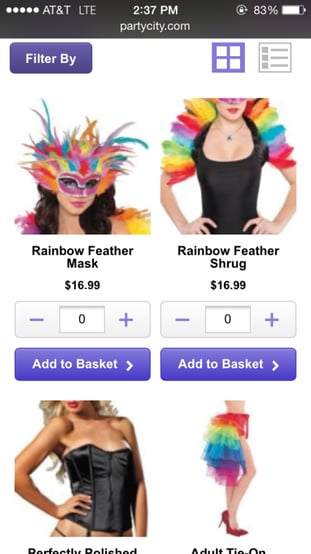
Image C: Party City's mobile website gives shoppers the ability to add items to their shopping carts easily on small screens.
Skinny Ties Be An Early Adopter
Although responsive design is Google's recommended approach to mobile, many retailers are still either not designing for mobile at all or opting for a separate mobile website entirely. In fact, Forrester reports that just 3 percent of retail sites have adopted responsive design.
One merchant that took heed of Google's recommendation, however, is Skinny Ties (Image D). The retailer is a veteran of providing a user-friendly experience on small screens, initially unveiling its responsive site (designed by Gravity Department) back in 2012. Immediately after implementation the retailer saw improvements in conversions, including a 71.9 percent conversion rate increase for iPhones.
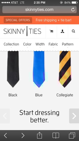
Image D: Skinny Ties offers a responsive website, providing a consistent experience across devices.
By offering a responsive site, Skinny Ties is able to deliver a website that automatically adapts to any device size, making it a consistent experience across channels and future-proofing the site for new screen sizes entering the market. Responsive design isn't the cure for all retailers' mobile woes, however, for further reading check out the feature in this month's issue on page 24.
Don't Foul Out
When adding techniques to your mobile playbook, it is important to keep your customers and their experience top of mind. In doing so, your mobile presence will be in position to attract more customers, score more conversions and win when it matters the most.