
3 Navigational Design Solutions for Mega Websites


Website navigation is not supposed to be an adventure for the visitor. It should be more like cruising on a superhighway than sailing in uncharted waters. The visitor clicks on a relevant button, clicks on one or two more and reaches his or her destination - unless he is on an mega website with hundreds or thousands of pages. Navigation and sub navigation are followed by more navigations and sub navigations, leaving the visitor befuddled and irritable.
Any large organization that offers a wide range of services or products is in the danger of spawning mammoth websites. Untangling the labyrinthine navigation of an enterprise-level website can be the ultimate test of one's "designerhood". Whether you are designing a website for a large organization or trying to knock some sense in the navigation of an existing enterprise website, the following navigational solutions will help you in your quest.
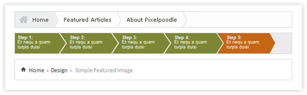
Method 1: Breadcrumbs Navigation
(Take one step at a time, never get lost)
Breadcrumbs can be used even by a poorly navigated website; we are not talking about that. But on large websites with several categories and sub categories, the visitor can easily get lost. For mammoth websites, it is a good idea to populate the page with several major categories.
Clicking on any of such categories would lead the visitor deeper into that particular section, and a clear breadcrumb at the top of side of the page would help him jump forward or move backward in his or her search. You can make breadcrumbs the central part of navigational structure, use minimal content on the page and link it to the pages lower down in the navigational hierarchy.
By using breadcrumbs and progress trackers, you show the visitors where they are and where they are going. Supplemented by a good website search box, this navigational structure can work wonders for websites with lots of information and deep pages. This approach works well with websites that are viewed on PCs; for extensive mobile websites or apps, this may be the only possible solution.
Method 2: No Navigation
(Dominant search button and focused navigation)
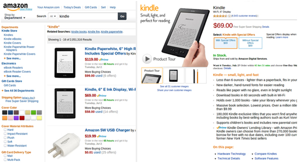
For several large websites, navigation structure of any kind may not be efficient enough. For instance, the Amazon website has thousands of broad categories and millions of products. A category-wise breakdown isn't feasible as most users may simply not be aware of which category or sub-category their desired products are nested in. At the same time, many visitors to ecommerce websites have the habit of selecting categories and working their way down to products of their interest.
To cater to the needs of the latter, Amazon website has a detailed navigation system that users who are simply browsing can use to search for products or services in a particular category. But, most of the visitors use the search box (which is, incidentally, placed bang in the center of the home page) to find products that they want. This is a simpler and more effective option.
For websites with thousands of pages, navigation cannot function as the primary method leading the visitors to their final destination. Instead of forcing the users to follow a set navigation structure, in some cases it may be a better idea to treat each webpage as a standalone document and enable users to find relevant information through the combination of a search box and navigation tags. The best thing about this approach is the ease with which you can add or remove pages without worrying about destabilizing your navigation structure.
Method 3: Divide and Rule
(Fuse several small, loosely connected micro-sites to build one mega site)
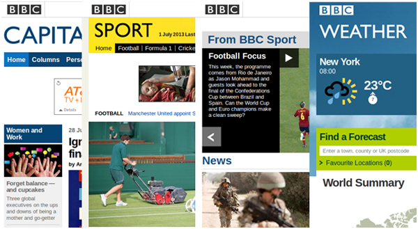
In the real world, large organizations and enterprises have lots of divisions and sub-divisions to make management simpler and more efficient. A similar approach to designing their websites may be the solution to navigational woes. Instead of creating one mammoth website spanning tens of categories and hundreds of sub categories, you could divide the website into several microsites. Each such website can have its own navigation.
By ensuring that all the microsites use similar design patterns, you avoid confusing the visitors or making them feel that they have been redirected to some other website. Consistency in design, typography, content and layout is a must when using microsites to resolve navigational issues. Check out the BBC website. They have several different section, and each section is has its unique design. The top banner retains all the options, which makes it easier for users to switch between the different sections or microsites.
Bonus: A combination of Different Approaches
This site combines different navigation techniques to make navigation simple for any kind of visitor. It has a mega-menu with every main navigation option in the banner has dozens of sub categories. When the users follow a particular option, breadcrumbs clearly show them where they have come from. Not only can the users trace their path back, but they can also go back to the start by clicking on any of the options.
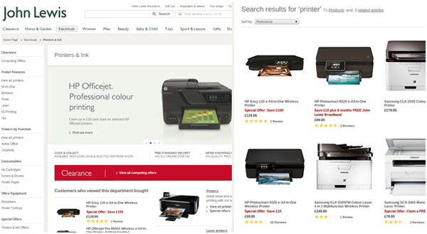
The site also has a dependable search button; so, if the users do not want to browse, but go straight to the points, they can. While the site is not split into different categories as the BBC website, the exhaustive list of sub categories from the main menu option serve a similar purpose through a similar approach. This shows that designers can use a combination of different approaches to fulfill the specific navigational demands of a unique website.
Summing Up
Large websites do not have to be heavy and unwieldy. Using the right navigational solution, or a combination of different navigational elements, you can enable users to find what they want with minimum fuss. Currently, designers all over the world are using breadcrumbs, mega-menus, microsites and smart search buttons to simplify the process of accessing relevant pages and information. You can use an appropriate combination of these techniques to create intuitive and user-friendly navigations for corporate, media, government or ecommerce websites.
About the Author: My name is Skylar Barret and I work for PLAVEB, a leading professional website design company in LA. Website navigation is something that excites me, and I like to find ways in which to improve user experience through better navigation. When I get time, I like to share my ideas with other designers through blogging.


