Ecommerce Web Forms: 3 Steps to Fill in the Blanks


Human beings are inherently averse to filling forms. Even if you are filling a form that is going to get you an admission in the best college or get you a job in a company of your dreams, you still won't love the process of filling a form. On the Internet, we have to fill forms on every second website they visit. We have to fill forms for every product we buy and we have to fill names and passwords during every online transaction.
Most people put up with form filling, but they do not love it. And they positively hate it when they have to fill the same Web form twice because of some minor error in inputting information. Bad Web forms have the power to drive visitors away from any website. While no website can afford to alienate visitors through annoying Web forms, ecommerce websites tend to lose the most because of sloppily designed Web forms. Here are a four major things about Web forms that drive visitors away from your online store:
1. Forced to fill a long form that demands too much unnecessary information
2. Lack of clarity regarding what kind of input is required for a particular field
3. Not finding the right options in the fields where text input doesn't work
4. Form doesn't save and the user is asked to fill the whole form again for a single error
What does the Web form on your website look like? Is it short, simple and easy-to-fill? Or is it a lengthy form that befuddles the users and makes them consider their decision about buying from your website? If a lot of your visitors abandon carts while they are in the process of making payments and checking out, your Web forms may be to blame. Here are some simple but powerful inline validation techniques than will help you keep your customers happy.
 1. Think Mobile-First, Impress Users with Brevity
One of the most common problems encountered by impatient users is a lengthy Web form. The goal of the user is to buy the product as quickly as possible, while the goal of the business is to make it as easy for the user to buy the product. Long forms are not needed for most ecommerce purchases - a quick checkout option is what the users really want. But your ecommerce website may want to gather as much information about the users as possible, and possibly interest them into registering. So, we have really long forms that most users hate the very sight of.
Such forms are annoying when you are sitting with your PC, trying to buy something. But, they are downright unforgivable when the user is trying to make a purchase through his mobile. While popular ecommerce websites always have a short form, too many growing ecommerce businesses force the user to fill long forms and register. If you do not want to see your visitors abandon shopping carts during the checkout, use minimal Web forms that ask nothing more than the required information.
And, if you desperately want extra information, you can wait for the payment process to complete and then request the user to share some more information with you. Don't ask for information at the cost of the sale.
 2. Insert Labels, Provide Quick Messages
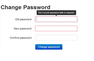
One of the biggest problems people face while filling forms is that they either do not understand what information is demanded, or they do not know that certain characters cannot be entered in the form box. One of the best ways of getting around this problem is offering labels with every box, briefly outlining the information that needs to be filled in the box.
If labels seems too ugly, you can have them in the form of tool-tips that show up when the user hovers the cursor near the box, or when the use begins to fill the form. You can also place the information within the input field itself - this works best for mobile Web forms.
By offering all the information regarding the information to be entered in the form field right at the start, you ensure that the users do not have to come back to the same field and fill it again after having already filled the form once.
3. Don't Disable Text Input, Offer Enough Options
To get around the problem of users entering wrong information in the fields without realizing their mistake, you can use quick messages. The messages can appear at the side of the input box, and they can clearly convey the message regarding what is wrong with the entered information. Also, ensure that you do not block the users' ability to input text information in the lieu of selecting an option.
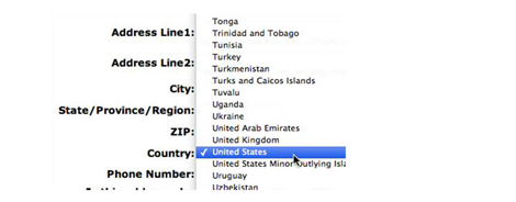
For instance, some forms let the user select the country, state, city and area through the Web form regarding address. But when the information the user wants to input is not a part of the offered options, there is simply no way for her to enter the address. This reflects a failure on your part to offer enough options to the users. And by not allowing the user to simply fill in the information that your set of options does not provide, you are making it impossible for her to buy any products from your online store. At such a juncture, a simple option of entering text in the box can solve the problem.
Well-designed Web forms are the only way in which the user can interact with our online store. Poorly designed Web forms act as barrier that block the user from reaching her goal of buying products or services from your ecommerce site. And they also stop you from achieving your goal of making profits through sales. The simple inline validation solutions discussed above can help you make Web forms tolerable, and help you avoid the wrath of frustrated customers.
Author Bio:
Skylar Barret works for PLAVEB, a leading Web design company in Los Angeles. He has been a part of ecommerce website design and development for a long time, and he firmly believes that small changes in designs can sometimes yield huge profits.