4 Common Small Biz Web Design Disasters

By Sam Butterworth, Just Template IT
The vast majority of small business owners understand just how important their website is to the success or failure of their company. For many, it's the central hub of their business and has a pivotal role in their marketing and branding. For ecommerce stores, it is the business. With so much at stake, getting the website design wrong could spell disaster.
Website design is the same as any other type of design, in that a certain amount of the skill required to be a good designer should be innate. Some people just don't have an aesthetic eye, and despite learning the website design rules, they'll still create an unsightly mess. It's not for want of trying of course, in fact if anything they're probably guilty of trying a little too hard.
This article will take a look at some all too common Web design disasters made by small businesses, and include a few incriminating images to show these aesthetic affronts in action (some of which will look like we've made a trip back to the 90s).
1. Too much clutter
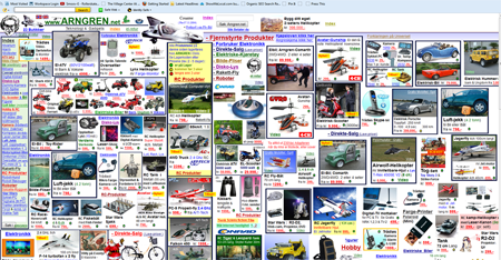
The eyes are a very sensitive organ and should be treated as such. For the most part, they prefer to settle on tranquil, well ordered spaces that have been designed sparingly to convey only the most important information. It's great that owners are passionate about their businesses and have so much to say, but that doesn't mean it should all be crammed onto one page.
As a general rule of thumb, the more extraneous items there are on a Web page, the less professional it's going to look. Too much clutter and a website risks falling into the realms of spam.
In terms of customer behaviour, an overly cluttered website will lead to a high bounce rate, a lower rate of returning visitors and a reduction in those all important conversions. Basically everything a small business does not want!
Take a look at this example below. A little cluttered, maybe?
2. Getting color and contrast wrong
It might sound trite, but sometimes less really is more. Getting the color and contrast right is a crucial part of any good website design. Its importance is more than just visual. Readability is key. Visitors should be able to read all the content on a site and navigate it freely.
There are a number of color contrast tools out there that can check whether the contrast on a website conforms to accepted standards. Size can also play an important part in creating a contrast. If color is uniform on a website, the size of text can help to differentiate between menus, sub-menus and body copy.
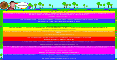
A splash of color here and there is great, but no small business website should make it its primary goal to have all the colors! (See screen shot below.) Yes, rainbows are a beautiful manifestation of sunlight travelling through moist air, but dang!
3. Content overload
Digital marketers have spent the last two or three years harping on about the importance of content, and to be fair to them, they're right. Content is what draws the masses from far and wide. It gives them a reason to visit a website. The trouble is, all that content can be tricky to present in an intuitive, unobtrusive way.
Web browsers like to scan and sift through information to find what they're looking for. A strong and logical content hierarchy can vastly improve the user's experience, without the need for them to scour your epic chunk of text to find the sentence or two they need.
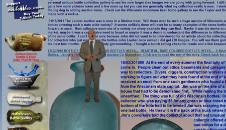
Take a look at Mr. Bottles' website below. He's clearly a man who likes his glass filled right to the brim!
4. Assuming (Anything)
Making assumptions is a dangerous game for any business owner to play. Assuming that visitors will understand where they have to go to perform certain actions, without clear instructions, will cause them to leave in their droves.
Hands up who has left a website thanks to the lack of any decent navigation? Exactly.
Navigation is a priority, and is something small businesses should decide on before any website design takes place. Not knowing where to go to find the information a visitor needs is incredibly frustrating. As soon as they has to actively think, they're gone, so make the navigational structure simple and logical. Here are a few tips:
- Group related pieces of content
- Use icons to aid navigation wherever possible
- Create a navigational hierarchy that leads the visitor naturally through the process they're trying to complete
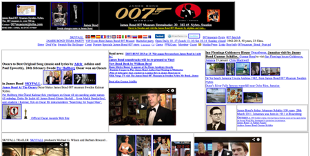
To their credit, there is some attempt at setting up a navigational structure on this 007 website, but it's not one Miss Moneypenny would be particularly impressed with.
And there you have it. Some of the worst Web design disasters to have been perpetrated in recent years. Although these examples may seem over the top, heeding the tips in this post will ensure you're not guilty of any design-based travesties of your own.
Author bio: Sam Butterworth is a writer and Web designer at Just Template IT, an international ecommerce design business. He loves exploring new ideas and sharing his insight of the design world.

Subscribe to Our Newsletter!
Latest in Web Design


