
4 Design Elements to Keep Above the Fold


While print marketing and digital marketing are very distinct in terms of design, there is a little bit of crossover.
Specifically, digital marketing design has adopted the term "above the fold" from print marketing. And when you're designing websites and landing pages, this is a concept you need to master.
Four Elements to Always Include Above the Fold
While you technically have an entire page to get your point across, many visitors will never scroll beyond the top section (which can be proven if a company employs a heat map solution). This makes above the fold elements most important. And as such, you'll need to focus on including the following.
1. Value Proposition
As soon as a visitor lands on your page, they should know exactly what your website is offering them and why your brand is worth their time. This is why you should proudly display your value proposition.
Your value proposition is who you are and what you stand for. It's the reason why people should care. By delivering this value proposition at the very top of the page in a clearly identifiable area, you're telling visitors why you're worth their time.
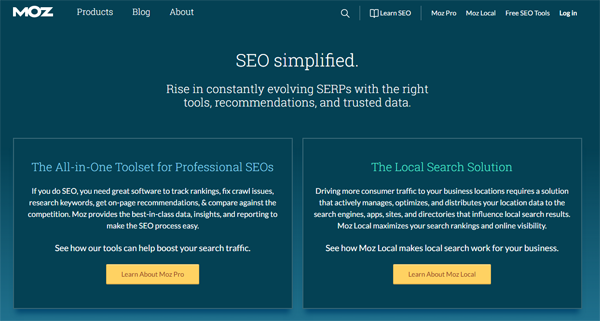
The Moz homepage is the perfect example. Their value proposition, which sits right beneath the navigation bar, reads, "SEO simplified." From that point on, visitors know that the Moz website and their line of products are all about simplifying SEO. The value proposition could be tucked away at the bottom of the page, but it wouldn't be nearly as effective.
2. Social Proof
What Web page doesn't need a little social proof? Whether it's a testimonial, research study or celebrity endorsement, social proof goes a long way toward pushing customers through the purchase process. If you're going to invest in one of these elements, you might as well maximize exposure by placing it above the fold.
3. Contact Information
Few things are more frustrating for a customer than visiting your website and not being able to find your contact information with ease. So many websites stick it in the footer or require visitors to navigate through multiple tabs. You can remove this point of friction by clearly placing your contact information above the fold.
If you only have room to include a "Contact Us" button, that's fine. However, if you're actually able to include the phone number, physical address, email address, etc., without overcrowding the page, this is even better.
4. Navigation Bar
A good navigation bar serves as a roadmap for your visitors' experiences on your website. If you make them go fishing for the navigation bar, chances are, you'll lose them. The key is to clearly display the navigation bar without overwhelming users or compromising the aesthetics of the page.
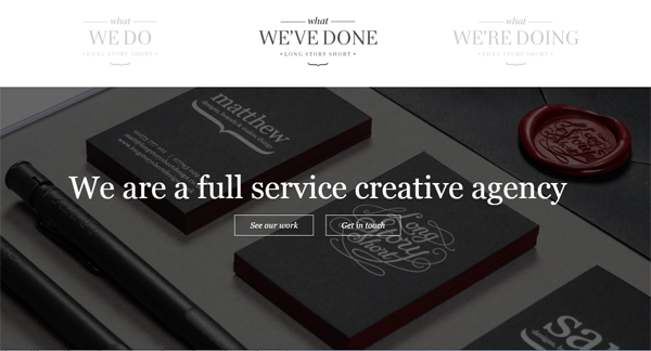
The Long Story Short Design website is a wonderful example worth studying. They include three simple navigation tabs at the very top of the page and do an effective job of making them look natural - and they also collapse to a hamburger menu on mobile.
Engage Visitors From the Start
The average attention span for humans is decreasing dramatically. Over the last decade alone, we've gone from 12 seconds to just seven seconds. Think this doesn't affect you? Think again. As soon as a visitor lands on one of your web pages, you have just a few brief seconds to engage them and get your point across. By keeping the aforementioned elements above the fold, you can better your chances of producing a positive result.
Larry Alton is a professional blogger, writer and researcher who contributes to a number of reputable online media outlets and news sources. In addition to journalism, technical writing and in-depth research, he's also active in his community and spends weekends volunteering with a local non-profit literacy organization and rock climbing. Follow him on Twitter and LinkedIn.


