
4 Lessons Web Designers Can Learn From Print

As a Web designer, it's easy to only mingle with other Web designers and forget all that graphic designers have to offer when it comes to advice on choosing the best layout, selecting the right colors and bringing continuity to a project.
Let's explore these topics and more to understand why it's wise to devote a little time to the print medium - regardless of whether most companies are moving their efforts online.
Four Lessons from Print
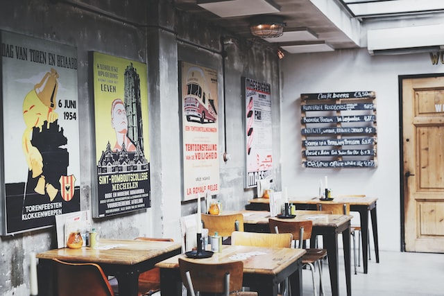
Print - whether it's magazines, brochures or catalogs - has been around for centuries in some form. Catalogs, in particular, are one of the oldest and most influential design mediums around. And while the industry has recently become more digitally inclined, there's still ample wisdom to be gleaned from studying print.
1. Words Matter
In print, there's no going back and editing, revising or cutting text after the fact. Once a catalog, magazine or other handouts have been printed, you're stuck with whatever is on the page. In this sense, content writers understand the importance of every single character they use. There's no room for fluff, which creates a much more stringent environment.
One of the benefits (as well as pitfalls) of Web design is that it's easy to plug something in and say, "Let's just see if it works." And while there's some truth in this - thanks in large part to the many robust split testing tools available - designers shouldn't use this as a crutch. Words matter and you'd do well to treat every single phrase, element (like fixing "widows") and image as if it were permanent because it may be in one visitor's mind.
Similarly, graphic designers pay close attention to alignment. You'll typically never see three columns of text end on different lines. In Web design (and often because assets are being accessed on different devices), too often we see columns ending all over the place (to the detriment of the page as it looks sloppy, which could be avoided with device testing).

2. Continuity is Important
There's something very experiential about flipping through a catalog or magazine. Each page is unique, but the reader expects some sort of continuity from page to page. While Web design is different in that pages don't necessarily follow one after another, continuity and consistency are still important.
"Because so much of visual design affects the user on a subconscious level, your site must first feel familiar," Creative Bloq explains. "When users encounter a new design, they are armed only with their prior experiences as they make a snap judgment."
If there's no continuity, then they'll feel less engaged and more uncomfortable (resulting in lost sales).

3. Color Selection is a Big Deal
When you look at print catalogs, what's one of the first things that jump off the page at you? For most people, it's the crisp colors. When printing catalogs or other marketing collatoral, designers focus a lot of their attention on this aspect because the wrong color selection can make the words difficult to read and, in terms of production, may not print the way they appear on-screen. It's wise to only work with printing companies that are able to supply high-quality printing with accurate and true color selection because it's not enough for pages to look great in production, they have to print that way too.
When you design websites, never settle for anything less than a "true" color. Even though it's as easy as going back in and revising your selection, remember that colors are sensitive. Even choosing a color that's just one shade different from the brand's normal color can compromise the brand's message.
4. Textures Matter
How many times have you flipped through a catalog or magazine and noticed an ad or graphic that caught your attention and compelled you to physically touch the page? Even though you know the page is nothing more than paper, the visuals are so enticing they seem to jump off the page at you.
In these situations, what is it that makes the visuals appear so palpable? It's generally the combination of colors and textures - with the latter aspect being particularly powerful. In Web design, finding ways to leverage textures to move people to action is a valuable skill to have. Looking for examples? Here are a few websites that have really nailed the use of texture.
Spend Time Studying Print
Nobody is telling you to copy everything you see in catalogs or magazines. There are many differences between what works in print and what works online. However, there are also plenty of valuable principles you can learn from studying print.
Really hone in on these lessons and you'll find that your design efforts are much better balanced.


