
5 Stunning Sites Using Responsive & Adaptive Web Design


Responsive, adaptive or a combination of the two? These are the considerations that many modern digital enterprises are making today.
Both responsive and adaptive have their fair share of advantages over the other, but some sites are getting the best of both worlds, like how J. Crew uses adaptive Web design (via Usablenet) but a responsive checkout (read more here). Listed below are five stunning sites using either responsive or adaptive Web design.
Adaptive
To find out if a site is using adaptive Web design or not, drag the browser window to the size of a smartphone screen. If the site reformats in real-time then the site is responsive and not adaptive. If the site does not reformat, then use your smartphone to see if the site reformats for your mobile device. Then check to make sure that the site's URL did not change. If the site adaped to your smartphone but the URL did not change (e.g. it's not an m. site), then the site uses the adaptive Web design approach, like these top sites:
- USA Today
- About.com
- Avenue 32
- Amazon
- Apple
(Read more about all five in, "5 Surprising Sites Using Adaptive Web Design.")
Responsive
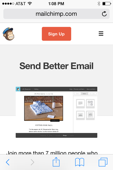
To find out if a site is responsive or not, drag the browser window to the size of a smartphone screen. If the site reformats in real-time, then it's responsive. Here are five sites that do just that:
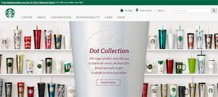
Starbucks

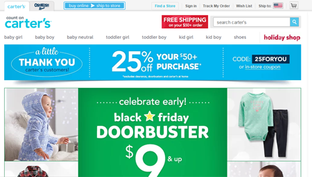
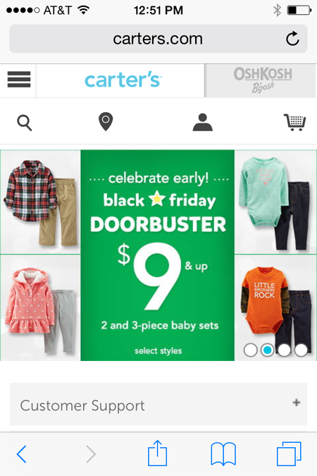
Carter's
Zendesk


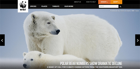
World Wildlife Fund

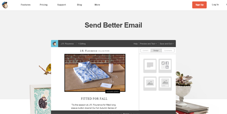
MailChimp


