
5 Ways to Create Frictionless Forms

Reassuring your customers that you can be trusted with their personal information is no easy feat.
Whether you want prospects to download your content, register for an account with you, or purchase from your website, form filling remains an essential part of the customer journey. Unfortunately, most people hate the intrinsic process of entering text into boxes, so it's important to make the web form experience as painless as possible. Although all forms are different, here are some sure-fire practical ways to reduce friction and improve web form conversions.
Keep the number of fields to minimum
I'm sure you don't need convincing that short forms are more user friendly but in case you do - Hubspot found that decreasing the number of fields from 4 to 3 increased conversion by 50%. Question the existence of every single field and use progressive or smart forms wherever possible. Depending on how much information you really require, minimizing the number of steps in each process and cutting out fields you probably don't need or won't act upon will have a huge impact on your conversion rates. A great example is having two fields for a phone number - having a separate one for the area code is not advisable.
Show the user's progress
For longer or more complicated forms, it's important to let your users know where they are in the form and how much further they have to go. This might be a simple as outlining the step they are currently on, displaying the percentage complete or by displaying a progress bar. Walking users through the process by making it easy and intuitive is key to helping increase conversion rates.

Use search engine-style address verification
Predictive verification tools in address fields can significantly reduce form friction by presenting a list of matching address options as the user types. The suggested options are refined as you type, avoiding the need to scroll down a huge list of matching addresses. Here's an example of smart validation in online retailer ThinkGeek's 'warp speed checkout'.
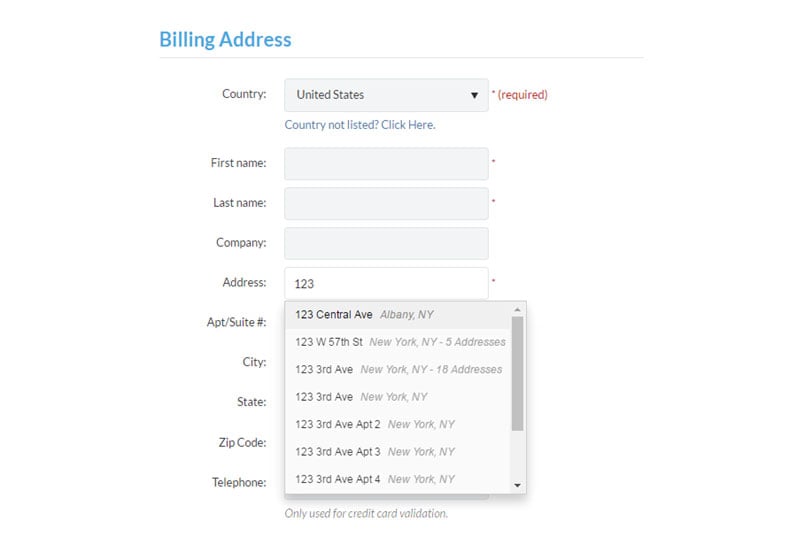
It doesn't matter how well you design a form - if you have input fields, people will make mistakes. Predictive address search not only delivers a better UX but also guarantees accurate customer data is captured at the point of entry.
Consider where you place your labels
All information should be placed in such a way that it is clearly associated to a given input field, but the alignment of a label can also affect the success of a submission as well as the speed of completion.
On smaller screens, like mobile devices, the location of a form label can make a huge difference to usability. Clicking into a form will automatically zoom the user to that field and launch their onscreen keyboard, if your label is to the left of the field then it will be hidden.

Placing them above the field is the best solution if you want users to eye-scan the form as fast as possible. Of course, there may been times when you'll want to deliberately slow them down, so they notice and read the labels attentively.
Some forms use inline placeholders to indicate examples of the information required. Although this is great for shortening the appearance of the form, it makes it impossible for users to check back through their submission as the label disappears as soon as the user starts typing.
Explain why you want their data
People will often feel cautious when handing over particularly personal data - usually because they're afraid it will end up in the wrong hands or question why you need it in the first place. By showing a clear purpose for the data will make asking far more understandable and reasonable, maintaining trust between you and the respondent. For example, if you want their date of birth so you can send them a free gift, then tell them so and you're be far less likely to lose them and their order.
While these tips are proven to reduce general form abandonment, it's always best to A/B split test any changes you make to ensure it's right for your form.
About the Author: Larry Brangwyn, Head of User Experience, PCA Predict


