5 Ways to Improve Your App


Not only is it tough for apps to get found (app store optimization can be as tricky as SEO), but it's also difficult to keep an app on a user's phone because many people have limited space available on their devices for items they don't use every day.
In fact, the majority of apps are deleted after first use but that's not to say the person didn't like the idea of the app; instead, the app likely didn't live up to the person's expectations or didn't solve an everyday problem. Let's look at five ways to improve your app, which could keep users engaged enough to not hit the dreaded "X."
Focus on user goals
When it comes to designing a mobile app, user goals are something you can't ignore. Prior to designing a mobile app, it is important to focus on user objectives. Mobile app design depends largely on user expectations. Irrespective of the time you spend designing your application, failure to pay attention to user objectives can impact your application's credibility.
Mobile apps should be quick and simple. They do not necessarily need too many features. As a matter of fact, the interaction should be as simpler as possible.
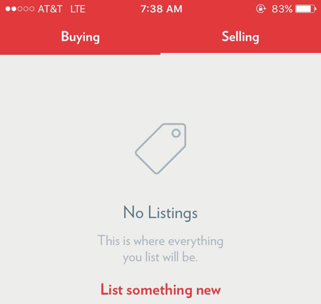
Your app should aim at meeting user needs. Focus on your user base, while initially designing your application. You can think of adding more functionalities in upcoming versions of your app. However, user goals have to be of utmost importance. Like in the Close5 garage sell app, most people are coming to buy or sale things so if a person's "selling" tab is empty, the app wisely includes a call-to-action of List Something New, which addresses users' goals.
Remove clutter
While many user interface (UI) designers talk about keeping everything simple, users do not choose apps solely because they are simple. They choose applications based on the accomplishment of a particular task.
Use icons within the app to save space and get rid of elements or components that do not add substantial value to your app.
Make everything else bigger
If you are reading content using a smartphone, you probably know that it is an experience that can swing from awesome to awful. While text-based content, videos and images can look amazing on a desktop screen, they look pathetic when squeezed into a mobile screen. Everything needs to be larger right from line spacing to controls.
Eliminate the need for typing
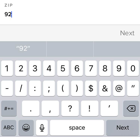
Let's face it, typing on a smartphone or tablet can be inconvenient. And while mobile technology continues to advance, with voice to text technology, it is important to allow users to tap rather than type when possible (like when entering in numbers present a keypad). Make sure forms are kept short by getting rid of unwanted and unnecessary fields. Incorporate smart features like auto-complete so that users need to enter minimum relevant information. For example, the app below could be improved by offering a keypad for easier typing but then filling in the city information once a zip code is entered.
Consider holding positions
How do users actually carry and hold their devices? Mobile devices, unlike desktops, have no fix position. People use their mobile devices while sitting, standing, walking or doing just about anything. They hold their devices allowing them great convenience, whilst dealing with their smartphone. Hand positions, and grips, affect the placement of controls largely. For example, navigation buttons positioned at the top, are more intuitive than placed at the bottom. Try to place buttons within the reach area. Controls like delete or edit should be placed away from the reach areas.
Author Bio: Kimber Johnson is the co-founder of ASPEN App Design, which is a sister company of Vanity Point and Pacific App Design. He has worked within the Web development, graphics design, mobile application development, marketing and advertising fields for over 17 years.