6 Practical Tips to Boost Ecommerce Conversions

by Martin Greif
01 Aug, 2017
When marketers are working on an ecommerce site, it is easy to lose themselves in the day-to-day aspects of the job.
+ They have specific discount campaigns running. Monitoring those and improving conversions on particular items can eat up a non-trivial amount of hours per day.
+ They have tagging tasks - assigning special links for campaigns coming from outside the site, assigning dollar values for pages and a slew of other types of technical marketing work. Those can take a while, especially if marketers have a complex ecosystem connected to their content management system.
+ They have site maintenance, taking down inactive products, adding more content and myriad of other tasks.
With all that going on, it is easy to miss the forest for the trees.
There are improvements marketers can make on their site that will not take much time to execute, but some of them will take quite a bit of willpower within the enterprise.
1. Don't Feature Products on the Homepage
When a user arrives on a website's homepage, there is generally not much in the way of information about the visitor. As a result, ecommerce brands should not be showing specific products at all as they risk alienating their potential customers. Instead, the homepage should aim to establish trust with the visitor and show the basics of navigating around the site, ultimately making the next click easy.
The job of the homepage is to get people off the homepage. Featuring products on the homepage makes that difficult; it is tough to pick up "information scent" if users are getting shown semi-random things, even if the random things are best-selling products from the site.
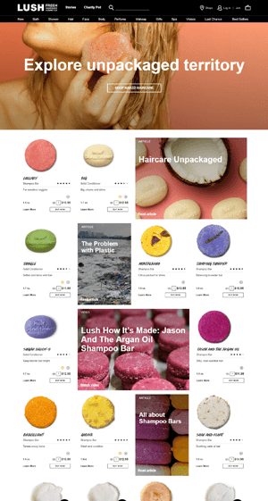 Lush's homepage, for instance, fails to represent the breadth of the company's available products (see image on the right). Instead, the homepage body is used solely to showcase haircare products; if the visitor is looking for skincare, makeup or anything else other than haircare, they will have to use the top navigation bar.
There are a few exceptions to this guideline, however. If an ecommerce store makes most of its revenue from 2-5 individual products, for example, and marketers do not have a wide product selection, they can feature some products on the homepage.
Likewise, if merchants have enough personalization technology in place so that people will only see products on the homepage if they have expressed interest in that before, then those products should be shown immediately after the person lands on the website. Without meeting those requirements, retailers should avoid showing products on the homepage.
2. Take it Easy on the Homepage
Promos Marketers might look at the first tip mentioned here and say, "I passed because I don't feature a particular product; I have a promo for a product line." This is still probably misguided.
Retailers should be showing users different categories of products on the homepage to help them navigate. Featuring homepage promos about a product or a set of products is really just the different committees in the company being out of control.
That in itself is easy enough to understand as every department wants a piece of the homepage, and switching between different promos from the different departments can feel like a rich compromise (for everyone but the user).
The primary responsibility is to make the user's life easy so they can transact with the company.
On the homepage, that translates to either displaying product categories above the fold (where the user can drill down as soon as the page loads) or showing the range of products available within a category (which marketers can do visually).
Promotions limit a brand's ability to execute on these items.
3. Dump the Homepage Carousel
Homepage carousels, especially those featuring a product or a promo, take up vital real estate that enterprises can use on more productive elements.
For example, Adorama's homepage body (see image) does a great job of showing what is possible to buy on the site by using a collage of different items to represent categories. The category-level images, however, get less visual emphasis as they are pushed down by the carousel.

Instead of distracting users with motion on what is basically an untargeted ad, brands can use the same real estate in a productive manner such as showing the categories of the website, incorporating trust elements like logos or using social proof to increase visitor trust.
4. Limit Choices
A study conducted by scholars Sheena Iyengar and Mark Lepper also proves relevant. When 24 products were offered, more people looked, but only three percent made a purchase. When six products were available, fewer people looked, but 30 percent ended up making a purchase. The takeaway? Too many choices can lead to decision paralysis to the detriment of conversion rate.
5. Make Choices Distinct
Just as the number of choices should be limited, the differences in those choices should be obvious.
Some options might include using photos to highlight the distinguishing characteristics of the choices. If what a brand is selling is heavy on specifics, the distinction should not just be achieved through filters, but should also be easily seen when scanning products.
JetPens.com (see image) allows users to see the pen tips to differentiate the items, making it easier for the user to drill down to the kind of pen they want.

Distinct choices make the next click easy for the visitor, but more importantly, they help them zero in on what they want (to the benefit of more conversions).
6. Minimal Distractions (Especially Backgrounds)
People's eyes cannot help but be drawn toward certain things. When people scan pages, they notice faces before other elements, irregular shapes before regular shapes, larger items before smaller items and high contrast elements before low contrast elements.
Think about what this means for sites that use backgrounds. If brands are using a photorealistic background, even a subtle one, they are taking away attention from the site's content. If retailers are using colors with gradation, patterns like clouds, etc., that is not as bad, but it is still distracting. A retailer's best bet is a solid color serving as a background or white space, so people can focus on the site's content.
Putting It All Together
Ecommerce sites can be really high on the upkeep but daily maintenance tasks by marketers will only take brands so far.
If retailers want meaningful improvements to their sites and conversion rates, they have to muster the willpower to push for and make significant website changes.
About the Author
Martin Greif brings 25-plus years of sales and marketing experience to SiteTuners where he is responsible for driving revenue growth, establishing and nurturing partner relationships and creating value for its broad customer base.
Keep Learning:
+ Conversions 101 for Multichannel Campaigns
+ Commonly Misused Web Design Techniques that Tank Conversions
+ Helping Users Recover from Errors
+ They have specific discount campaigns running. Monitoring those and improving conversions on particular items can eat up a non-trivial amount of hours per day.
+ They have tagging tasks - assigning special links for campaigns coming from outside the site, assigning dollar values for pages and a slew of other types of technical marketing work. Those can take a while, especially if marketers have a complex ecosystem connected to their content management system.
+ They have site maintenance, taking down inactive products, adding more content and myriad of other tasks.
With all that going on, it is easy to miss the forest for the trees.
There are improvements marketers can make on their site that will not take much time to execute, but some of them will take quite a bit of willpower within the enterprise.
1. Don't Feature Products on the Homepage
When a user arrives on a website's homepage, there is generally not much in the way of information about the visitor. As a result, ecommerce brands should not be showing specific products at all as they risk alienating their potential customers. Instead, the homepage should aim to establish trust with the visitor and show the basics of navigating around the site, ultimately making the next click easy.
The job of the homepage is to get people off the homepage. Featuring products on the homepage makes that difficult; it is tough to pick up "information scent" if users are getting shown semi-random things, even if the random things are best-selling products from the site.
 Lush's homepage, for instance, fails to represent the breadth of the company's available products (see image on the right). Instead, the homepage body is used solely to showcase haircare products; if the visitor is looking for skincare, makeup or anything else other than haircare, they will have to use the top navigation bar.
There are a few exceptions to this guideline, however. If an ecommerce store makes most of its revenue from 2-5 individual products, for example, and marketers do not have a wide product selection, they can feature some products on the homepage.
Likewise, if merchants have enough personalization technology in place so that people will only see products on the homepage if they have expressed interest in that before, then those products should be shown immediately after the person lands on the website. Without meeting those requirements, retailers should avoid showing products on the homepage.
2. Take it Easy on the Homepage
Promos Marketers might look at the first tip mentioned here and say, "I passed because I don't feature a particular product; I have a promo for a product line." This is still probably misguided.
Retailers should be showing users different categories of products on the homepage to help them navigate. Featuring homepage promos about a product or a set of products is really just the different committees in the company being out of control.
That in itself is easy enough to understand as every department wants a piece of the homepage, and switching between different promos from the different departments can feel like a rich compromise (for everyone but the user).
The primary responsibility is to make the user's life easy so they can transact with the company.
On the homepage, that translates to either displaying product categories above the fold (where the user can drill down as soon as the page loads) or showing the range of products available within a category (which marketers can do visually).
Promotions limit a brand's ability to execute on these items.
3. Dump the Homepage Carousel
Homepage carousels, especially those featuring a product or a promo, take up vital real estate that enterprises can use on more productive elements.
For example, Adorama's homepage body (see image) does a great job of showing what is possible to buy on the site by using a collage of different items to represent categories. The category-level images, however, get less visual emphasis as they are pushed down by the carousel.

Instead of distracting users with motion on what is basically an untargeted ad, brands can use the same real estate in a productive manner such as showing the categories of the website, incorporating trust elements like logos or using social proof to increase visitor trust.
4. Limit Choices
A study conducted by scholars Sheena Iyengar and Mark Lepper also proves relevant. When 24 products were offered, more people looked, but only three percent made a purchase. When six products were available, fewer people looked, but 30 percent ended up making a purchase. The takeaway? Too many choices can lead to decision paralysis to the detriment of conversion rate.
5. Make Choices Distinct
Just as the number of choices should be limited, the differences in those choices should be obvious.
Some options might include using photos to highlight the distinguishing characteristics of the choices. If what a brand is selling is heavy on specifics, the distinction should not just be achieved through filters, but should also be easily seen when scanning products.
JetPens.com (see image) allows users to see the pen tips to differentiate the items, making it easier for the user to drill down to the kind of pen they want.

Distinct choices make the next click easy for the visitor, but more importantly, they help them zero in on what they want (to the benefit of more conversions).
6. Minimal Distractions (Especially Backgrounds)
People's eyes cannot help but be drawn toward certain things. When people scan pages, they notice faces before other elements, irregular shapes before regular shapes, larger items before smaller items and high contrast elements before low contrast elements.
Think about what this means for sites that use backgrounds. If brands are using a photorealistic background, even a subtle one, they are taking away attention from the site's content. If retailers are using colors with gradation, patterns like clouds, etc., that is not as bad, but it is still distracting. A retailer's best bet is a solid color serving as a background or white space, so people can focus on the site's content.
Putting It All Together
Ecommerce sites can be really high on the upkeep but daily maintenance tasks by marketers will only take brands so far.
If retailers want meaningful improvements to their sites and conversion rates, they have to muster the willpower to push for and make significant website changes.
About the Author
Martin Greif brings 25-plus years of sales and marketing experience to SiteTuners where he is responsible for driving revenue growth, establishing and nurturing partner relationships and creating value for its broad customer base.
Keep Learning:
+ Conversions 101 for Multichannel Campaigns
+ Commonly Misused Web Design Techniques that Tank Conversions
+ Helping Users Recover from Errors

Martin Greif
Martin is the President of SiteTurners.com, a company that helps businesses overcome growth challenges. Clients turn to SiteTurners when they face increased acquisition costs, stagnant revenue and conversion rates, and difficulties scaling their operations. With a focus on testing and marketing funnel optimization, Martin and his team aim to help businesses generate more sales, leads, and subscriptions and achieve their desired growth.

