6 Tips for a Bulletproof Responsive Website


Understanding the importance of responsive Web design (RWD) is to realize that the Web "canvas" is not static. It's not like a printed book or magazine where you know how much space is on the page and it will not change. Users can view a website through various devices. The best way to accommodate the best-fit for this multitude of screen sizes is to make it respond to the display.
While the conversation is growing louder about how to go about creating a responsive site, here we offer six most important design and development techniques to keep in mind when creating a responsive website. These key tips will help ensure a successful Web experience for all users from desktop to mobile.
The Six Tips for a Bulletproof Responsive Website:
1. Prioritize Content
2. Follow a Mobile First Approach
3. Design for Fingers, Not Just Cursors
4. Compress Files for Low Bandwidth
5. Use a Fluid Grid Framework
6. Use Flexible Images/Video
1. Prioritize Content
We should practice prioritizing content in Web design as a whole. Don't build the house without knowing how many rooms and what goes in it. As the screen size narrows, it's obvious we cannot have the same amount of content as we do when viewed on the desktop. Keep in mind not everything on a desktop needs to be on its 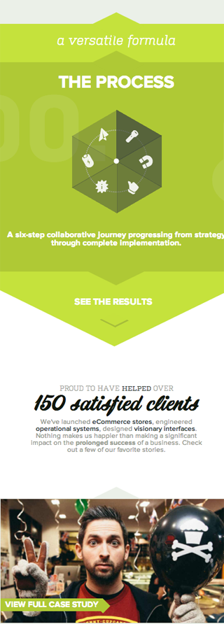 mobile version. Remove ads and archives to save space or place them in a dropdown navigation so it is only seen when the user wants to see it. More is less, and less must be more focused. We need to switch and reposition content as the screen size compresses to emphasize the important information, which leads to our next point, which is mobile-first.
2. Mobile-First Approach
As some of you might have already heard the buzz around having a mobile-first approach, it's the notion of thinking for small screens first. However, the mobile first approach is also a mindset; the realization that we should design not just for small screens but with the understanding that people are viewing your site on various devices. They may be outside. They may be doing the laundry. The world is full of stimuli and cutting through the clutter is difficult.
Your viewers and audiences are most likely going to be in a mobile state while viewing your site, so it is critical to keep that in mind and make sure your content is consolidated and focused. Think as if your viewers are scanning your site for relevant information. They don't want to take the time to read everything on the page. They just need to find out how to get to what they want from your site in the first place.
The Mobile First (from the Book Apart series) by Luke Wroblewski is a great reference that explains how to take the mobile first approach.
As an example, we used the mobile-first approach on our own site (see image). The site, whether on mobile or desktop is linear. There is only one direction that the reader can scroll. Using this, we've directed the readers' attention in one direction with content that flows one after the other. These carefully prioritized content bites tell a short story. We like to tell stories. The content is a story about us, what we do, how we do it, what we have done, who we are as individuals, and how to contact us. The image shows a snippet of the mobile version of the site but even viewed on a desktop, it is still linear. The reader is directed to read one thing after another, carefully making them focus from one section to the next.
3. Design for Fingers, Not Just Cursors
This is not just for the tech-savy grandmothers out there. Everyone can appreciate a good-sized button that works the first time they click it. On the other hand, besides creating larger buttons on mobile, making a content area clickable is another way to solve the problem.
As a reminder, when playing with those awesome hover effects to note that an area is linked and clickable, there is no hover effect on touch devices (at least not yet). Hover effects can be really cool. You can  change the color, the size, anything. But since touch devices will not get these effects, keep in mind not to rely too much on hover effects to denote a link because it may be overlooked.
4. Compress Files for Low Bandwidth
No matter how cool your site, if it doesn't load fast enough, the user won't be impressed. The user might even think your site doesn't work and have left already before your site loads. That's something we don't want when we think about building a responsive site. Your site also needs to respond to the lowest bandwidths.
There are a few ways to do this.
1. Consolidate as much code as you can using media queries. That's why a mobile first approach works better. The core of the code loaded is used for mobile and media queries are used to adjust for the bigger screen sizes. One simple thing I read that is useful is to apply the "not mobile" class and have it display none when it's not mobile.
2. Compress images. There are many sites that can help compress image sizes. TinyPNG is one. It's also available as a Photoshop plugin.
3. Use a plugin that will delay image loading instead of having the images load all at the same time.
4. Specify smaller image files using media queries for smaller screen sizes.
We encountered this problem working on the Aerolife site (see image). The site, especially the homepage, is a collage of beautiful, high-resolution images. However, it would take great toil to load on a mobile phone. We used the Lazy Load plugin and a combination of smaller image files for mobile screen sizes.
(Left: The Aerolife Homepage is a concept of a collage of interactive content areas with images and text.)
5. Use a Fluid Grid Framework
To set the big picture, all content we see on a website is contained within a box. That is how we tell the browser that one section is ending and another is beginning. In the HTML language, these indicators are called tags. Using a fluid grid framework will provide many advantages. A lot of work is done for you when you utilize the frameworks that are constantly iterated. It will also allow you to rapidly create prototypes and really think about how you want to rearrange the content when it responds to the browser.
Check out popular frameworks such as Foundation, Gumby, Skeleton and many more. This article includes a comparison table of 13 responsive frameworks.
6. Use Flexible Images/Video
With a flexible grid, we will want flexible images that respond to browser size accordingly. Having flexible images means they are able to resize respective to the browser, but it is also guided by the styles that the designer/developer set. For example, when we want an image to fill the width of the container (it can be the full body width), we will set the image width to 100 percent but sometimes images become pixelated if they are stretched beyond their actual size. Using max-width will ensure that an image will only resize to 100 percent of its actual dimensions and not stretch beyond.
In some cases, mobile devices will render pixelated icons or images. This is because these mobile devices have a higher ppi (pixel per inch) resolution than desktops. This article explains why this is so. For a responsive site, we need to consider this factor. We want to maintain a clean, crisp look for all devices. In this situation, we can opt to use SVG (scalable vector graphic) files or icon fonts. Using a SVG file is like using a PNG or JPEG file. It can be used directly in an tag. For more browser support information and more ways to use SVG files, there is a very informative CSS Tricks tutorial.
There are increasingly more icon font libraries. There's a huge list of fonts here. The idea is treating these icons like fonts. We can use them with the @font-face method or some libraries can be used through simply including a snippet of code in the like you would use Typekit or Google fonts. Of course, you can even generate your own and use them on your site. An application like Fontastic makes it easy, generating the code and the necessary files for you to turn your icons into fonts.
Video can also be resized. Here is a great tutorial and article from A List Apart about scaling videos.
Think Responsive
There are many more factors to consider when creating a responsive website. You will always stumble onto a roadblock and you might uncover better solutions than the tips we have here. There is an ongoing learning process when building responsive websites. There will always be more than one solution to the problem. In this article, we've addressed a few points to keep in mind and a few solutions we've worked with successfully. If we just keep in mind that the site is not always going to be viewed the same way you, the designer, views it, it will bring up more questions and force us to prioritize some things over others, which in turn is the benefit of being responsive. It leads to a more focused site in the end.


