Smartphone users want mobile sites to be well optimized for their smaller screens, but many brands have not given their mobile website visitors the experiences they not only want, but also demand.
The following are nine features that companies should quickly consider adding to their sites, because they are the features users want from their mobile experience.
1. Better contact forms
Contact forms on a mobile website should be just long enough to collect the relevant information needed from the users. The form should not only be short but also have large enough fields that a user can easily navigate the form without pinching in or zooming out. Businesses can gather more information as the user interacts with the company in the future.
2. Easy navigation
The most important actions on a website should be easily accessible on the homepage (e.g. for a restaurant: menu, contact information, etc.). By leveraging a collapsed menu, users can simply tap on a single area and see all of the main-link options.
3. Multi-language support
The United States is not the only country where mobile-Web usage is rising quickly. What's more, people want to do business in their own language. The support for multi-languages is becoming an essential feature for the companies.
4. Large buttons
The size of call to actions is one of the most important features a mobile website presents to users, as small, un-tappable buttons will not only be a frustrating experience, but will also cost a company conversions because users won't follow the path the company wants them to. The recommended size of the buttons is 45-56 pixels.
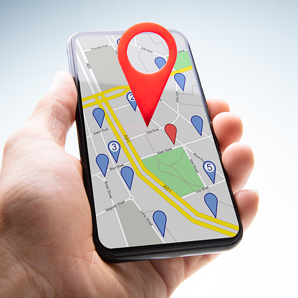
5. Mobile maps
With the majority of mobile searches leading to local action (visits, calls, etc.), companies should consider adding a map to their business on their mobile site, as this can provide a user a simple experience to get directions and visit the store.
6. Collapsible content
Smartphones have smaller screens, but it is still necessary to present a variety of content to users. By collapsing some of the content, mobile users (1) don't feel like they are missing out, (2) will see a polished and professional site and (3) do not have to scroll as much to find the content they need/want. Further, by allowing them to collapse content, the user feels more in control of his or her experience.
7. Correlation between the mobile and the desktop site
Mobile Web users want brands to provide a consistent experience regardless of what device they are using. Brands will want to recognize the device and the person accessing the site.
8. Social media integration
Social media is one of the most engaging forms of media today. Brands will not only want to include social sharing buttons to increase their brand reach, but also consider social login. Mobile users are even less inclined than their desktop counterparts to register for a company (especially if this is the first time accessing a site), so social login makes it easier for users to sign up because they do not have to complete a form.
9. Enlarged product image
The mobile screen is very small and it is very difficult for users to see images properly. It is important for companies to allow users to enlarge images. The enlarged image should be clearly visible to the user; or else they will move on and will never come to the site again.
Mobile user sophistication is increasing quickly and the users are expecting more features on the mobile sites. The marketers and advertisers who do not cater the needs of the users will see their conversions, rankings and more drop in the near future.
Author Bio
Keval Padia is a Founder & CEO of Nimblechapps, a fast-growing iPhone game development company. The current innovation and updates of the field lures him to express his views and thoughts on certain topics.


