
User Personas & Wireframes : The First Ten Seconds

By Charles B. Kreitzberg, Ph.D.
![]()
Through a combination of brilliant marketing and careful SEO, you finally got your targeted user to your site. Now your visitor is about to see your landing page for the first time.
Online, you have just seconds to capture a visitor's interest before they hit the back button and find your competitors. While there are no hard and fast rules to guarantee success, approaching the design carefully can help create the stickiness you need.
When users come to your site for the first time, their goal is to understand what you are offering and how they can benefit. So the landing page must convey that information in a format that is easy to comprehend.
As with all Web design problems, the best place to start is by understanding the user. What is your best guess of who will come to your site and what are their expectations?
PERSONAS FOCUS YOUR DESIGN
A good way to get a handle on your visitors is to create two or three personas that describe the main user segments you expect to visit. A persona is a brief fictional biography that captures the essence of the individual you are targeting. Creating personas can be a complicated process. Large companies spend a great deal of effort researching and creating personas. But you can benefit from simple, quick personas based on your knowledge and best guesses. I call these "assumptive personas," because they are based on assumptions rather than data. But even without hard data they can be surprisingly helpful in focusing your design.
As simple as these personas are, you can see how they make the users more concrete. When creating personas, it's always best to talk to actual customers or prospects. If you can't do that, try talking with secondary sources - people who know the actual customers well. In our example, good secondary sources might be travel agents. Once you have created the personas, show them to knowledgeable people who can help you refine them.
FIRST IMPRESSIONS
When users first encounter your site, they will form an immediate first impression. Some of the factors include:
The visual design - does the site look interesting? Are the graphics appropriate for the audience? Bob and Sandy, for example, are unlikely to appreciate a grunge style. (see box below)
The information architecture - is the information organized so that its structure is immediately understandable or does it take too much effort to figure out what's important?
The site's mission - does the site proclaim its purpose or does the user have to figure it out?
Imagine we are creating a site for people looking to find bargain vacation cruises. You might come up with these three personas:
 |
Susan, age 24, engaged Susan is getting married to Greg in a few weeks and would love to honeymoon on a cruise ship. Susan and Greg are on a budget so she wants to find a fun cruise with interesting ports of call at a reasonable price. "I want to able to find a romantic cruise for my honeymoon that we can afford. |
 |
Lisa, age 50, single Lisa is an adventurer. She wants to cruise to interesting and unusual places. She would prefer to be with many other singles so she will have a choice of people to talk to. "I love seeing new places. I like nature a lot and I'm an avid photographer. I'm still friendly with some of the people I met on past cruises." |
 |
Bob and Sandy, age 66, married Bob and Sandy are newly retired and are looking for long cruises at a bargain price. Because they are not working, they can take advantage of last minute discounts. "We're retired now and want to spend time vacationing with each other and occasionally with our friends. We prefer a cruise with others like us. |
The goal for the first 10 seconds is to orient the users, make them feel that the site is worth exploring, and get them to click on a link and go deeper in the site. An exciting visual design will get you a few seconds of initial attention but unless your visitors engage with some-thing on the site, they'll soon move on. So creating engagement is the initial design goal.
WIREFRAMES
Many designers produce wireframes in a highly schematic form with no graphics. There is a good argument for doing this. If you are not a skilled graphic designer people you show the pages to may not get the full picture. In addition, when you pass the wireframes on to a visual designer, your initial attempts at graphic design may bias the designer and you might end up with a less creative design.
Despite these arguments, I generally use some graphic elements in my wireframes. There are two reasons for this:
1. I need to see the site with graphics so that I can gauge my own reaction to it and refine the design. The visual design affects the user's behavior and I want to understand what elements are important for the particular site.
2. Customers and others I show the wireframes to may not be able to visualize how the design would look without some graphics.
I use clip art because I'm not an artist. Then, as soon as I have a first-draft wireframe, I get a visual designer to work up two or three treatments. Once customers see a professionally produced "comp" of a page or two, they are reassured that the site will look good and that gives me more leeway on the wireframes.
Another technique that I sometimes use is to create a few pages with the customer's input. Since we are working together, the customer sees and helps select the clip art. However, many good designers are not comfortable with this approach, finding it too hectic and without enough time for reflection.
A wireframe is a first draft that sets positions for all the engaging elements and
serves as a guide for the designer, who will take it to the next level
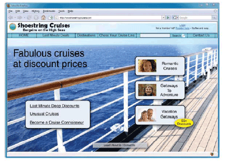
THE LANDING PAGE WIREFRAME
Remembering that our goal is to create engagement within 10 seconds, at the top of this page is a wireframe that I created for our fictitious discount cruise company.
It's not very exciting from a visual perspective - that will be the job of a visual designer. In selecting visual designers, I look for highly talented artists, often with training in the fine arts who also understand how to create usable design. It's important that the visual design make it clear which elements on the screen are interactive. For example, I'm fine with the artist replacing my ordinary but easily recognized underlined blue text links with something more interesting - as long as it remains clear which text is clickable. It's also important that all buttons or controls are obvious and that all text is readable (including by people with less than perfect vision –- a group that includes everyone over 40).
Other design elements in the wireframe that I want to preserve in the visual design:
1. Initially the visitor will probably focus on the area below the main menu, because the background picture is visually stronger than the header. Because the background photo presents a single, easily recognized scene, the visitor does not have to interpret a lot of small visual elements but can focus on the text.
2. The phrase, Fabulous cruises at discount prices," positions the site's mission in one, easy-to-comprehend phrase. On another site I might have chosen to make the phrase more descriptive but that can make the screen busier, competing for the user's attention.
3. The most obvious visual element on the page is the group of three buttons offering three types of cruises. These buttons, of course, were derived from the personas I created at the outset. This is where I want the user to focus in the first 10 seconds. If the personas are correct, there is a good chance that visitors will click on the button that reflects their interest.
Because of their importance, I have made these buttons brighter and more visually intense than other elements that might compete with them. Their shape, size, and arrangement create a cohesive visual grouping for the buttons. I used faces to decorate the buttons, because the human face is visually compelling and tends to attract attention. Hopefully, my visitor will identify with one of the faces, and this will improve the chances of a click.
Because not all users are looking for cruises that fit what three buttons offer, I have provided a secondary area with text links. It is designed to be a bit less obvious than the three buttons so it doesn't compete with them. My intent is to capture visitors who are not engaged by the main offer and who go on to scan the remainder of the screen. Note the simple and large text so the visitor won't have to work hard to find a link of interest.
As you can see, a great deal of thought went into the design of this landing page. I'll make sure that the design works as intended with some simple, informal usability testing. The wireframe is a first draft and while it is a solid and usable design it's neither exciting nor innovative. Getting to the next level will require more thought and more work. As design is a team sport, not a solitary activity, I will seek input and ideas from others to make the site really stand out and increase my chances of keeping a user on the site for more than a few seconds - ultimately leading to a conversion.
About the Author: Charles B. Kreitzberg, Ph.D. is founder and CEO of Cognetics Corporation, a company that, since 1982, has created award-winning interactive designs. Charlie has designed user interfaces for such diverse products as automated teller machines, medical software, and knowledge systems as well as served on the national boards of the Usability Professionals Association and the Society for Information Management.


