"Beyond Responsive" Mobile Solution Comes to Wix

HTML5 website development platform Wix has launched a new "beyond responsive" mobile solution for its 38 million registered worldwide users.
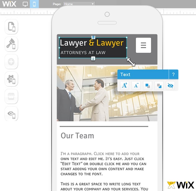
The solution automatically converts a traditional website, including design elements, content, integrated apps and ecommerce capabilities, into a responsive mobile site. However, the solution goes beyond responsive by providing users with the ability to customize mobile sites further via a WYSIWYG mobile editor. With the WYSIWYG editor, users can change their responsive sites by altering the design, hiding content and moving features.
"There are many responsive design solutions out there that work in blocks, scaling and rearranging components based on screen size. Wix, however, is built on flexible layers so we set out to create an infinitely flexible and customizable mobile offering to match and augment the Wix platform," said Avishai Abrahami, Wix co-founder and CEO. "Our goal has always been to put the power of the Web into the hands of our users by providing tools to create and manage a professional and comprehensive online presence. The new mobile solution is the latest addition to the Wix suite, allowing SMBs, entrepreneurs and creative professionals to compete effectively however the market evolves."
It is important to note that the new Wix mobile offering complies with Web and mobile best practices, including using a single URL structure across versions, a single source code and single source of content. These best practices not only help with SEO efforts, but also make it easy for Wix users to maintain and manage their Web presence on both desktop and mobile from a single location. Moreover, the new mobile solution ensures that mobile sites are automatically updated when a user's desktop site is changed.


