Boost Sales with Better Buttons

 When it's all said and done, there is no more powerful weapon in an online retailer's arsenal than the add-to-cart button. Merchants can spend unlimited resources on market research, product development, advertising and social media, but the success of each one is ultimately decided by the click of a single button.
That's why it is critical for ecommerce professionals not to underestimate the importance of this design element. The five fundamental components to consider when producing a call-to-action button are its size, color, shape, text and placement, and each one has to be weighed with careful precision.
There are some guidelines to follow but it is one of the most hotly debated topics in ecommerce - there are no right or wrong answers. The only way to know for certain what will work best for your site is to test all of the different options, but below are some suggestions and examples from retailers.
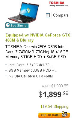
Size: Most conversion experts agree that the bigger the button, the more attention it will command - but there is a limit to that theory. Banner blindness is a legitimate affliction, so the button has to be big enough to grab the user's eye but not so big that it resembles a banner ad. Ironically, being too subtle or refined with your button can be an even bigger mistake, so to err on the larger side is probably the safer bet. More important than the actual dimensions of the button is how it compares to the other elements on the page, from which it should stand out clearly. Here is one example of a generously sized button from Overstock.com that leaves no doubt about the call to action.
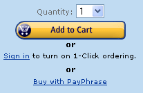
Color: Countless studies have been performed on the effects that colors have on Web users. Among the findings are that red increases the heart rate, yellow draws the eye fastest, green instills a sense of calm and blue may be associated with indecision. Yet you will find all of these colors being used for call-to-action buttons across the Web, and a number of others as well. One color that many experts can agree has a successful track record for this purpose is orange, which is a natural eye-catcher and blends the more aggressive red with the cheerful yellow for what could be a potentially winning combination. Again, the actual color itself may be less important than how it contrasts the rest of the page. Here is an example from Amazon.
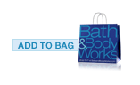
Shape: Again, no specific shape has been proven to outperform the rest, but it is true that the most commonly used shapes are round, rectangular and oval. Some experts suggests using irregular shapes for this very reason, to help your buttons stand out from the masses. Possibilities for this strategy would include designing eye-catching shopping carts or plus signs for your buttons. The shape of your button can also help to identify your brand, as in the case of Bath Body & Works below.
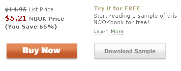
Text: The text is a very important part of the equation but one that is also frequently overlooked or undervalued. It may seem that retailers are limited in their options, but their decisions can have a major impact on conversion rates. "Add to Cart", for instance, sounds less demanding to a user than "Buy Now", which takes a more direct approach. The differences may seem subtle but they have significant consequences on separate consumer groups, and the best way to determine what is best for your customers is to test the various options. Guidelines to follow include keeping the text simple and brief, two or three words only, and to always start with an action verb. Here's an example of two call-to-action options from BarnesandNoble.com, and their very different presentations.
Placement: The placement of the button is critical. Call-to-action buttons have to stand out from all of the surrounding content on the page, which means that a liberal use of white space or other negative space is usually called for. Using this space effectively can be as important as the size and color of the buttons, as well-managed use of negative space around the button will make it appear larger and more striking. Here's an example from Newegg.com's recently redesigned website.