Creative Principles for Increasing Customer Response in Any Channel

:: By David Braun, New Control ::
The cold hard truth about direct response marketing is that most users are just looking for a reason to ignore any communications sent their way. On average, a customer will spend 3 seconds on a direct mail piece before putting it into the trash and about 1 second on the upper left corner of Web page before shifting focus.
With the odds stacked against them, how can marketers develop direct response campaigns that will engage the user and drive their desired results?
Fortunately for marketers, a set of creative guiding principles exists that have proven to enhance message clarity and drive response. These principles vary in scope and can be applied within any marketing channel in order to ensure that creative communications clearly convey why and how the user should respond.
Core Principle: A Clear Communication Will Beat a Clever Concept Every Time
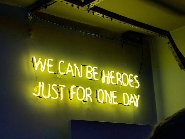
While many agencies focus on developing highly creative marketing communications that look to create a meaningful connection with the consumer, the reality is that most users don't spend enough time viewing ad creative to interpret a "catchy" or "clever" message. In direct marketing, message clarity is the key to driving response.
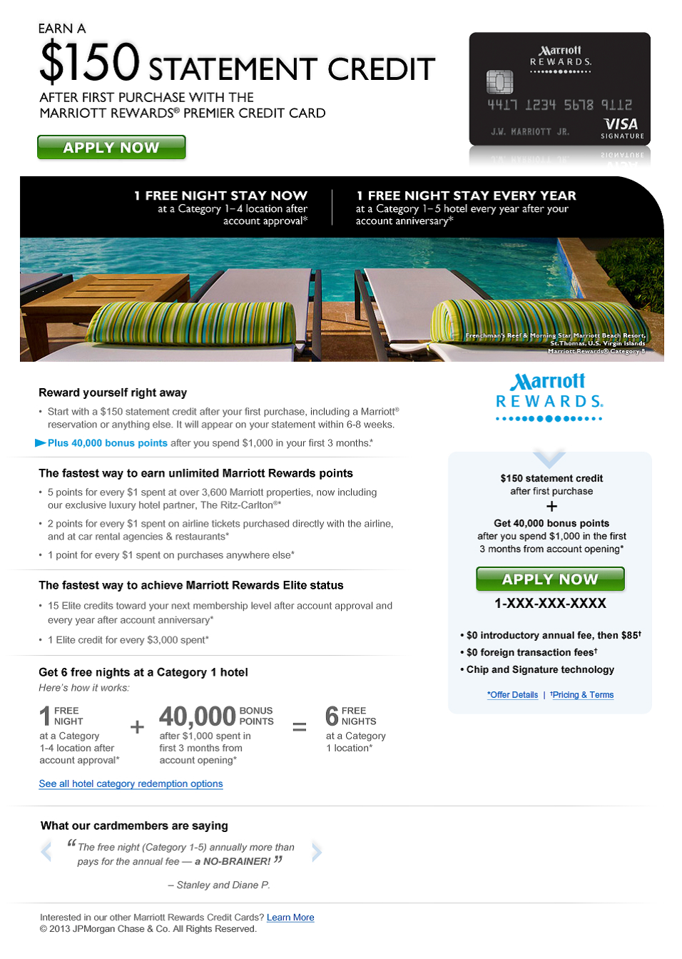
For example, when designing landing pages, marketers may think the more visuals the better - after all, isn't a picture worth a thousand words? Not necessarily. Graphics can impact load time and should be used only to reinforce the offer. In this example for Marriott Reward, a single image is able to convey an aspirational element that words can't, but desn't interfere with the main call to action.
 not to include a hashtag

This strategy is especially important for email, as many users will only see the portion of your message - typically the top left corner - that is visible in their email preview pane. By featuring the single selfish benefit and response button in the portion of your email that will be most visible, readers can quickly determine what your offer is and how they can respond.

In a channel like paid search, where we have such a limited number of characters in which to convey our message, it's important to use strong, benefit-driven calls to action. In the examples below, the first copy version offers vague promotions, a sale on dresses and potential free shipping. The second copy version is more likely to elicit as a response, as it's clearer on how and why the user should respond - they can save 20 percent, but only if they  New Control, is an industry veteran with nearly two decades of direct marketing experience. Dave has worked within a range of industries supporting clients as diverse as Liberty Mutual, Visa, AAA, Allstate, Constellation Energy, Humana, 24 Hour Fitness, Gap, AstraZeneca, HSBC and Chase.