Design Inspiration from the Web 100


From innovative navigational elements to design based on customer feedback, Web 100 companies design for the user experience. These top digital destinations are also setting the bar and changing consumer expectations.
Here are six companies, one from each Web 100 category, that are improving their bottom line with design.
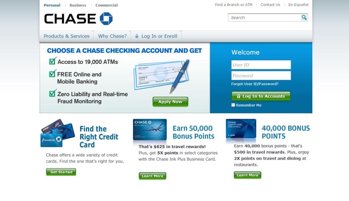
Chase.com
Category: Finance
Design Takeaway: Listen to your users!
A clearer, simpler Chase.com arrived in late 2012. The redesign centered on cleaner, more user-friendly aesthetics, including clearer language and navigation that is more purposeful. For example, all of Chase's products and services can be viewed in just one click.
The redesign was the multiyear product of incorporating feedback from customers on what they want to see from the number one most visited banking website. Even though customers wanted a new Chase.com, not everyone likes change, however, especially such a drastic one. The financial company took a 'rip off the Band-Aid' approach, but explained the new home page to users visiting the site for the first time since the re-launch and even made the login area take up nearly 50 percent of the page's real estate.
Visitor cookies eventually take over and indicate to Chase to swap out the re-design content (for things like credit card offers) and a smaller login space. The image below is with cookies.
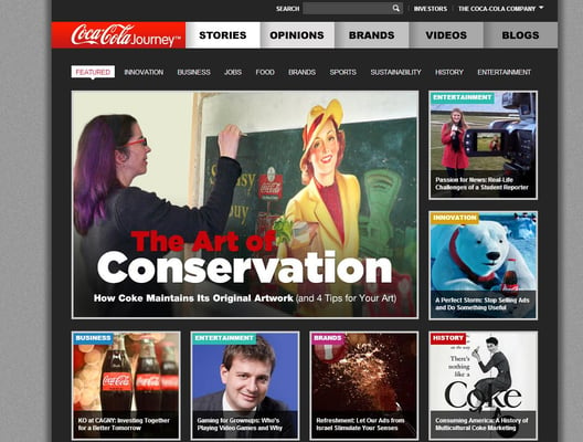
Coca-ColaCompany.com
Category: Lifestyle
Design Takeaway: Break the mold.
Visit nearly any corporate website, and dull design is sure to follow. Visit Coca-Cola's, and you'll get a website that uses content marketing and visual elements to spark your interest and bring you into the Coca-Cola "journey". The iconic brand completely reimagined the way a corporate website can look, feel and function. The site doesn't fit into one category, but is a destination for investors, businesses and consumers. Its home page caters to all of these groups seamlessly.
Coca-Cola uses its above-the-fold assets to promote articles and videos, while the below-the-fold area features visually appealing company statistics, conversations and social elements. Again, it's difficult to pinpoint the direction that Coca-Cola wants to take you to when arriving on the homepage, but that might be the goal - to get lost in the Coca-Cola Journey.
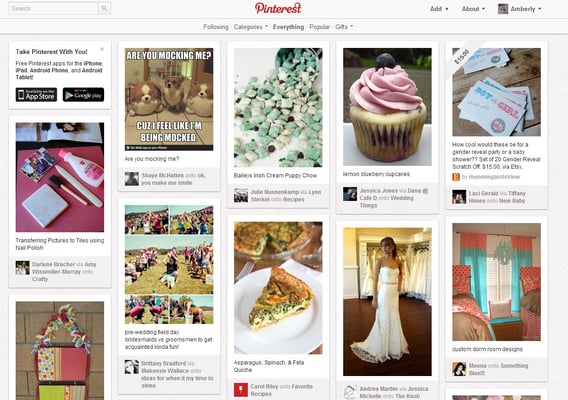
Pinterest.com
Category: News & Media
Design Takeaway: Images are everything.
When Pinterest pinned itself as a contender in the social scene, it did so in a way we had not yet seen. Its main content comes in the form of images, which users can pin, repin, like and comment on. Pinterest's use of image tiles was the real groundbreaker, as many other companies - including eBay and Interscope - have imitated the design and have seen increased engagement levels. Pinterest also offers a streamlined navigational bar and search function that helps users sorts through the countless pins of Pinterest.
Moreover, while the social network still brings out all of our crafty sides, Pinterest has major ecommerce benefits, as merchants are increasing website traffic, conversions and finding creative ways to make the site grow their business.
Zappos.com
Category: Retail/Consumer Goods
Design Takeaway: Leave a trail.
Between millions of dollars of ad spend on Facebook and its partnership with Commission Junction, Zappos knows a thing or two about acquisition. The customer-first brand also knows it's their job to provide an effortless user experience. One of the ways Zappos achieves this is through its use of breadcrumbs, which can work by either showing users other available product options or by providing a list of refinements that users have made to filter their searches (this helps users trace their searching steps).
Besides easier navigation, breadcrumbs also make the structure of your site more transparent to readers.
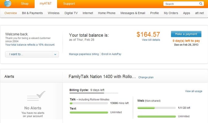
att.com
Category: Service Providers
Design Takeaway: Never stop innovating.
AT&T is a ubiquitous think tank that drives and delivers innovation in seemingly impossible ways. Its website, att.com, keeps up with this momentum. In 2012, the brand made several enhancements as part of its continual improvement of the online experience for its customers. Upgrades to the site design and technology have made it easier and faster for customers to get what they need, whether they are shopping, managing their accounts or need help.
For example, AT&T redesigned its account management page to make the most common tasks and most requested information easier to find.
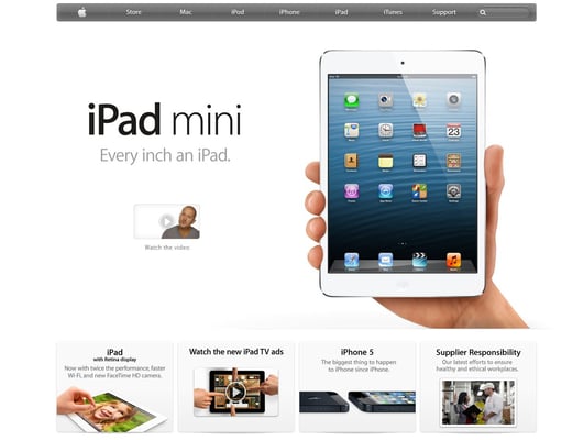
Apple.com
Category: Tech
Design Takeaway: More is less.
There's a reason why Apple's product packaging is often kept as long as the products themselves. Not only is nothing about the wrapping wasteful (everything has a function), but the product inside is so high quality you are sure you'll be able to repackage it and repurpose it.
Apple.com works in much the same way. The design takes a minimalist approach that makes the site easy to navigate and visually appealing - almost like a tablet or mobile-like experience.