
Finding Value in Design: How to Make Forms an Asset to Site UX

Web forms are not inherently pretty. At their core, they are just boxes and letters; function over fashion. And for years, they have mostly been an afterthought to designers. What, however, would be the impact if online forms actually enhanced a site's user experience (UX)?
Believe it or not, great forms strike a balance between aesthetics and usability.
A lot has changed in the world of Web forms since Caroline Jarrett published her 2008 book, "Forms that Work: Designing Web Forms for Usability." Still, the overarching lessons are just as true, nearly a decade later:
"Spoken conversations have a natural flow. They switch from one topic to another. Sometimes one person says something that the other person doesn't understand. This confusion doesn't matter because in spoken language we are used to asking for clarifications or repeating parts of the conversation. Asking for clarification is much harder when half of the conversation has been predefined, as it is in a form. So that's why we have to think about the topics, flow, and handling of errors in advance."
Make it flow.
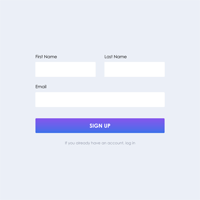
As intuitive as it might sound, form questions should have some semblance of flow to them. If marketers were asking someone questions face-to-face, they would not jump between topics erratically. So, why would a form?
Especially if a form is long and/or multi-page, make sure to organize questions by topic. For instance, a job application form should split personal information from professional information, with a clear separation between the two.
Additionally, service forms where both the company and the customer could benefit from being able to upload or receive a photo, respectively, should have this capability (see image).

Handle entry errors gracefully.
There are few things more jarring to a form respondent than error messages due to the form validation organizations have implemented. There are two primary ways validation is put into place: instant validation, which occurs as someone is typing into a field, and validation that comes after someone clicks the "submit" button.
In either case, do not annoy the user by placing validation text anywhere other than next to the incorrectly filled field; designers, instead, should use a color that indicates it has been incorrectly filled (red should do the trick, see image); and use conversational language to indicate when something needs to be corrected. Remember, it is a human interacting with the form, not a robot (well, hopefully).

However, while handling entry errors smoothly is critical, it is equally important to minimize them in the first place. Designers and developers will want to make sure their form instructions are clear. Use ghost text on form fields that have the potential to be complicated, use sub text to describe exactly what the organization is looking for, and even include some introductory sentences outlining what is needed below.
Connect a site's branding to the form.
It sends an alarming signal to site visitors if the lead generation or contact form has a different background, font and color scheme than the rest of the site. At best, it will appear lazy. At worst, it will seem downright suspicious. Either way, glossing over this important branding step stands in direct opposition to higher form conversions.
Mobile optimization is not just a buzzword; it is a requirement.
If designers and developers have spent hours making sure their website is mobile optimized, but they have embedded forms that look clunky on a smartphone, then their hard work is for naught.
The majority of Americans now own a smartphone. They are on the move, so in order for a website to be fully interactive with a population that is increasingly looking into their hand for answers, an organization's forms need to be easy to be fully responsive. For optimal results, consider forms that ask a single question at a time, which makes it easy for a respondent to focus on the questions being asked.
Consider the user experience after the form is submitted.
There is good reason to place emphasis on optimizing a form for completions-that is what businesses depend on, but the relationship with the form respondent should not end once they click the "submit" button.
Go one step further to envision what the user should do next. Is there a "thank you" message after the form? Does it have an explanation on what the respondent should expect next?
This is also a space where designers sometimes gloss over. If they have successfully designed their form to match the site's look and feel, they should not ruin it by not doing the same with the page that follows a form submission.
About the Author
Chad Reid is director of communications at JotForm, an easy-to-use online form creation software for designers all around the world.
Believe it or not, great forms strike a balance between aesthetics and usability.
A lot has changed in the world of Web forms since Caroline Jarrett published her 2008 book, "Forms that Work: Designing Web Forms for Usability." Still, the overarching lessons are just as true, nearly a decade later:
"Spoken conversations have a natural flow. They switch from one topic to another. Sometimes one person says something that the other person doesn't understand. This confusion doesn't matter because in spoken language we are used to asking for clarifications or repeating parts of the conversation. Asking for clarification is much harder when half of the conversation has been predefined, as it is in a form. So that's why we have to think about the topics, flow, and handling of errors in advance."
Make it flow.
As intuitive as it might sound, form questions should have some semblance of flow to them. If marketers were asking someone questions face-to-face, they would not jump between topics erratically. So, why would a form?
Especially if a form is long and/or multi-page, make sure to organize questions by topic. For instance, a job application form should split personal information from professional information, with a clear separation between the two.
Additionally, service forms where both the company and the customer could benefit from being able to upload or receive a photo, respectively, should have this capability (see image).

Handle entry errors gracefully.
There are few things more jarring to a form respondent than error messages due to the form validation organizations have implemented. There are two primary ways validation is put into place: instant validation, which occurs as someone is typing into a field, and validation that comes after someone clicks the "submit" button.
In either case, do not annoy the user by placing validation text anywhere other than next to the incorrectly filled field; designers, instead, should use a color that indicates it has been incorrectly filled (red should do the trick, see image); and use conversational language to indicate when something needs to be corrected. Remember, it is a human interacting with the form, not a robot (well, hopefully).
However, while handling entry errors smoothly is critical, it is equally important to minimize them in the first place. Designers and developers will want to make sure their form instructions are clear. Use ghost text on form fields that have the potential to be complicated, use sub text to describe exactly what the organization is looking for, and even include some introductory sentences outlining what is needed below.
Connect a site's branding to the form.
It sends an alarming signal to site visitors if the lead generation or contact form has a different background, font and color scheme than the rest of the site. At best, it will appear lazy. At worst, it will seem downright suspicious. Either way, glossing over this important branding step stands in direct opposition to higher form conversions.
Mobile optimization is not just a buzzword; it is a requirement.
If designers and developers have spent hours making sure their website is mobile optimized, but they have embedded forms that look clunky on a smartphone, then their hard work is for naught.
The majority of Americans now own a smartphone. They are on the move, so in order for a website to be fully interactive with a population that is increasingly looking into their hand for answers, an organization's forms need to be easy to be fully responsive. For optimal results, consider forms that ask a single question at a time, which makes it easy for a respondent to focus on the questions being asked.
Consider the user experience after the form is submitted.
There is good reason to place emphasis on optimizing a form for completions-that is what businesses depend on, but the relationship with the form respondent should not end once they click the "submit" button.
Go one step further to envision what the user should do next. Is there a "thank you" message after the form? Does it have an explanation on what the respondent should expect next?
This is also a space where designers sometimes gloss over. If they have successfully designed their form to match the site's look and feel, they should not ruin it by not doing the same with the page that follows a form submission.
About the Author
Chad Reid is director of communications at JotForm, an easy-to-use online form creation software for designers all around the world.


