Exposing Web Design Copycats

Once a style catches on, however, it can be difficult to contain. Some talented person is probably out there saying, "that's my design" - looking for props or proper credit.
When, however, does following a trend border on copyright infringement? Further, what legal grounds do individuals and companies have for when they feel their design was "lifted"?
By no means are we legal experts, but we do know a thing or two about intellectual property. What's more, there are plenty of people around the Web who have weighed in on this topic. To source their information (legally), we turn to published works from startup attorney Dana H. Shultz who explained a case on Quora that companies will want to familiarize themselves with. In it, the company wanted to protect the " look and feel" of its website from a direct competitor it believed used its design to gain economic advantage. Take a look:

( Image source)
In short, the Lanham Act is what most trademark laws fall under ( infringement, dilution and false advertising). As I understand it, designers/employers can find themselves in legal trouble for trademark infringement if they were to copy a trademarked site (its code included) and would be in legal trouble for trade dress if they " dress up" their site to closely match another company's "whole" appearance (images, colors, fonts, etc.).
You will want to consult an attorney to learn about protecting your intellectual property, but we have included some ways that designers/developers can still draw inspiration from other sites (like most are doing) in an ethical and legal manner (although this should not be taken as legal advice):
Be Careful with Layouts, Avoid Elements
Take two publisher sites and compare them; what's the same and what's different? They likely have a similar layout with third-party stories at the bottom, ads in the right-hand column, a navigation bar up top and social-sharing widgets in each article as well. They also likely have different color, font and image choices.
Now, take two ecommerce sites and compare them; what's the same and what's different? They likely have a main promotion on their homepage, reviews on their product pages, a similar navigation bar and suggested items on each product page as well. They also likely have different color, font and image choices.
Ecommerce sites tend to have similar layouts because retailers want to design for consumers who have grown accustomed to an ecommerce site looking a certain way. When a layout is changed across retail sites, consumers get confused and leave. The same is true of publisher sites, as there is a natural-occurring pattern across the Web (SiteTuners spoke about Web conventions here) and breaking that pattern loses customers. What's more, if sites do not adhere to certain trends, they start to look outdated.
That said, every website should have its own identity. A person should not be confused about whether they are visiting Retailer A's site or Retailer B's site. Yes, they should be able to easily navigate both in a way that matches their expectations, but the design elements should be drastically different in that it is clear what site they are on. In my experience, even sites that resemble one another are more dissimilar than similar. It didn't take long to come across some terrible examples of the opposite though.
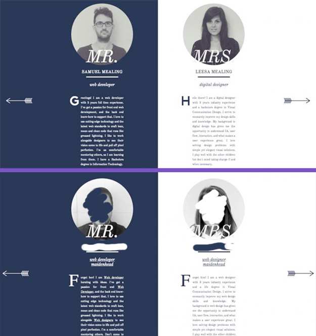
CSS Design Awards, for instance, offered a cringe-worthy example. CSS Design Awards found the story on Yoke and while it's a pretty dated story, it clearly shows designers what not to do (the top image is the original and the bottom image is allegedly "borrowed"). Note: The names and faces were crossed out since we couldn't locate them for comment, as it seems the site in question and corresponding social handles have been deleted since they were called out years ago. The backlash they received should stop anyone in their tracks.
(Image source)
Would a split page with both the husband and wife's pictures and bios been OK in this situation? Probably. A website visitor using both sites, however, would likely be too confused to know the difference between the two websites as the overall look and feel is far too similar to reasonably separate. Further, the website does not follow a sort of unwritten rule about how design team websites should function.
Use a Template/Theme
If a design is just too attractive to pass up, purchase a template or a theme. Beyond do-it-yourself website builders like Wix or Squarespace that are typically used by non-designers, there are some highly sophisticated options that a professional designer can customize (good starting points include Envato's ThemeForest or TemplateMonster). Not only will a thorough round of customization fit the brand better, but the design will also be legal and likely adhere to usability best practices. And if you're just looking for some inspiration? Check out Behance.
Be Collaborative
The Web can be a very collaborative environment, so there is a good chance that a designer is just a download away from the functionality they desire. Check out some of our Web Tech Watch series ( here, here and here), explore GitHub and for some animation scripts read, " The First Law of Website Motion."
When In Doubt, Don't
Good advice for many situations, but designers and developers concerned their design is bordering on someone else's should rework their projects. The process of scraping and re-working can often result in a better design altogether anyway.

Subscribe to Our Newsletter!
Latest in Web Design


