
How 9 Well-Known Websites Looked Way Back When

There's always a need to reflect. It shows us where we've been and helps us determine where we want to go.
Web design is no different. The digital past teaches us plenty of lessons - fads we never should have adopted and tactics we probably should have known. The question becomes, which brands have learned from their virtual pasts and which ones keep making the same mistakes? Website Magazine looks at how nine well-known websites (desktop versions only) looked way back when and how they look today (in most cases, 10 years later), as well as provides some quick thoughts on the aesthetics of the decade-old and new sites.
Consumer Goods
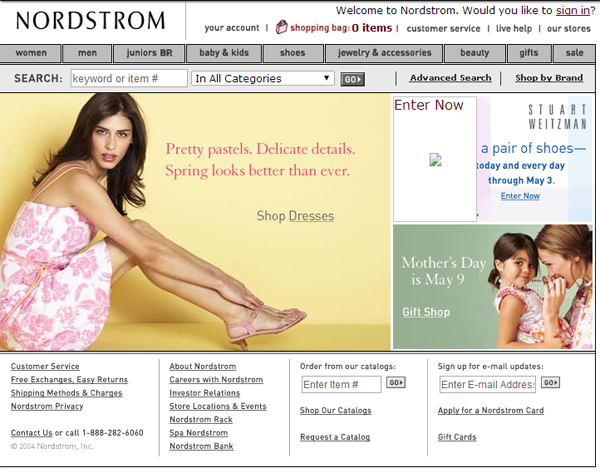
Nordstrom
April 20, 2004
Today:

Thoughts: At first glance, not a lot has changed on Nordstrom.com. Many of the navigation elements are similar, but the new site appears a lot less busy. Stacking the two promotions on top of each other rather than side by side lets the shopper focus quicker and all of the other elements on the page are now a lot more subtle. It's also clear that Nordstrom's Free Shipping and Free Returns policy has become more important today, as the retailer moved the wording from the website's footer to the top right and it uses the only green on the page.
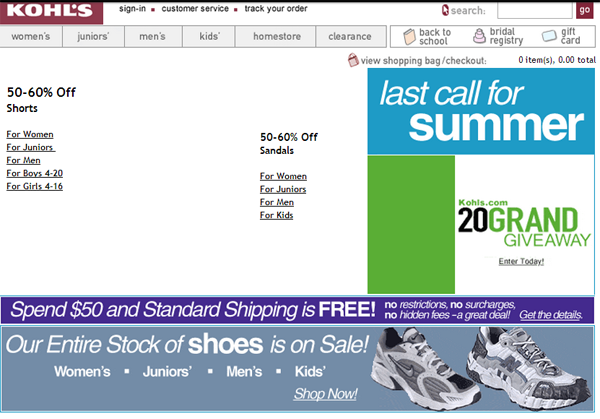
Kohl's
July 26, 2004
Today:
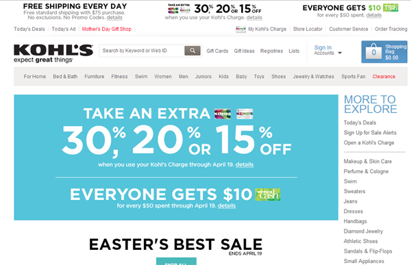
Thoughts: To be fair, an image on Kohl's yesteryear page may not have rendered, but it appears that Kohl's still isn't very good at including above-the-fold calls-to-action. What is it they want shoppers to do? CTAs get them there. Kohl's modern page also has a lot more navigation elements both a top-level bar and the More to Explore column, which was indicative of a lot of large retail sites, but many have streamlined it like Macy's.
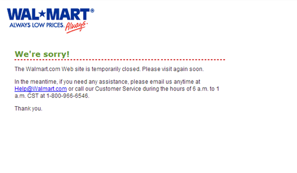
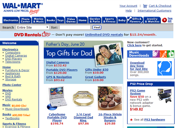
Walmart
April 15, 2004
June 11, 2004
Today
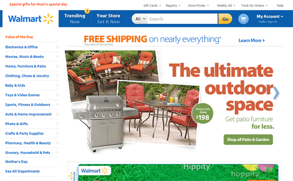
Thoughts: Probably the most-improved site we've seen so far, Walmart's new site is clean, crisp and organized nicely. It's old site is a jumbled mess with no clear direction and focus.
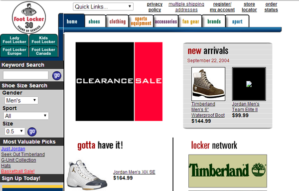
Foot Locker
June 15, 2004
Today
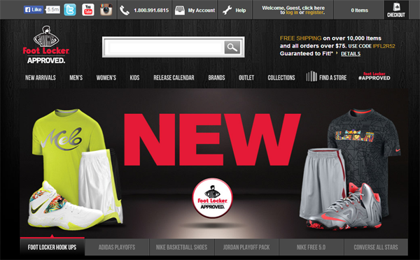
Thoughts: What a difference 10 years makes. Aside from simply being more modern, Foot Locker's website in 2014 prominently features social media icons. Of course, they weren't thought of in 2004, but will the saturation of social icons be something we scoff in 10 years? And, while FootLocker.com, today, is a beautiful site, where are the CTAs?
Information Publishers
Website Magazine
April 5, 2004

October 23, 2006

Today
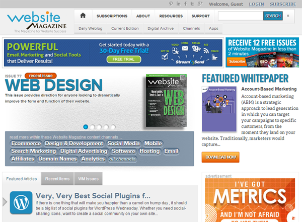
Thoughts: If we can dish it, we can take it. Website Magazine has made many improvements to its website over the years, but our new version has added space for online advertisements and still puts a large focus on our print issues, which you can tell by the prominence they have on our homepage both in 2006 and today.
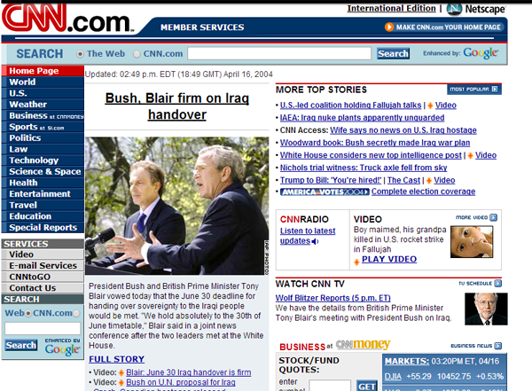
CNN
April 16, 2004
Today
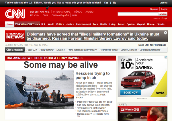
Thoughts: It's easy to get lost in the headlines of 2004, but today's site has added space for ads, while utilizing larger images/video and more white space. If forced to choose, no doubt most readers would prefer to consume information on CNN.com's new site rather than its much-more crowded version in 2004.
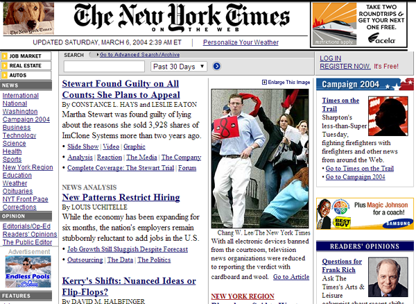
New York Times
March 6, 2004
Today
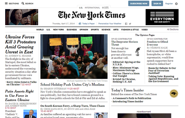
Thoughts: NewYorkTimes.com reorganized its home page, but kept many of the same elements. The navigation bar seems to be the biggest change. It was moved from a left-vertical bar to below the masthead, which de-clutters the page tremendously.
Service Providers
AT&T
December 30, 2004
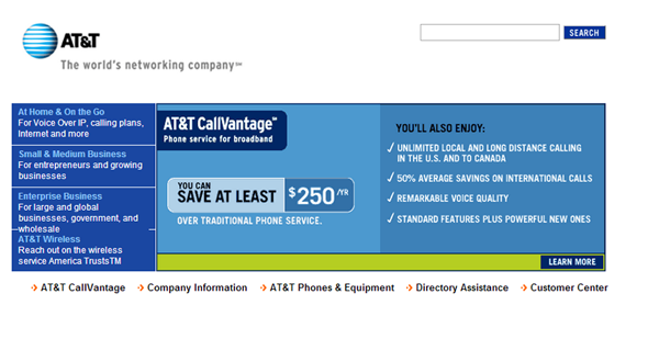
Today

Thoughts: Moving from a brochure-looking site to a robust website that tailors to many different audiences, ATT.com continues to improve based on consumer feedback.
Chase
April 17, 2004
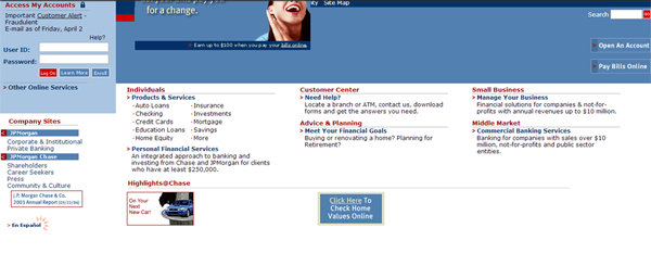
Today

Thoughts: While we are comparing apples and oranges here, Chase's most recent redesign focused on a clearer, simpler website with clearer language and more purposeful navigation.


