
How One Design Shop Cooked Up a Modern Approach to Responsive Web Design

Web designers and developers spend months and sometimes years redesigning a website to cater to clients' lofty goals for their new site, which often includes meeting users' evolving expectations.
Further, what clients want their sites to be - in regard to form and function - and what is possible - in relation to budget, time and capabilities - don't always mesh. With proper planning, collaboration and even some disagreement, however, everyone involved in a design project can get a better version of what they originally anticipated.
This was the case when non-profit organization World Pulse hired Web design and development shop Four Kitchens to give it a new website that would not only support current and potential donors, but also its social network side, where users write, connect and discover new content online. The challenge was that much of World Pulse's audience is in developing countries, where users don't have access to desktop computers or high-speed Internet. What's more, to offer the best experience, the site needed to be presented in a way that was familiar to World Pulse's diverse audience, starting with native support for English and French, with plans to introduce additional languages, including Arabic (see sidebar).
With these goals in mind, Four Kitchens leveraged responsive Web design, taking a mobile-first approach, which Aaron Stanush, creative director and partner at Four Kitchens, said wasn't a "nice to have," but rather a "must have."
The next obstacle to overcome was how to streamline World Pulse's complex site, which includes donor support, news stories, training resources, online communities and events. Content prioritization quickly proved to be the (which plays quite nicely with responsive design).
Show & Tell
After working through early drafts of the information architecture (IA) and user flows, according to Four Kitchen Designer and Frontend Engineer Taylor Smith, Four Kitchens established three primary categories for the site: editorial, community and static "about" content, and continued to prioritize content, work on wireframes and test their design theories (here's a list of popular wireframe tools).
Part of the testing was to see (and hear) how global participants interacted with the site. Four Kitchens used video chat to see how someone would sign up for a newsletter, for example. They quickly realized some of the early friction on the site centered around labeling.
One decision that came out of this user testing was the choice to use the word "menu" in its main navigation bar rather than a hamburger icon (three stacked lines indicating a collapsed menu on a mobile device) because the word "menu" proved to have the most global appeal.
The team continued to face tough decisions, especially regarding what to include and exclude on the World Pulse homepage.
The 7-Circle Exercise
To start the conversation with an eye toward focus and reduction, Four Kitchens gave World Pulse a very simple chart with seven circles (see image). Each of the seven circles represented homepage content and how the content was to be prioritized based on how high the circle is on the chart, establishing hierarchy/importance.
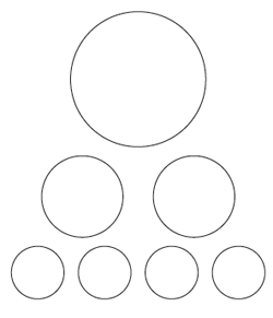
Four Kitchens tasked its clients with prioritizing and streamlining content based on seven circles (or areas for content) on the homepage.
The "big circle" needed to be the site's main takeaway. Four Kitchens strongly recommended that takeaway be the answer to, "What is World Pulse," in easy-to-understand vocabulary. The verbiage was especially important in this project because as an organization that has been around for 10-plus years, World Pulse needed to be challenged to rethink words and phrases they have used since the early 2000s if it meant improving conversion/engagement. The result was, "World Pulse is a global movement," with a call to join.
Moving down the chart, the two smaller circles needed to answer, "What should a user be presented with that gets into the site's purpose?" World Pulse chose to highlight the best of its recent editorial content and an ever-refreshing display of highly active community members.
Finally, the four small circles in the chart needed to cater to users still exploring the homepage, showing them, in brevity, what further actions they could take on the website. World Pulse and Four Kitchens decided on: 'What We Do', 'Our Impact' and 'Donate'. Even though there was room for four "circles" (representations of content they could include toward the bottom of the homepage), they were able to drop a "circle" because the three sections were so concise.
"Although this exercise was definitely helpful to the project - we still aren't sure whether it sent the whole committee into a horrifically long meeting, a boxing ring or a bar!" said Smith. "It successfully allowed the homepage to be a strong starting point for these three disparate divisions, and produced a piece we were all proud of."
Modern RWD
At the end of the digital day, Four Kitchens and World Pulse created a website that accomplished its many goals. And despite some technical conundrums (like supporting legacy browsers and organizing CSS), Four Kitchens elevated what perhaps they even thought responsive Web design could do.


