
Improve Your Travel Site Conversions through Page Design


The greatest travel sites don't rely on just a single page to convince visitors of their utility. They develop many pages of content, images and forms to deliver the ultimate experience.
Many novice travel sites neglect the opportunities that can be theirs if they were to develop a multi-level website. Instead, their pages are few, sparse and tend to lack the inventive design that's necessary to convert.
Conversions for most travel sites are appallingly low: currently about five percent. That's about half the conversion rate enjoyed by many financial and media firms. If you want your website to defy the odds, you may have to apply some critical updates to your pages.
As technology rapidly evolves and customers become accustomed to new features as they appear and perform on various commercial websites, the exciting content and conveniences quickly become the new standard that visitors take for granted. When they're not there, people notice.
Great website pages offer consumers what they want. They're well designed and usually include many of the latest features. Below are some compelling changes you can make to improve page design on your travel site.
Offer Multiple Pages
If your site currently boasts no more than a homepage, a blog and travel listings, that is not sufficient. It needs a variety of pages to keep visitors diverted so their visits turn into bookings.
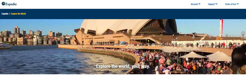
Expedia's website offers a classic exemplar. Aside from the standard homepage, blog and contact info, the site also features pages of information regarding specific travel destinations.
An unusual set of pages consists of information about excursions. This targets people who might have bucket list items and hope to travel in search of a specific activity rather than a destination. Examples of information provided here include activities such as parasailing, white water rafting, whale watching and the like.
Diversified pages such as these give your visitors more options. Consumers get a chance to explore various possible dream activities and become fully converted to the idea of travel before they book a reservation.
Optimize for Imagery
It's wise to use images that promote action and enhance the quality of your site. Any old picture won't do if you want to have a strong impression on customers and inspire them to book a trip.
"People across the Internet are getting smarter and faster at judging company websites," says an article from HubSpot. "When they first visit your site they are easily able to pick out a generic stock photo that they have already seen elsewhere or that resembles the non-personal style of stock photography."
The article goes on to discuss a case study that examined conversions in response to a stock photo versus images of the company's team in practice. The authentic photo elicited higher conversions because it showed the firm's actual service in context. This made the company seem more real and increased customer trust.
Appropriately Utilize White Space
When we address white space in websites, we're referring to any empty space that surrounds paragraphs, pictures, buttons, icons and any other visual objects on a Web page. In some cases, considerable white space will make the page look empty and bland, but in other situations, it can have a powerful impact on your visitors.
According to research from Crazy Egg, when you provide adequate white space between paragraphs and photographs, it can increase comprehension by up to 20 percent. Additionally, it can raise the professional credibility of your site and escalate consumer trust.
Any of these benefits will increase the likelihood of the consumer making a purchase. The person will feel more satisfied with the content on the page and be able to comprehend it in context. He or she will imagine being on a vacation far away from troubles and cares.
Improve Site Search
"For no other industry is the search function as critical as for travel websites," says an article from Visual Website Optimizer, a website design and marketing company. "In the case of ecommerce stores, visitors operate in the 'browsing and finding' mode. They may or may not use a site search. But when it comes to travel sites, the entire premise of the prospective transaction is based on site search. Only when a visitor selects a location and a date, will he find relevant results from which he/she will make a choice."
As the article strongly argues, the search function is the most essential feature of a travel website. Site search should be smart and intuitive; it should understand and anticipate what the consumer means rather than what he or she may type.
In other words, if the visitor to your site makes a mistake while typing, and the destination gets misspelled, your search system should still take people where they want to go.
Conversions are obviously very difficult to nail down in the travel industry, which puts extra pressure on your need to maintain a clean, compelling website. Making changes to individual pages can be an intimidating task, but it's the surest way to stay in business and help connect consumers with their vacation dreams.
Larry Alton is a professional blogger, writer and researcher who contributes to a number of reputable online media outlets and news sources. In addition to journalism, technical writing and in-depth research, he's also active in his community and spends weekends volunteering with a local non-profit literacy organization and rock climbing. Follow him on Twitter and LinkedIn.


