
Designing Awesome Web Experiences with Parallax Scrolling

Parallax scrolling is still a hot Web design trend incorporated by countless sites on the Web.
While some used it effectively to tell about their brand, products and services, there are too many that just used it inconsiderately making site performance and usability suffer. Yes, even though parallax scrolling is still a good technique to present information and grab attention in a visually engaging way it can also backfire if it is overused.
In parallax scrolling the background moves at a slower rate to the foreground offering a 3-D effect when scrolling down the page. With the use of full-screen visuals and engaging graphics, the effect can further be enhanced creating a memorable experience.
Let us begin with some good and bad examples of parallax scrolling. The website of tech giant Sony has incorporated parallax scrolling for a nice storytelling about their brand and becoming what they are today.
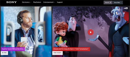
Although, the design is pretty engaging it took a lot of time to load. That is a big concern for many parallax scrolling websites.

Another great example of parallax scrolling website that can cited here is the one from Nature Conservancy, an organization working on water conservation. The site really made an impressive storytelling flow with a constantly interaction-driven graphic design and parallax scrolling effects. One cannot help but stick to their crisply told conservation story until the end. That's the beauty!
With Web technologies like HTML5 and CSS3 in place, it has become easier now to create advanced, fluid, eye grabbing and remarkable effects in the Web browser and when these effects are incorporated with a clear objectively driven manner, they can help a brand or company tell their story in much engaging manner.
From the perspective of a designer, seeing a parallax scrolling site it becomes apparently clear that huge effort and time went into building such a site. This unparalleled level of effort from the designer often helps creating the right balance of colors, graphics and copy, but the visual effect aside, the site performance and speed remains a concern as often these sites uses heavy graphics and elements that make loading time suffer (as was the case with Sony).
The one aspect that clearly stands out in favor of parallax scrolling is the engaging capability of content. Most users end up grabbing more knowledge of a product or service thanks to this innovative flow of displayed content. The movement of the page with graphic elements often helps reducing and breaking the large texts into useful parts, so that the user doesn't feel like he or she is consuming large amounts of text.
Considering all, undoubtedly parallax scrolling still seems awesome. But with inconsiderate use it can go the wrong direction as well. Let us explain below key principles of using parallax scrolling in Web design.
The role of parallax scrolling in Web design
In many ways parallax scrolling has really changed the way we think about Web design. Simple images and texts often fail to create a lasting impression. Users like design that can grab their attention with a story told in a visually interactive way. The role of parallax scrolling can be summarized in the following aspects.
- Contents presented in an objective way to guide the user through a story.
- Contents are prioritized in a flow according to what users value most.
- Parallax scrolling helps in pushing the user to interact, in many cases simply by choosing an option or selecting an objective opinion.
- Finally, parallax scrolling by grabbing user attention throughout the story imprints a better brand impression on user's mind.
Consider how and to what extent it helps users
It should be the primary principle to ask and verify how a design element helps the users and to what extent. There are a few relevant questions to ask:
- Do the users know their next step? Many users arriving upon a parallax scrolling site just cannot decide what to do next. In spite of the "start here" button on majority of these sites most users fail to see it. This makes interaction at the initial state confusing. Once users recognize their very next step, however, they become quite engaged through the site.
- Do users find scrolling interesting? In most cases users initially find such visually engaging scrolling quite interesting but gradually over time they lose interest in it. So, the challenge is to make the site interesting over time for both repeated and initial users.
- To what extent scrolling helps engaging users? As far as engagement is considered, parallax scrolling really takes initial users to a trip and completely absorbs their attention. But lack of scopes for user input and interaction actually reduces this engagement over time. So the challenge is to provide users diverse options of input and choices of interaction.
Considerations for using parallax scrolling
Before using parallax scrolling, a few considerations can be helpful.
- Further engage users with nteractive graphics and animations.
- Incorporate storytelling approach to make a logical flow of presented information.
- Make your presentation work toward provoking interest and curiosity in users.
- Remember, with touch-enabled devices scrolling is smooth, natural and native.
- Finally, guide users to the calls to action options.
Challenges involved in using parallax scrolling
Parallax scrolling has some challenges as well in relation to device specific browser experience, page loading speed, compatibility, etc.
- Parallax scrolling is not always friendly to mobile display.
- The biggest objection to parallax scrolling is its slow loading time due to use of heavy graphics and image layers.
- Parallax scrolling requires testing in different device browser combinations and it may not perform in all browser-device combinations in the same way.
- Without an engaging and interaction driven story the users may lose track and feel confused. This happened in many websites using this without a clear objective.
Helpful tips for designing a successful website with parallax scrolling
Besides the above mentioned considerations and principles, there are few other priorities and helpful attributes that can make a robust parallax scrolling experience.
- Content should enjoy the focus and priority and design style should only help making it more visible and engaging.
- Offer short pieces of content one at a time.
- Keep the design clutter free, user-friendly and enjoyable throughout.
- Keep the navigation flow simple.
- Provide users scopes to skip the scrolling and find the information they need instantly. Provide some dropdown buttons on the uppermost layer or a hidden menu on the upper right corner.
- Remember parallax scrolling is not new at all and so using it with other design elements can lead to a more unique user experience.
- The storytelling through parallax effect should have a clear objective and all the elements will only work toward accomplishing that goal.
- Avoid offering too much information and scrolling in one page. Too much scrolling creates distraction and annoys users.
Testing the parallax scrolling experience
Finally, you must test the performance of your parallax Web design before moving further into development. Testing on different devices and browsers would reveal compatibility issues, mobile friendliness and issues concerning loading speed and functionalities.


