
Is RWD Responsible Web Design?


By Firuze Okten Gokce, Superarama Search Engine
The rapid expansion of different Web-enabled devices and screen sizes is pressuring Web designers and developers to produce effective and creative solutions to provide the best user experience possible, regardless of device.
One of the ways in which designers and developers have met this expectations is through responsive Web design (RWD), which is now the approach Google recommends. What is responsive Web design? Does it improve the user experience? Let's tackle some of the answers to these questions below.
The most advantageous part of a responsive website is that there is only one URL to adapt to different devices or screen sizes, making it easier for the search engines to crawl the single site, which could make it more visible to those searching for it. However, rich media websites full of audio, video and flash on desktop machines do not perform well on mobile sites with responsive Web design principles.
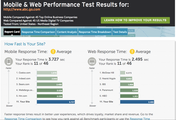
Abc.go.com, for example, uses a responsive Web design (see image below).


Now that you know what the site looks like on both desktop and mobile devices, let's look at its response time. It has an "average" response time but only ranks 11 out of 46 Media Digital TV websites. As a digital property of Disney, average just doesn't cut it.
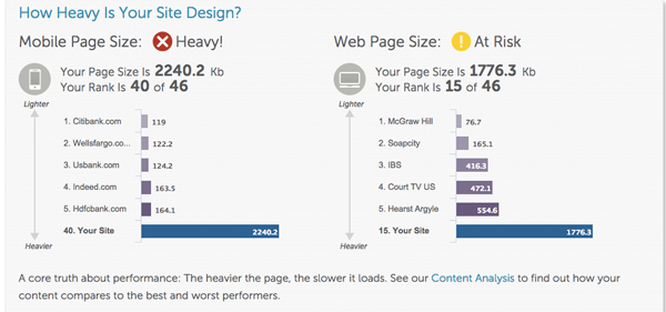
Additionally, both ABC's mobile and Web page sizes are classified as "Heavy" and "At Risk" categories, which leads to iffy response times depending on the connection performance of the mobile carriers.
Due to high volume of file sizes of websites and speed constraints on mobile networks (4G is not widespread yet) slow loading times on mobile devices makes user experience a painful process, which in return leads to less conversions.
Even though responsive Web design is easy to implement and Google's recommended approach, it is not capable enough for creating high performance loading times. Responsive Web design imposed as one solution to mobile or Web-enabled devices is only the first step. It only brings successful outcomes if and only if it is combined with other mobile-friendly design and implementation techniques.
Why Google is Taking Action in favor or Responsible Design?
Responsive Web design seems to be the best-fitting solution for crawling and indexing a website. There is no need to send crawlers to different URLs, sub domains or mobile domains for different devices. For Google this means that there is no need for a separate database for mobile or Web-enabled devices. Unfortunately, this approach undervalues user experience and performance criteria as a priority.
If Web masters, developers and designers are aware of this situation and are very careful in building their Web strategy by harnessing efficient mobile solutions possible, then they can create the best user experience possible.
Other Techniques as Mobile Web Design Solutions
There are two other techniques that can be used to improve user experience and Web performance:
- A dynamic serving website: This solution also offers a single URL for multiple devices but creates a separate version of HTML for different device types based on what the server knows about the user's browser. This technique is also known as Server Side Components. In comparison to responsive Web design, designing multiple custom pages, which are convenient for different device types, brings more work for development teams, but in return increases the performance and qualifying of the user experience. What's more, the sites only use the resources they need, which can improve Web performance (and loading times).
- Separate mobile site: With this solution, Web masters are creating a mobile-only approach with, mobi or .m extensions. Only mobile phone users can see the mobile site. This approach could be helpful for mobile optimization but demands a careful management for multiple URLs, redirects or changes to content.
So What's The Solution?
An optimal solution for maintaining performance and user experience on the user's side and providing convenience on the Web development side is combining responsive Web design principles with dynamic serving website solutions known as RESS (Responsive Web Design + Server Side Components).
RESS will provide a single URL for multiple devices and platforms and at the same time will create dynamic custom pages depending on the user agent's device type.
Web Design is no longer a visual process; instead it is a strategic experience for platform creation in which users are at the core. This ecosystem will entail multidisciplinary approaches from visual design, user experience, code development and hardware knowledge.
Firuze Okten Gokce is the CEO & Cofounder of Superarama Search Engine, a search engine for Turkey. Previous ventures as CEO Affmeter LLC., 3dbility.com and Wishica. Charter founding member of Performance Marketing Association. He can be reached at firuze@superarama.com.


