
Landing Page Design Trends for 2012

Turn Down the Volume and Hear the Cash Register Sing!
Business website designs have become increasingly "quieter" over the past couple of years.
Internet professionals have come to realize that when executed properly, a Web page can still achieve rock-star results with a more classical approach. This trend will only become more evident in 2012, and it is especially important in the case of landing pages.
"You don't want landing pages to shout at your visitors, or have many elements on the page competing for their attention," says Tim Ash, CEO of landing page optimization firm SiteTuners. "The most effective pages you'll see will have a Zen-like simplicity to them, and the desired call-to-action should naturally arise out of this background of stillness."
So, for anyone considering a website redesign this year, the advice is . . . well, simple. Try turning the volume down a few notches and instead aspire to achieving a harmonious hum. And by no means should you be trying to outshout the competition - that is so last decade.
Below are some landing page design trends to be watching for -and executing - in 2012:
Clearer calls to action
Today's Web users want to be able to see the forest without being obstructed by the trees. The slow demise of Flash and the quicker-than-anticipated adoption of HTML5 and CSS3 are allowing designers, developers and businesses to deliver these critical messages with greater clarity and across platforms - which is what users have wanted all along.
Don't complicate the process with overly cumbersome navigation, inconsistent typography, poor choices of color or special effects such as animation. While nothing has changed about the motivations behind beautiful website designs, website designers are finally embracing the fact that users want to be spoken to and not yelled at.
Simpler color schemes
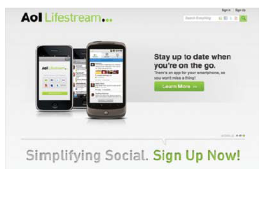
One surefire way to convey a message to users without shouting at them is through the use of color - or, more precisely, the lack of it. AOL illustrates these first two trends almost perfectly in the landing page seen below. A simple white background with a call to action placed in the center of the page, and the use of a soft shade of green that indicates where the user should "go" to get results.
Better mobile compatibility
For every online business that has successfully tapped into the mobile channel, there are five more that are failing - and the difference lies in their design strategies. Not fully understanding the habits and preferences of an audience is the most costly mistake committed by those who fall short.
"Since each mobile device has different resolutions, screen sizes, operating systems, memory and processor capabilities," says Ash, "it is very hard to design for. You have to focus on the few key devices that are important to your segment, and you need to reduce their choices to a single action and make it easy to click on the most important options."
Not only should every Web business be designing for mobile devices today, but they should also know exactly which devices their users prefer and be designing pages specifically for the ones that earn the highest priority - taking into account factors such as screen sizes, touchpads or keyboards, etcetera. In addition to testing and analyzing your website's traffic volume to draw these important conclusions, below is one more tip to carry into the New Year.
Try designing the mobile versions of your landing pages first, and then build them out for desktop versions later. This way you will gain a better understanding of how users are attempting to complete the desired goals in the quickest and easiest ways possible, which will result in more online conversions no matter what you are offering.
Larger images, simpler typography, more slideshows and more video
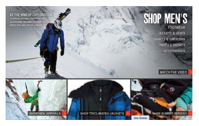
The use of imagery and typography in graphic design has been around since the inception of the printing press, but one pleasing new trend has been the adoption of a "less is more" mentality. Especially with landing pages, additional clutter and undue distractions will only detract from the end goal - whether it is to solicit sales, invite engagement, establish authority or all of the above. The trends we will see in 2012 will include the use of one or more dominant images, simpler and more consistent typography, and the use of slideshows and video to better show a retailer's entire inventory or to describe a business' service in greater depth (see page 20). This landing page from The North Face illustrates all of of these tactics, as well as those mentioned in the previous section.
More prominent social icons and shorter registration forms
The use of social media icons in landing page design can hardly be called a trend, but as more users flock to sites such as Facebook, Twitter and LinkedIn, the roles that these services play become increasingly important for business owners. Therefore, it will also become increasingly important in 2012 how these icons are represented on Web pages.
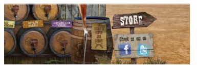
We are already starting to see some fun and creative variations like the example below from beverage retailer Wild Bill's Soda. But the important thing to remember is why integrating these icons on to your landing pages can be so helpful. Users can get real-time recommendations about your business from their social networks while they are considering a product or service, and they can just as easily write a favorable review about their experiences on your site. A thank you page after closing the sale provides Web businesses with a wonderful opportunity to invite social media engagement from customers, which, in turn, can also prove helpful by letting you know more about their specific interests.
Keep in mind, however, that when it comes to putting registration forms on your site, the less-is-more theory applies here as well. Users in 2012 will have less patience than ever for filling out long and cumbersome forms, so ask only for the necessary information up front and use future correspondences through email to gain more.
Above all else: Keep it simple
The irony is that after all of the technological advances that the practice of Web design has enjoyed over the years, what will have the most profound effect on conversions in 2012 is simplicity. More than anything, today's users want their Web experiences to be quick, easy and enjoyable - and the most effective landing pages of the year will deliver exactly that.
About the Author: Linc Wonham is the senior editor at Website Magazine, writing primarily about design, development and software.


