Life After Mobilegeddon: Tested Techniques That Help Increase Mobile Conversions

By Marcus Howling
Business owners and marketers have been scrambling for the past few months trying to prepare for the release of Google's Mobilegeddon.
Webmasters should have been preparing for this since last year. If a company's website is not already responsive or displaying a separate mobile version, start there. Understanding how the user views your site on a mobile platform is vital to the business having success and growing online. Taking the traditional ideas and applying them to mobile design will no longer help convert more users. Continue reading and learn important techniques that are guaranteed to help improve mobile conversions.
Limiting The Users Options Will Help Increase Mobile Conversions
The number one mistake most people make is providing too many options. Some marketers believe having more options for the user increases the chance of converting. However, limited space on mobile devices makes eliminating options detrimental to the company's success. An A/B test will likely prove decreasing distractions actually improves conversions. Think about it, mobile devices have limited space, focus users on one product or goal. Limiting the number of options is key, but continue reading to understand why reducing the number of steps also goes a long way.
Mobile Conversions Increase When The User Sees The Product or Form First
Mobile conversions will also increase when the users path to the checkout is shortened. A lot of companies design websites the same way. Visitors land on a homepage with ads, company information, banners and multiple products. How is the user supposed to know where to go next? How are they supposed to know what to do? If the goal is to sell more products, they should not have to sign up first. They should not have to read an about section. The user should see the desired action on the home screen and be driven to the end goal.
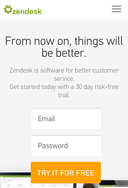
Try placing your products or goals on the homepage. Forget trying to greet people and wow them with fancy tricks, get strait to the point. If they want to learn more about the company later, great! But make the conversion point the first thing the user sees, then funnel them directly to the end goal (like Zendesk does in the screenshot below).
Simplify The Checkout Process to Increase Mobile Conversions
The only thing worse than keeping people from reaching the cart, is having them drop off before the transaction is complete. Make the last step simple as possible. Consider a simple process on one screen. Also reduce the number of checkout fields. There is nothing worse for a consumer than having to fill in 10 or more fields. Only collect the information pertinent for the completion of the sale. Limit the number of fields to fewer than five.
These are a few easy ways to help improve mobile conversions. Remember the old saying, less is more. Start by providing the least amount of options for visitors. Focus them on the goal. Second, move conversion points to the mobile home screen. Highlight the end goal!
Finally, keep the final step as short as possible. The checkout cart or lead generation form should be limited to fewer than five fields when possible (consider guest checkout).
Old Navy, for example, enables returning customers to sign-in for easy checkout or those wanting to checkout as a guest have five steps to complete: email address, shipping information (address and delivery preferences), gift options, payment (credit card) and promotions (promo codes) and place order.

Avoid asking for phone numbers, using confirmation email fields and multiple address fields. Remember, do A/B tests to document and support changes. Finally, and most importantly, having a mobile site is not enough; the platform has to be optimized for maximum performance.
Marcus Howling, The SEO Doctor, is an SEO specialist and a regular contributor to Website Magazine and other leading publications.


