
Nine Critical Elements of a Confirmation Page


:: By Joe Schnaufer, cleverbridge ::
We've all experienced it - after purchasing a product online we find ourselves unceremoniously dumped on a mostly empty page, perhaps with the sentence "Thank you for order." Companies spend millions of dollars to drive traffic to their web stores, converting a small, highly engaged fraction of that traffic, only to drop the ball with a useless confirmation page. This page is not only your last chance to talk to your customers on their way out the door, but by providing them with certain key resources and crucial pieces of info, you can prevent the problems that cause customers to contact support teams in the first place, thereby reducing contact rates and increasing customer satisfaction.
Sofa vs. Software
If I buy a sofa at Overstock.com, I'll need information that allows me to track the delivery of the product, but I won't need any instructions on how to access or use the product: It goes in the living room and I sit on it.
However, digital products are different. They are delivered immediately to the buyer, but download and installation processes are often complex, even overwhelming, to some users. The order confirmation page is the perfect place to address these concerns and others. Here are nine critical elements companies should implement to their order confirmation page.
1. Order completed
 Having had years of experience in customer service, I can personally attest to the fact that many customers who arrive on a confirmation page are uncertain whether or not there is anything else they have to do to complete the order. But on its most basic level, a confirmation page's entire purpose is to do just that. A good example of a confirmation page that clearly shows the order is completed is from ashampoo, who use breadcrumbs at the top of the page.
2. Say "thank you"
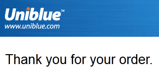
Your mother taught you this when you were young: When someone does you a favor, you say, "Thank you." In a sense, every paying customer is doing you a favor - they're allowing you to stay in business, and that favor should be acknowledged. It would take too long to explain the psychology behind the power of these two little words, but suffice it to say, thank you's go a long way in maintaining relationships. Subscription companies especially, who depend on customer renewals, need to make sure the confirmation page is the first (though not the last) place in which they thank customers for their business. Uniblue is one of the many companies who include a thank you at the top of the confirmation page.
3. Browsers close, but an email is forever
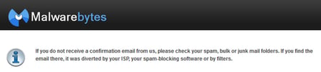 The confirmation page is first displayed in the customer's web browser. For many reasons, the customer will need to refer to the confirmation page at a future time, well after the browser has been closed. Maybe they aren't ready to download and install the product just yet, or maybe they need the receipt later. Therefore, it's a best practice to send an email version of the confirmation page. However, sending an email isn't helpful if the customer can't find it. That is why it is also necessary to remind the customer to white-list your company's domain name and to check their spam filters in the event they cannot find the confirmation email. Here is an example from Malwarebytes:
4. Contact methods
 No matter how many precautions you take, some customers are going to need more care than others. It's why every business has a customer support team. The key here is not to make customers hunt around your website for contact information. Provide a toll-free number and an email address that the customer can use to contact you about the order. If you've got live chat capabilities, make sure it's known right off the bat, like ZeoBIT does. And, of course, always include a reference number the customer can use when asking questions about their order.
5. Product Information
Payment Method - The confirmation page needs to confirm which product was bought and the method of payment. These two should be obvious, but they go on the list because they're an absolute necessity. Also make sure to include a downloadable PDF version of a receipt, as some customers may require this. And just in case your customers are not as tech savvy as the rest of us, provide a link to download a free PDF reader like Adobe.
6. Download Link
As we explained above, digital products are delivered a little differently than a sofa, for example. The confirmation page not only confirms the customer's purchase, it provides access to the product itself. The download link is important because a) you should not assume the customer already downloaded the product through a trial version, and b) the customer might need to download the product onto a different machine at a later time.
7. Entitlement
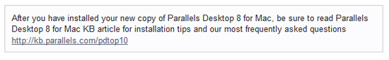 This is the license or activation key. It should be accompanied by very clear instructions on how to properly activate the product. Don't forget the copy and paste instructions - I can't tell you how many customers I have encountered who are unfamiliar with this process. It is also helpful to supply a link to a knowledgebase on your site that includes some common issues faced by your customers during the installation. Parallels is a company that provides this type of important information on the confirmation page.
8. Refund policies
 Whether you have liberal or conservative refund policies, making those policies clear in the confirmation page can prevent a lot of customer and employee frustration in the long run. If customers are allowed to request a refund at any time, let them know it. If they only have 30 days to do so, let them know that as well.
9. Subscriptions
Cancellation Options - Customers can become upset if their credit cards are unexpectedly charged, and rightfully so. For subscription products, the confirmation page should make it clear at what intervals and for what amount the customer will be charged by subscribing to the product. Make it as easy as possible for customers to cancel if needed.
Preventive Care
It is useful to think of the confirmation page as preventive care - the things a patient should know and do to avoid a visit to the doctor's office. All the above best practices should be in place in order to prevent customer contacts. Not because you don't value your customers and don't want to hear from them. Rather, these elements are in place precisely because you care for your customers and want them to have the smoothest experience possible with your company.
About the Author
Joe Schnaufer is the global director customer support, cleverbridge - a full-service e-commerce provider for more than 300 international software and SaaS corporations like Acronis, Avira, Dell, Malwarebytes and Parallels. Schnaufer is responsible for leading the company's global operations with respect to managing all customer support related initiatives, staff and day-to-day operations.


