
Optimizing Conversion: Hands-On UX Analysis

By Kate Shaughnessy and Jennifer Malone, 3Q Digital
Improving conversion rate on a client's site can be a challenge.
Finding a page with decent organic traffic, high conversion rate and low bounce rate is a proverbial diamond in the rough. Something in the user's experience of that page resonates strongly with users - but what? Thankfully, Web analytics allows us to see what is working and what isn't.
In this article, we'll analyze a site that is predominantly information-based, focused on getting users to register for the site and regularly purchase on-site content.
First-Page Data
The image below is a top-converting landing page for a high-value SEO term, with a high conversion rate. With a little work, one can see how users interact with this page. The circles reflect where users click and visit after landing - the size of the circle on that element reflects the number of users following that path (in the form of a percentage). Web professionals can obtain this information by taking a landing page report and layering in the second-page path, showing where users go after interacting with the page.
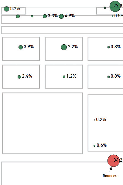
The area with 27.3 percent of clicks is the "Sign In" button. As we know this page converts well, we can conclude that its conversion rate is bolstered by attracting returning users. As such, on-site content should be tailored to speak to these users' position lower in the conversion funnel.
Additionally, we can see that users are not traveling far below the fold. Even when users do engage with mid-page content, only a couple of the hero images in the top row are receiving clicks, with a third hero in the second row performing well. This signals an opportunity to rearrange on-page content to better speak to user intent. We learned earlier that this page attracts returning users, signaling that they're at least marginally sold on the site's value proposition; by incorporating trust signals (such as satisfaction guarantees) into the hero images, we may be able to give engaged users the nudge they need to finally convert.
The text boxes immediately below the fold have low user interaction, and they're worth revisiting. Replacing this low-interaction content with stickier content may reduce bounce rate or increase conversion rate.
Second-Page Data
The image below provides an example of the same report, this time aggregating the second-page data for all users visiting any page with a similar template. A great example here would be for an ecommerce client looking at the second-page behavior of all users who, for example, landed on children's apparel product pages. Looking at this set of pages, we see that most user interactions are within the top navigation bar; some engagement occurs with above-the-fold content. Note that, in contrast to the previous example, there's very little interaction with the upper right corner where the "Sign In" button is located. This page group attracts large numbers of new users who have never converted - their investment in the site is low and they may not be ready to convert.
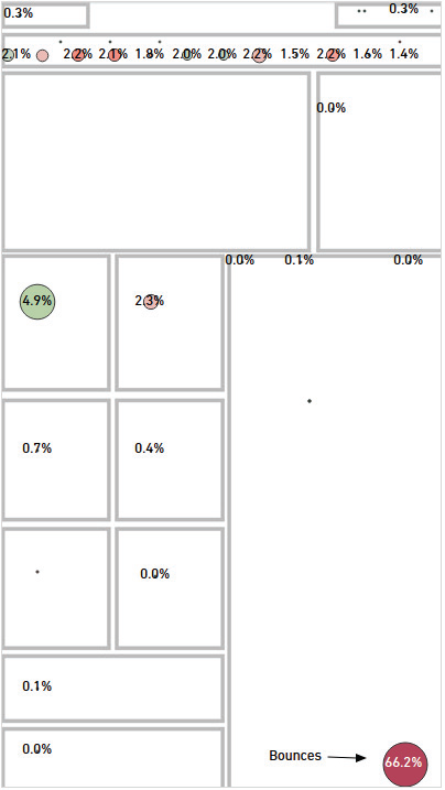
This page group's biggest problem is that there's a lot of different information thrown at the user. From a busy navigation bar to as much content below the fold as the template can hold, it isn't clear what users should do. There isn't a clear call-to-action, but rather multiple calls, each of which speaks to a different level of commitment: newsletter sign-up, site registration and lead form fill. Ideally, there should be one call-to-action on the page, catered to the user's likely place in the funnel; considering that users at this stage are new to the site and just looking around, prompting them to sign up for an email newsletter will likely convert better and keep them moving toward eventual conversion.
Lastly, a technical issue with this page group is that users navigate to deeper content through a JavaScript action, which most analytics platforms cannot recognize as distinct because of the # that appears in the URL. We're able to see that users are interacting with sections of the page that utilize this element through CrazyEgg, a visualization software (see sidebar). However, as a result of this type of navigation, bounce rate may appear artificially high, and this data is otherwise invisible. We should either place event tracking on this action or change the navigation so we have a more accurate understanding of on-site behavior.
Visualization Tools You Might Have Missed
See your pages all marked up at wsm.co/wdvisualize
While the users who flock to this page are low value right now, they come in large enough quantities to warrant thorough testing and analysis. Testing different page elements, such as the call-to-action or navigation, could improve the content of the page, increase engagement and, thus, lift conversion rate.
First-Hand Feedback
In this way, UX analysis gives designers, developers and digital marketing professionals direct feedback on how users are interacting with their content. By better understanding what users want from a site, and how those goals are met (or not met) on each page, this analysis provides an opportunity to optimize for conversion and engagement behavior by page elements that matter.
Kate Shaughnessy is a senior SEO and analytics manager at 3Q Digital; Jennifer Malone is a client services manager at the same digital agency.


