Quick Guide to Quality Website Content


Providing a good user experience starts with having a well-designed website along with quality content that can then be shared via social networks, email, etc. The question becomes, however, will a company know quality content when it sees it? To be considered "high quality," content must answer three simple questions: who, what and where.
Who: Is there a clear audience?
Defining who content is intended for is a key part of creating content that will compel and motivate an audience to take action. For example, a landing page or blog article about affiliate marketing should clearly define whether it is speaking to advertisers or publishers (like this article does here). If there is any doubt, visitors will quickly leave and the likeliness of them returning is slim.
Conversant (see screenshot below) successfully splits its audiences from the onset, by funneling advertisers and publishers on its homepage. From there, all content is tailored to that specific audience, like "popular support topics" for advertisers or publishers.
SiteTuners is another example of a company that quickly defines its audience to ensure content is tailored to either "large businesses" or "small businesses" specifically.

Of course not all companies will have such clear distinct audience groups, but knowing who they are writing for (e.g. parents, business owners, students, etc.) and catering to that audience is always a safe bet.
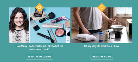
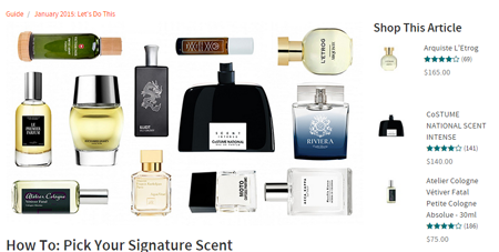
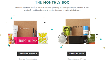
A final example...since Birchbox visitors navigate to pages specifically created for gender type, the beauty subscription company is able to create content that will resonate with them (increasing engagement and the likeliness of the user sharing the content). It's men-only blog, for instance, offers content like "How To: Pick Your Signature Scent" or "Dressing Up for the Gym." Not only are the male readers able to share the articles (with the always-present social-sharing options), but they are also able to "Shop this Article," which increases conversion for Birchbox. Like Birchbox, content writers should ensure there are ways for readers/visitors/users to interact further with the article.
What: Is it clear what you're offering?
Whether it's an article headline or a website homepage, audiences should know who is speaking to them and what they are offering. Tech websites are notorious for using copy that doesn't clearly state what it is exactly that they do. Perhaps the offering is so confusing the copywriter isn't sure either.
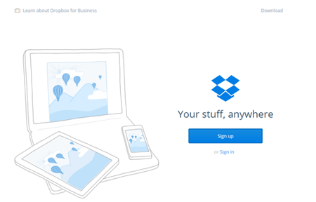
Dropbox, for example, could begin the user experience by telling visitors about its file-sharing service or cloud storage but that would likely get lost on a lot of potential users. Instead, it uses the most basic language to tell them what it offers, "your stuff, anywhere." Of course, as visitors scroll down, more information is given, but never once on the page does it use confusing tech jargon. Further, visitors to its homepage know that Dropbox can be used by businesses or everyday people, which speaks to the first quality checkpoint, "is there a clear audience?"
Back to Birchbox...the concept of receiving a box of beauty samples (personalized to the customer's preferences) each month isn't an off-the-wall concept, but it is unique. Most people are familiar with magazine subscriptions but not beauty subscriptions, which makes the content Birchbox chooses to convey what it's offering very important. On its homepage it repeats the call-to-action "subscribe," which lets users know, of course, that it's a subscription, as well as basically hits them over the head with the idea that they get beauty samples in the monthly box. Just as important, Birchbox continues to funnel users into their "male" or "female" roles as the page is nearly split in half to ensure users are getting the content that is relevant to them. Some savvy Internet professionals might be asking, "why not just use data to personalize the homepage based on their known gender?" Birchbox may leave the options up because its subscriptions are often gifted.
Where: Does the audience know what to do?
Typically 'Net users go to a company's website to learn more, but is that really what the business wants them to do? Wouldn't they rather provide a stronger (or more direct or relevant) call-to-action? A quality website removes any indecision by a user, like Bigcommerce.com does.
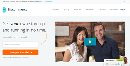
It wants users to start its free trial but if they need a little more information, they can watch the video. There are two clear options that Bigcommerce wants the users to take and that tells the audience what to do rather than leaving them guessing (or abandoning). Back to Dropbox, it immediately tells users it wants them to sign in or sign up - simple enough, right?
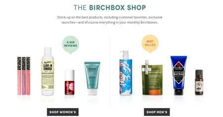
And, one final example from Birchbox. It, once again, funnels users into gender roles and then very directly tells them to "Read the Magazine" or "Read the Guide," which leads them to quality content (answering who, what, where) that is easily shareable.