Rethink Your Search Box Design

 If you have a search box on your website, take a minute now to review it. Look at it in relation to other elements on the page. Does it stand out and make an impression? If the answer is no, then you are not alone.
Most website owners know that they need to have search boxes in place for the convenience of visitors. For some, it might even be the primary means of navigation, but in most cases a tour of the Internet will reveal that not much time or energy is invested in their designs.
If there's one area of Web design that often gets placed on the "Phase 2" list of things to update on a website, it is often the search box. The role that site search plays in the success of a website, however, is enormous - particularly for Internet retailers and information publishers.
So, why not pay more attention to its design? Why not make the availability of site search a priority on your digital property?
Most Web workers will be content with the standard site search functionalities offered by their content management systems or ecommerce shopping carts, but we are not talking about how it works - we are talking about getting people to use it. And they can't use it if they don't know it's there.
A recent research study by the Missouri University of Science and Technology revealed that it takes just two-tenths of a second to form a first impression when viewing a website. If you need or want people to search your site, every effort should be made to ensure that users see the search box.
For this reason, consider updating the design of that search box. Not only can users receive helpful cues about what to do when they arrive on your website, you will ultimately move them one step closer to a conversion - or at least further down the sales funnel.
In order to be effective, a search form should be easily visible, in a location consistent with other websites, and with enough space for the user to enter their query and still read it. The search button should be clickable, large enough to click, and include a search-related icon such as a magnifying glass, or simply the word "Search" as a label.
Get Inspired!
All search boxes are not created equal. Website Magazine has assembled a collection of several effective implementations at https://wsm.co/SearchBoxDesign, but review a few of the best in these three different search forms below.
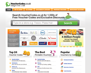
VoucherCodes.co.uk
One tactic to increase the visibility of a search box is to simply make it bigger. This is taken to somewhat of an extreme by the VoucherCodes site, but likely to their benefit.
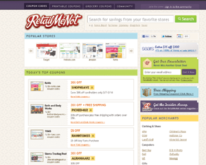
RetailMeNot.com
As one of the leading coupon sites, RetailMeNot also leads in best practices for its search box, giving it a high profile and populating the form with some helpful hints.
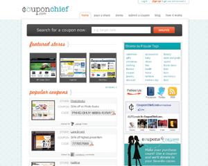
CouponChief.com
This site has taken somewhat of a traditional approach, but by offsetting the search box with a dark border and placing it front and center and above the fold, its importance is obvious to users.