
The Best Data Visualization Dashboards

Visualize the Data
Check out 10 of the tech world's best data visualization dashboards below. With data in a visual, easy-to-read format, website owners, marketers and data scientists can make more informed business decisions.
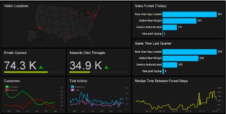
LEFTRONIC
Leftronic offers businesses an easy to understand and aesthetically pleasing dashboard. With a real-time map display of website visitors' locations, Leftronic positions itself toward those who are more visual learners. In fact, the dashboard has as little writing as possible, only what is necessary for users to understand the graphs. With integration for major players like MailChimp, Flurry, Salesforce, Amazon Web Services as well as a multitude of Google services, Leftronic offers an impressive cocktail of solutions for businesses looking to leverage analytics.
KLIPFOLIO
With a completely customizable dashboard, Klipfolio offers businesses analytics on their terms, whenever they want them. Through the use of tabs, users can monitor different sets of information with just a click. One of the most interesting features of Klipfolio is its annotation tool. Through this tool, users can add comments on any section of the dashboard so others can see and respond. Another great feature of Klipfolio is its threshold indicator. With this feature users can easily identify the outliers of any data set in order to gain quicker insight on what is happening with the business. Kilpfolio is also available on any device.
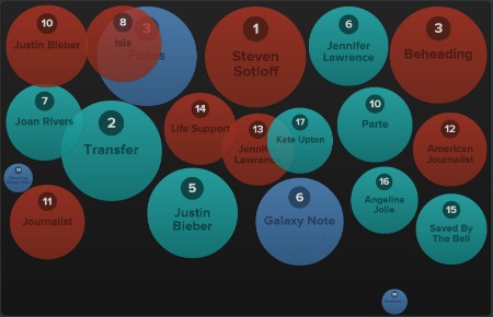
CHARTBEAT
A spin on the typical analytics dashboard, Chartbeat was created for editorial employees. Instead of offering information on average sales or return on investments, Chartbeat offers information on what are the most talked about topics across the Web. To help editorial employees, Chartbeat collects information from news, technology and entertainment sites and displays the most popular terms and topics. This useful feature will help users to speed up the content curation process.
DUCKSBOARD
In today's world, businesses must operate and make decisions on a real-time basis; there is no room to wait. With their real-time dynamic dashboard, Ducksboard offers businesses an intriguing option to take care of their analytic needs. In order for businesses to get a complete 360-degree view of how they are really performing, they need to be able to see all of their data as quickly as possible. With more than 60 integrations, Ducksboard enables users to include an extensive list of third-party data in their dashboard from sources including Facebook, Flurry as well as multiple Google applications.
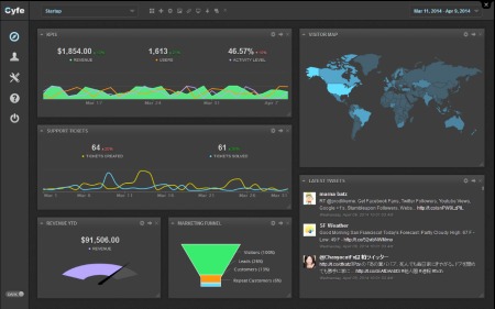
CYFE
With one of the more expansive list of clients (which includes AT&T, ABC and Salesforce), Cyfe delivers an impressive set of data to its users in real-time. Through nine dashboards (startup, social media, marketing, client, Web analytics, finance, sales, project management and IT) Cyfe enables businesses to keep an eye on all facets of their business at all time. Also, thanks to a long list of available widgets, users can also keep an eye on data from other sources like Twitter, Moz and Constant Contact.
IDASHBOARDS
With an expansive list of features for their Enterprise Solutions, iDashboards offers an enticing option to businesses. With auto updates as quickly as every 60 seconds, iDashboards provides analytics to users in real-time. Perhaps most importantly to businesses today is the ability to access the dashboard while they are on the go. With support for mobile devices, iDashboards allows businesses to be up to speed at all times. Moreover, businesses can convert a report from iDashboard into an HTML or PDF view so there is never any problem with viewing reports.
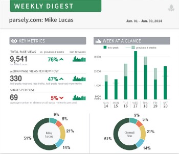
PARSE.LY
Readability is key with analytics. In order for businesses to put analytics to good use they must understand what they are saying (an unclear dashboard is as good as no dashboard). Parse.ly offers businesses an easy-to-read real-time dashboard. Another great feature of Parse.ly is that businesses with more than one website can track metrics from all of their websites on one dashboard. This allows businesses to stay current on how all of their websites are performing, not just their main site.
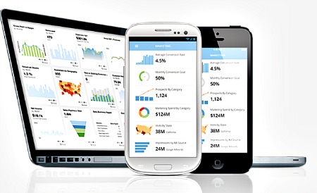
DOMO
With the Internet running 24/7 businesses are always operating even if their brick-and-mortar stores are closed. In order to compete in this type of market businesses need to be able to check their performance at any time and on any device. Through a clean design, Domo allows for users to access their analytics dashboard on the device of their choosing. Their fully customizable dashboard allows users to see the information they want instead of having to sift through data that is of no use to them (like a social media manager having to sift through warehouse inventory figures).
CHARTIO
It's rare today that businesses receive all of their data from only one source, so it's important that your analytics solution allows for businesses to include data from multiple sources. Knowing this, Chartio allows businesses to integrate data form multiple sources without having to specially format it in a database. Also, with an easy-to-use drag-and-drop interface, Chartio provides analytics to businesses on their terms. The interface allows for businesses to customize how they see their analytics as well as in what form (basic tables or interactive charts) on any device.
STATSMIX
With the ability to create custom dashboards and integrate them with popular tools like MySQL and Google Analytics, StatsMix offers businesses a diverse set of features. Analytics have become a vital part of businesses and to be most effective analytics need to be shared throughout the company, not responsibility of a single person. StatsMix allows businesses to share their metrics and dashboard graphics through email, guest accounts as well as in private links.


