The Ultimate Guide to Maximizing SEO Traffic Value with Conversion Optimization


While it is easy to get wrapped up in generating more traffic to your website, failing to capitalize on your current traffic would be a big mistake. Today we are going to discuss how you can improve your website so that you are able to convert more of your current visitors into leads or customers.
Website optimization is a key component to online marketing. The purpose of having your business on the Web is to increase your conversion rate of leads to actual sales. By doing so, your site will rise in popularity and give you a constant stream of exposure from potential customers or clients. To optimize your site for the best possible conversion rates, you will have to engage in a lot of experimentation and testing. The main goal of redesigning your website should be to address the needs of your users and fix objections to the current design. This may take time and a lot of revision, but eventually you will have a successful website marketing the very best qualities of your business.
Research
Before you start changing your website beyond recognition, get some quality feedback from visitors and understand their needs. Collect their objections to your website through surveys and brainstorm about how you can make your homepage or landing page easier to navigate.
Understanding your current and target audiences will help you optimize your site for their needs and preferences. Deciding whether to keep the site traditional or make it more modern all depends on what kinds of visitors you are attracting. Keep this in mind when thinking about layout design.
Once you have a mockup of your potential new website, you can use side-by-side testing tools or A/B testing (read "4 Website Elements that Need A/B Testing") to determine how much your homepage has improved. These online research tools are instrumental in creating the perfect website for your most desired customers because they give you a platform where your new pages can be compared to older ones. Potential leads and conversion rates can be increased by small, simple changes or complete design overhauls. If you're not sure where to start or what to change about your homepage, we have some helpful guidelines to get you one step closer to higher conversion rates for your website.
Layout
When redesigning your website to prepare for optimization testing, remember there is no rule book. What works for one website may not work for yours and vice versa. Layouts take time to redesign because there are so many different ways to incorporate menus, calls to action (CTA), links to more information, graphics, videos, or anything else you want your customer to see first. Prioritize your information and decide if your homepage should be a longer layout with pages to scroll through or one static landing page with a defined click path. There is no formula for the perfect page layout, so if your website has a short page, extend it to scroll through. If you have an information heavy, long homepage, try cutting it down to the most basic information.
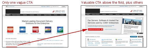
Whatever the layout, it is usually best practice to start with the pertinent information above the fold. Provide menus for further browsing and an immediate call to action for a free trial or special offer. Incorporating the proper visual cues will subconsciously build trust with site visitors. You want to convey the personality of your business through the colors, design and language of your website. Is it a serious software business or a fun travel service site? Either way, there are appealing visual elements that go with both businesses.
Organization
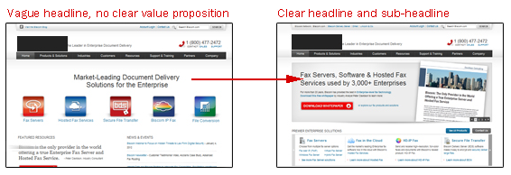
Half the battle of organizing a new website design is testing new layouts and finding what works best to market your products. It could be as simple as changing the wording of your headline, emphasizing product descriptions instead of visuals, or moving and resizing your call to action. In the example below, all three are modified, increasing the conversion rate from 1.65 percent to 3.40 percent. That's almost a 106 percent improvement.
![]()
Remember though, this may not work for everyone. There are thousands of ways to modify a website to increase conversion rates. It is of utmost importance to keep testing your changes and always be flexible about the layout of your site. Nothing is sacred. Everything can be changed, moved or thrown out completely.
Modern vs. Classic
The debate is almost as old as the Internet itself. Stay with a classical, boxy look or update your website to make it look a little more modern (e.g. flat design, large images, etc.). While there is no rule of thumb for redesigning a website, understanding the needs of your visitors will help you decide what layout will work best for optimum user functionality. Elements of a modern website include full-screen images of people using products, blurred out enough to put the focus more on the CTA buttons or contact forms. Classic designs usually stick to text boxes and accompanying image boxes. Most classic websites could be simplified into a grid providing functionality and the most organized layout for older web users who need information more than flashy pictures or design. Neither website layouts is wrong, but one may be more successful for your particular business.
Color schemes
Color theory encompasses a few divisions of studying colors. The relationships between colors, combinations, palettes and color psychology should all be considered when designing a website. Web designers should have an extensive understanding of color theory and how it can be applied to sell a product online. While there are misconceptions about how people perceive color, there is an emotional color guide for marketing and selling a brand. The color of your brand should evoke the personality you want to portray rather than lining up with "conventions" of color perception.
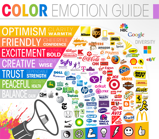
While there is no magical color combination that will increase conversion rates, within your website's color palette there should be an assigned "color hierarchy" to each content element. This will indicate to visitors the difference between headers, content, calls to action or any other information you may have. Also, it is best practice to make CTA buttons or information the visitor should remember pop from the background colors (despite the growing popularity of "ghost buttons"). Creating a contrast between important elements and the background will help with visibility, but will in turn help the visitor remember the information.
Content
Delivering a message effectively can be the difference between a successful online presence and a failing website. The copy has to be the best quality, since it's what your leads will be reading to determine whether or not your website is meeting their needs. From CTA buttons to product descriptions, make sure you are presenting information with a concise, unique voice that is appropriate for your brand. Minor word changes can greatly increase conversion rates throughout your entire website, not just your homepage. Apart from your website's copy, cutting down on distractions will put more attention on your CTA and give the visitor less to pay attention to. Limiting the actions will also help.
Call to Action
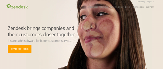
Your calls to action need to use action-oriented phrasing to drive up conversion rates. This creates a sense of urgency and a need to click on your CTA button. To also create urgency, make sure your make the button stand out with bold text and colors. Keep your CTA in the content portion of your page, ensuring that visitors will see it and immediately know what you want them to do. Also, cutting down on distractions and limiting a visitors options will put more attention on your CTA and help guide visitors to a signup form or demo. Be clear but succinct about the message, showing the benefits of the signing up for emails, newsletters or free trials (like Zendesk des in the example below - note the lady in the picture gets closer and closer to the "glass" as a person spends time on the page - reinforcing the value proposition).
Color theory can be expanded to your call to action as well. It has been proven that changing your CTA button to red will boost conversion rates as much as 21 percent. Make the buttons or contact form stand out on your page. Experiment with colors, placement and wording to find the best conversion rate for your call to action.
Visuals
Aside from words, visuals must be taken into consideration when optimizing your website. You can increase conversion rates by using large pictures with smiling customers, or short (2 minutes or under) product demos at the top of your homepage. Make sure to make these visuals personable. In some cases it may be best to place your product in a familiar environment, rather than focusing on the functions of your new phone app or gadget. Use pictures and videos to set up scenarios where your product will come in handy; film guerilla product tests and see how people receive your product in a blind trial. Putting your product in a real-world setting will establish the need and what kinds of people will enjoy it. If you've found your target audience, this method should prove to be highly successful.
Sometimes the text and image pairing may be causing an issue as well. Make sure your CTA is not covering up the most important part of the picture. Keeping with the tested reading conventions of design (Z-layout and F-layout), arrange text and images together to follow those patterns. This will ensure optimum scanning and reading ability for your visitors. While those patterns are not the only ones that work, they may help in setting up the initial wireframe layout of your website.
Banner ads for other products on your website can be a useful tool for directing visitors to sales or special promotions. Use less of these, but make the ones you do have stand out at the top of the fold. Fewer ads but better organization will display the products visitors might be more interested in. Experiment with the size of your images as well as the links accompanying the banner ad. Try taking three ads and rearranging them in a couple different ways. You might be surprised to find how many different ways these visuals can be arranged and how much each will have a positive or negative impact on your conversion rates.
Features
Sometimes, adding certain links or features to your website will greatly increase your conversion rate. However, if they are not utilized properly they could actually be hurting the effectiveness of your website. Social media, special certifications and optimized navigation can all be used to better optimize your site for higher conversion rates.
Social Media
Show off your strongest strengths on your home or landing page. If you have hundreds of thousands of Facebook likes, utilize that information to persuade your visitors to use your service. On the other hand though, using social proof tags that show low numbers could negatively affect your home page. Be strategic about how you present your social media following and until your numbers are in the thousands, it may be best to simply have a link to your Facebook page available.
Certification Badges
Seals of approval and special certification from other professionals almost always yield a higher conversion rate. Anything that gives your growing business credibility will show customers that you are a trusted business which could directly correlate to higher conversion rates.
Experiment with the size, placement, color and copy of your certification badge. Think about when the visitor needs this information and if it pertains to a specific product or your business as a whole. Determining where it best fits in the content of your website could influence the visitor to sign up for a free trial of your service or buy the product because a trusted expert backs it up.
Navigation
Navigation is essential to the functionality of your website. A landing page usually only has one guide to enter the website, but once visitors enter the homepage of your website, they need to know where to go next besides your CTA. Below your header, before the homepage content, there should always be a listed form of navigation.
Whether you are designing a modern, edgy website or sticking with a classic look, navigation needs to be available. Navigation desn't just pertain to a bar of buttons on your homepage. You'll need to streamline the headings of each page as well as the organization of the pages themselves.
There should be a hierarchy of pages within your website, so optimizing for the most organized navigation is key. Also, adding a navigation sidebar can help if you are displaying a wide variety of products, offering search filters so visitors can browse their specific size, color, etc., with ease. Pay attention to navigation placement as well as phrasing and color choices. There are best practices to navigation, but like any element on a website, nothing is written in stone.
Search bars
Never underestimate the importance of a search bar. A website displaying any kind of product or service should have a search bar, helping visitors find the exact keywords they are looking for on your site. If they are quickly scanning websites for a specific product, they'll need the search bar to find what you carry so they can quickly and easily reach it.
While this is a wealth of information it is going to take testing, modifying, and hard work on your end to find the optimal homepage for your website. In conjunction with your homepage, modifying deeper pages on your website could also contribute to higher conversion rates. If you are having a high rate of shopping cart abandonment, maybe a subsequent page is the reason behind the problem. Always be looking for ways to modify any page of the website and eventually you will find a design that best suits the needs of your customers.
Your business's website is a living thing. It should be constantly tweaked and changed for further optimization. Remember that there are no rules or conventions dictating the best format for any aspect of a site. Stay open-minded and creative and you'll be able to create a one-of-a-kind, successful business website.