These 15 Search Boxes Deserve Another Look

No matter what the end goal of your Web property may be, it is imperative that you provide visitors with every opportunity to find your products, understand your services and consume your content.
With just a fraction of a second to make the all-important first impression, the placement and design of your website's search box is critically important to this process. Too often, however, the presentation and execution of this element is undervalued in the design process.
Internet retailers and information publishers can pay a particularly high price for making their website visitors search for the search box. If it is not immediately noticeable and recognizable for what it is, users will not only struggle to find what they are looking for but will also most likely get what they need from a competitor's site.
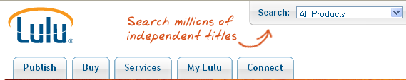
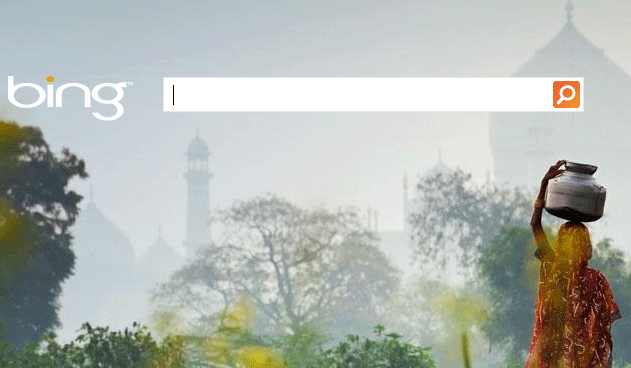
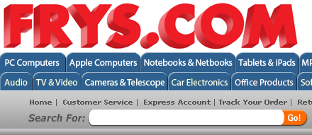
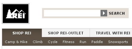
Below is a collection of search boxes from a variety of websites that use a number of different strategies to make the boxes stand out to their visitors. Whether it be through the use of color, images, size, placement, text or all of the above, the following examples may offer some inspiration if you are considering a redesign of your website search box.
Shopzilla