
Three Highly Effective Home Pages: What We Can Learn


The website home page has gone through many transitions. We've seen the brochure-style page, the links-galore page and the Flash-frenzied page, to name a few. And, while many visitors come to sites through specific channels and hit specific landing pages, the home page is still a place to make your brand stand out. Let's have a look at three excellent home pages and examine how they are fulfilling the brand initiatives while providing real value to consumers.
You will notice that these pages are not only attractive but functional, too. They are built to show the brand, but all demonstrate their value to consumers beyond the product itself. They are engaging, sometimes entertaining and always focused on being a resource for consumers in order to create brand loyalty. These companies might have big budgets, but what they can teach us is applicable to all businesses, big and small.
Dominicks.com
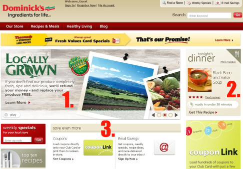
(Dominicks is a local grocery store chain, and a subsidiary of Safeway.)
- Locally Grown: There is a growing movement of purchasing produce from local farms and markets. This panel on the home page reinforces local ties to the community and guarantees fresh produce - or your money back. The section reinforces all points of consumer satisfaction, local business support and healthy eating.
- Tonight's Dinner: This section changes daily, offering a new recipe for dinner every night. This is a true resource for a daily need.
- Coupons, Email Savings and More: Everyone wants coupons and Dominick's delivers. You can get them in a variety of ways and, to the left, is the opportunity to find deals specific to your local store.
As a local business, Domincks.com does an excellent job of proving their value - local ties, daily recipe ideas, money-saving tactics and more. The page is resourceful without being chaotic and invites the user to explore.
SweetLeafTea.com
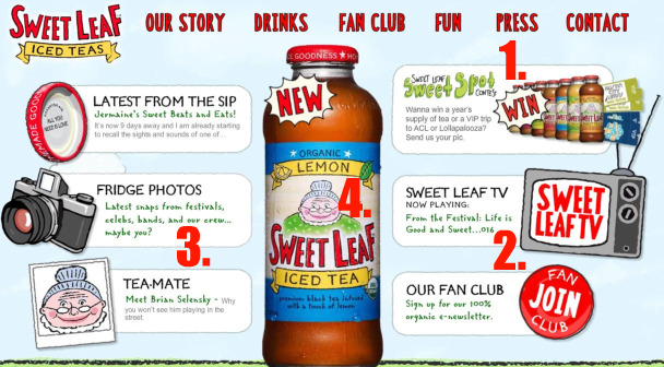
(Sweet Leaf Tea is an iced tea beverage popular with young, music-loving people.)
- Sweet Leaf Sweet Spot Contest: Who doesn't like to win stuff? This contest invites users to enter to win a VIP trip to ACL or Lollapalooza (two major - and expensive - music festivals) by uploading photos of themselves. It's a perfect fit for consumers and the brand. These are young, engaged, tech-savvy people who are serious about music festivals (and likely short on cash) where Sweet Leaf has a major presence. An excellent example of online and offline brand synergy.
- Sweet Leaf TV: Have you ever heard of a beverage with its own TV channel? No? Maybe it's worth a click to find out?
- Fridge Photos: Includes more user-generated photos from music festivals and other events. Another opportunity for engagement and deeper site exploration.
- The Product: Sweet Leaf has a very good product - so why not showcase it? The rotating, sweating bottles show off the variety of flavors in their icy-cold glory.
Sweet Leaf's home page shows its most important element - the product - upfront. It also shows that they know their audience by providing interaction, engagement and a chance for real-world value with the contest page. It's easy to start clicking around this site. Even when simply hovering your mouse over the top navigation, it makes a "pop" sound as if you just un-capped a fresh bottle of Sweet Leaf Tea.
FritoLay.com
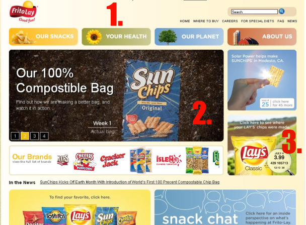
(Frito Lay is a national snack food brand.)
- Our Snacks, Your Health, Our Planet: You know about Frito Lay's snacks. But did you know they care about your health and our planet, too? This "replacement" for traditional site navigation does a great job of connecting the brand, the individual and the collective community conscience. From the outset, the consumer is put in a position of feeling like a healthy member of a community. Usually snack brands try to hide health information. Not here.
- Our 100% Compostable Bag: Intriguing on its own, but click through and you can see video of an actual Sun Chips bag biodegrading over the course of a few weeks. Watching a brand's leading product disintegrate for the better of the environment is at once interesting, entertaining and innovative. It also removes a little guilt the next time I buy a bag. The only thing that would make this better is if the video clip played when you hit the home page, without the need to click through.
- Click Here to See Where Your LAY'S Chips Were Made: I assume that they are made in a big factory somewhere. But I'm interested, especially considering the image of a farm in the background. Click through and you can interact with a bag of chips by entering your ZIP code and the code on the bag to see exactly how those potatoes arrived in your lunchbox. Who knew a bag of chips could be so personalized?
Frito Lay is a good example of a major brand appealing to an individual consumer. When you think of snack foods, health and environmentalism do not usually enter the equation. However, Frito Lay is looking to change that, providing eating tips and heavily promoting its "green" initiatives. They are effectively creating a feel-good community around the brand.
These examples highlight just a few elements that make a successful home page on today's consumer-focused Web. They each show off their product, provide some level of engagement beyond just the product itself, create a sense of community and provide real-world value. You will also notice that none of them are attempting to sell anything upfront. While landing pages are designed for conversion, home pages have come to be the "face" of a brand.
When a user visits your home page, either through a search or by direct type-in traffic, they are there to explore, to see what you have to offer. If we can provide value for our consumers right away - solve a problem, fulfill a need or even just entertain - then we can sell something to them down the road. In other words, the home page is all about lifetime customer value, not a quick sale.


