Tips for Selecting the Right Chart for Your Data


Recording and identifying the right data is only half the battle.
Once you obtain the information you're looking for, you must be able to display it in a meaningful way. One of the biggest issues people encounter is using the wrong charts, graphs and visuals. As a result, valuable data is often misconstrued or inappropriately judged. The key to avoiding these conundrums is selecting the right chart for your data.
3 Tips for Choosing the Right Visualizations
"In today's business environment big and small businesses face the challenge of managing an increasing amount of data as part of their everyday operations," datapine, a leader in business intelligence, reminds its readers. "This triggers the need for interactive data visualization tools that can give meaning to figures and percentages and make interacting with data easier."
While the technology for clearly organizing and conveying data is available, it's up to businesses to effectively leverage these tools in order to guide users and maximize the value of the information contained within these visualizations. With that being said, here are some tips you'll find valuable in your pursuit of choosing the right charts.
1. Determine Your Message
The very first thing you must do is determine the message you're trying to send to the end user. In almost every situation, the purpose of a visualization is to convey a comparison of data points, a relationship between data points, a distribution of data, or a composition of data. Let's take a look:
- A comparison sets one variable apart from another and displays how the two interact with each other. An example of this would be the number of people visiting three different stores
over a one-month period.
- A relationship shows the connection between two or more variables through the data. An example would be the market cap of one stock over time, versus the greater market trend.
- A distribution displays a collection of seemingly unrelated information and shows how it's connected. An example would be the number of issues reported during beta testing.
- A composition uses different pieces of information and shows how they combine to create a greater result. An example would be the different sales figures of various products and how
they lead to the overall bottom line.
Once you determine the goal of your message, you'll find it much easier to select the appropriate visualization.
2. Choose Your Chart
Now you can focus on choosing the correct chart for your data. While there are many different formats, it's best to limit your options in order to avoid getting carried away. When used in conjunction with the previous exercise, this graphic will really help provide some clarity (click to zoom):
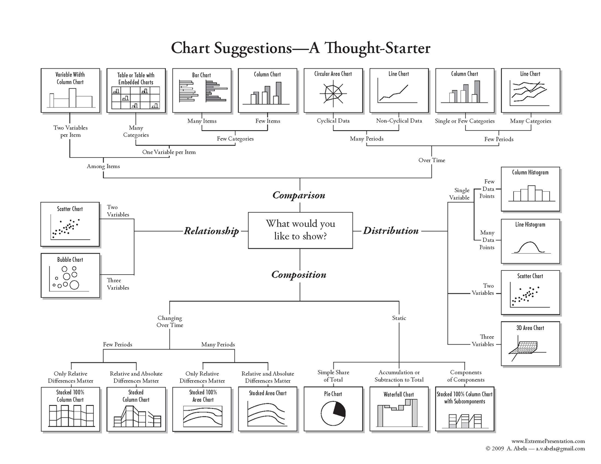
As you can see, if you're trying to compare data points, things such as column charts, bar charts, line charts and tables are ideal. If distribution is the aim, histograms, scatter charts, and 3-D area charts are ideal. When the composition of data is the aim, options include stacked column charts, pie charts, waterfall charts and more. Finally, when attempting to prove the relationship between data, scatter charts and bubble charts are preferred.
3. Analyze the Results
While choosing the right visualization is important, your work isn't done yet. After creating a chart and plugging in the data, you need to analyze the results. This means exposing the visualization to a group of test users and asking them to provide you with feedback. Based on the responses, you can make any last-minute tweaks that went undetected in your own personal research.
Choosing the Right Visual
While finding and organizing data is widely considered the most grueling and intensive process related to the use of data, you could argue that choosing and implementing the appropriate visualizations is the most important step. After all, the wrong visualization will render your efforts useless, whereas the right visualization will help you influence your readers in a particular direction. Keep these tips in mind and you'll become proficient at choosing the right visualization.
Larry Alton is a professional blogger, writer and researcher who contributes to a number of reputable online media outlets and news sources. In addition to journalism, technical writing and in-depth research, he's also active in his community and spends weekends volunteering with a local non-profit literacy organization and rock climbing. Follow him on Twitter and connect with him on LinkedIn.