Trends in Landing Page Design for Search Marketers

 Landing pages are critical to the success of search marketing and advertising campaigns. To ensure that the destination where consumers end up post-click presents the best opportunity for conversion, let's review three current landing page design trends.
When you want to analyze what works best in landing page design, start with the most competitive terms. The keyword in focus for this review (and, of course, the landing pages that result) was "Tax Preparation" - the logic for that choice was the expected upcoming search volume for that keyword (see chart below).
Six landing pages were reviewed for the similarities/differences that the design concepts had in common. The sites used for this review (listed below) are in no particular order and were pulled from Google and Bing results.
There are three key trends that revealed themselves by comparing the landing pages - the presence of cost information, the presence of varying levels of trust signals and the presence of supporting navigation.
You might end up applying some of the techniques you see below on your own site, but before settling on one remember that testing is the only sure-fire way to ensure that the right elements are available to convert your specific audience of consumers into buyers.
Google Trends Graph for "Tax Preparation" Keyword over the past year: 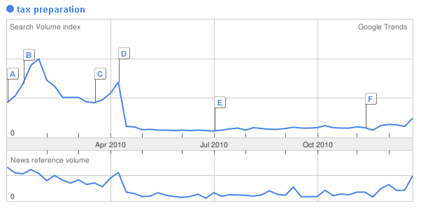
Editors Note: While we did encounter a few affiliate marketing landing pages in the paid returns (we're looking at you, H&R Block affiliates), the guidance in this article relates primarily to those businesses ultimately responsible for the quality of a landing page design.
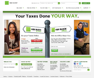
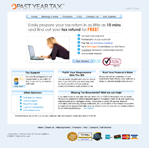
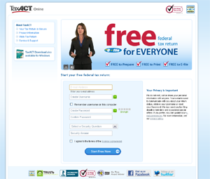
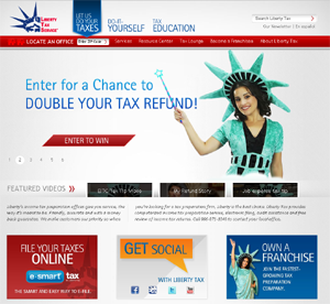
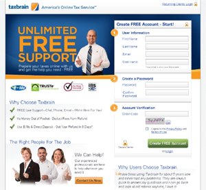
Trend One: Prominence of Cost-Related Information
While many might try to dissuade decision makers from including cost-related details (pricing, setup costs, registration fees, etc.), there have been studies showing that displaying this information is an effective strategy. Should the industry in which you are promoting products and services be price-sensitive, where consumers frequently look for bargains (more common for lower-priced products/services - e.g. useful in the tax preparation example but not so much for those selling grand pianos), the presence of cost-related information is common. Of our sample group, only one of the six (H&R Block) did not use the actual word "free" or refer to the cost in some manner within their primary headline. To determine if displaying cost-related information is a feasible strategy, as well as the prominence of that information, you must consider engaging in A/B or multivariate testing.
Trend Two: Presence of Level 1, 2 and 3 Trust Signals
When it comes to something as important as the sensitivity of personal and financial information, you can be sure that consumers are seeking out indicators of trust. How that trust is currently being conveyed, at least based on the sites we reviewed, is quite interesting today. While the inclusion of icons from more prominent services like Verisign or Truste (level 1 trust signals) are common among larger enterprises, there is an opportunity for both extending the number and type of trust signals. For example, three of the six landing pages reviewed had social icons (level two) on their landing pages, as social graph depth and activity are now a good indicator of how much an enterprise is trusted by its community. Level three trust signals including displaying guarantees and providing proof statements (for example, "over one million served") or even more visible customer support elements are common among the landing page designs we encountered.
Trend Three: Presence of Supporting Navigation
While not unique to this finance/banking niche, another important trend is a shift from the minimalist approach of quickly funneling the user towards a particular path. We noted back in the summer of 2009 that providing users with a limited number of possible paths was a common trend among those sites in the ringtone niche that we reviewed. While in a very different industry, the "tax preparation" category is equally competitive, providing a good point of comparison. Should you be faced with a decision to produce a stripped down minimalist landing page or one which provides many different paths towards the information users need, know that the presence of supporting navigation on landing pages is common.
Trend Summation
In the end, the key takeaway might just be that there is a small shift occurring in landing page design. Previously, it was common to opt for a more abbreviated, "less is more" approach. Now, it seems that landing page designers and search marketers are moving back towards providing a more complete, traditional experience.
What trends in landing page design have you seen recently? Share with other