Typography in Email


Email marketing is crucial for any business looking to reach its audience directly. With so many factors impacting the effectiveness of email campaigns, typography is often overlooked. However, typography can significantly impact how readers interact with and respond to email content.
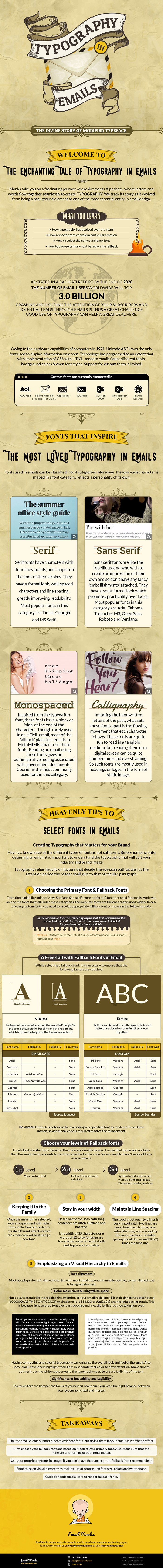
This infographic on typography in email is a must-read for anyone looking to improve their email marketing efforts. The infographic covers the basics of typography, including font size, style, and color, as well as more advanced techniques such as kerning and leading.
One of the key takeaways from the infographic is the importance of choosing the right font. Readers should be able to easily read the content without squinting or struggling to make out the letters. Sans-serif fonts are often a good choice for email because they are easy to read on screens of all sizes.
Another important aspect covered in the infographic is using color in typography. Color can grab attention, highlight key points, or convey emotions. However, using color judiciously is important, as too much can be overwhelming or distracting.
Finally, the infographic provides practical tips on how to use typography effectively in email campaigns. For example, using bold or italicized fonts can help draw attention to important information, while adjusting line spacing can make content easier to read.
Overall, this infographic is a valuable resource for anyone looking to improve their email marketing efforts. By paying attention to typography, businesses can create more effective email campaigns that are more likely to engage readers and drive results.