
Typography's Role in Branding

The average website visitor is likely very unaware of how much typography (fonts, line spacing and other elements) impacts their online experience - everything from initial reaction to likeliness of returning.
Designers can't be as oblivious, as their typography choices make or break key performance indicators like bounce rate, time on site, number of pages visited and so on. Not only do visitors judge a website within seconds (high quality versus low quality, trustworthy versus untrustworthy) and choose whether to stay or go just as fast, but they're also picking up on the clues left for them (what does this brand offer, who is it for and what do they stand for).
As one can imagine, typography plays a huge role in subtly answering those questions. To keep your visitors interested and clicking, explore how typography can be used to set your brand apart.
FAMILIARITY
Designers draw inspiration from a number of sources - even competitors - and when they find something they like, it can be useful to look under the hood to see what is actually in use.
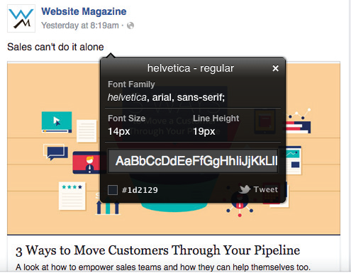
WhatFont can be added as an extension for Chrome to see what typography elements are being used such as fonts (and font families), font sizes, line heights and colors on any website. Aside from WhatFont, other Chrome extensions include Fontface Ninja (which even shows how to buy the fonts), WhatTheFont and WhatFontIs.
Let's take Facebook as an example. Using WhatFont, it can be observed that the third most visited website in the world (behind Google and YouTube according to Alexa rankings) uses Helvetica-regular at 14 pixels with a 19 pixels line height. While there is nothing overly intriguing about Facebook's typography elements, Web users spend a lot of their digital time on the network each day so if a brand is looking to establish trust through familiarity, these elements might serve them well as a starting point. In addition to using a blue color palette, which instills calmness and is said to convey stability, the elements that Facebook uses could do the same for companies that are in the financial space or the publishing world because of its familiarity (albeit subconscious) and its readability.
CONSISTENCY
Mobile now accounts for more than half of website traffic, so designers will want to keep typography choices consistent across mobile and desktop devices - not doing so could impact the user experience and perceived brand quality.
To see how their peers are tackling mobile typography, designers may want to download the WhatFont app for iOS to conduct the same research mentioned above, but on mobile. When comparing the fonts of desktop and mobile sites, users will likely see smaller font sizes on desktop than mobile and larger line heights on mobile than desktop. It's important to not change much else.
Check out the top resources for getting fonts.
STATEMENT
Most enterprises are able to get and keep people's attention without rocking the boat through unfamiliar typography choices. Emerging brands (or those with new offerings), however, can use website typography to make a statement and quickly share their brand story.
Check out three sites using statement-making fonts.
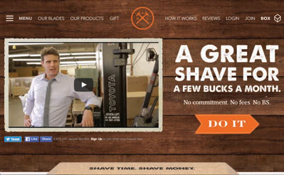
While not the most "out there" example, Dollar Shave Club's choices are interesting and further establish its brand. It uses three fonts on its homepage (AvenirNext, ThunderSubset and PrumoSlab) with varying sizes, weight and positioning to create interest on the page. Immediately, users know what Dollar Shave Club does (razor subscription service), who it's for (clearly branded for men) and what they stand for (a certain boldness). The typography choices here complement the brand's value proposition and its ruggedness and sarcasm.
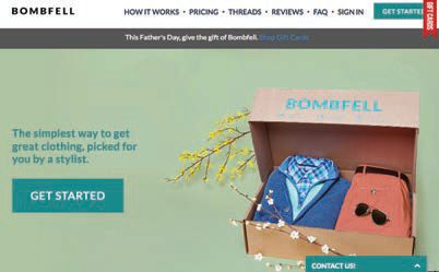
In contrast, the typography elements chosen for Bombfell, a men's clothing subscription box, are understated giving more prominence to its product photography. The pulled-together outfits it offers for subscribers, matches its typography choices. So, despite offering similar services, Dollar Shave Club and Bombfell use typography to represent their brands in different ways.
TYPE ON!
There are many important choices to be made when designing or updating a website and typography elements should top that list as they play a big role in the first impression a visitor makes, the last one and every one in between.


