
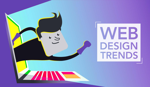
Web Design Midterm: Where Trends Stand Halfway through 2016

Hopefully 2016 has found your site with plenty of highly engaged consumers who value the Web design choices you've made to better their experience.
If people are bouncing, not converting or are otherwise uninterested in what your site is offering, it may be time to take a look at whether it's meeting expectations based on the trends of this year. But first, let's look at the Web design trends from 2015:
- Flat
- Video sliders
- Responsive
- Hamburger menus
- Newsletter pop-up
- Long scroll
- CSS animation
- Hero images
- Frontend framework
So where does that leave us halfway through 2016? Many of these trends are being refined and some might be replaced for better alterations.
Where Web Design Trends Are Going
Web design trends in 2016 could probably be summed up in two letters: U and X (user and experience). Actually, one more word too: mobile. Successful Web design allows for stellar UX regardless of device. These are driving Web design trends, but there are others that are materializing as well.
Material Design
It is an alternative to flat design that produces some nice graphical elements. It's a group of Google design standards that separates elements using layer concept of image editing software. It's a design language with a group of guidelines that remove guesswork and hampers creativity. The way I see this, it's a challenge to improve creativity within guidelines.
Material design is based on 3-D. It's a good choice for those who want some stylish visual design. It gives you some of the design elements back so you're not stuck with having old solid colors and not having any animations.
New Typography
With increased resolutions and responsive Web designs, typography has become possible to improve. That's the reason why typography is included in Web design trends. Top two trends I have seen with typography are serif and handwriting, both for specific uses.
But, one thing to consider while designing with typography is that more users are consuming content on mobile devices. Unfortunately, people with lower-end devices, display low resolutions. This is more noticeable because they have low-pixel density. But, one solution is to display typography based on screen resolution is to make sure that the screens with low resolutions receive fonts that are more suitable to their resolution. Yes, the server speed and load time have to be taken into the consideration.
Mobile UX
Not just typography will become convenient for mobiles screens, but forms, images, navigation will have the focus of design as well. Where images were used for effects and texts, the CSS and fancy fonts will be used for the same. This will result in less page loading time and server load.
Touch events are also becoming prominent as more sites are using plugins to handle touch and swipe events, which will take into account screen type, size and amount of pressure, etc.
Mobile Layouts
One minimalism rule for mobile devices is that when a website is opened on a mobile device, some desktop elements are hidden, and other elements are adjusted and modified depending on the screen size or type. Therefore, images, buttons and slideshows should be developed with mobile in mind. Fortunately, the material design brings back the visual elements so the sites don't have to appear simple on mobile. Also, it allows the rendering of images at different sizes and resolutions, which speeds up the page-loading and the images look great on small screens.
Designing Ahead
These are just a few Web design trends that are prominent in 2016. Sometimes popular trends are not always the best choice, but these can be good tools to stand out from the crowd as long as UX and device compatibility don't suffer. About the Author
Daniel Clark is an experienced Web designer, ecommerce business analyst and a technical blogger. Clark works with a leading Web development company in Auckland.


