Why Web Conventions Win: 3 Things Every Marketer Needs to Think About

By Martin Greif, EVP at SiteTuners
There are some website owners that just don't care about conventions.
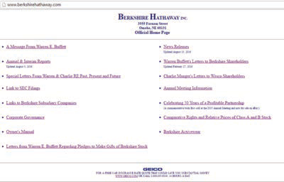
Take 10 seconds to look at the Warren Buffett-led Berkshire Hathaway site, a website for one of the largest companies in the world, and it becomes clear this isn't a mistake only small companies make.
Outright dismissal of Web conventions is something that is seen in organizations of all sizes. It's an easy mistake to make. Whether aiming to stand out or just plain doubt the value of conventions in Web design, brands wouldn't be alone if they broke a best practice or two. To understand why the conventions are important, and to ensure that those that matter most are followed, it is important to understand a few things about the way brains process information.
The Human Brain and Predictability
Web marketers need to understand these main components about the brain:
+ Half of the brain is devoted to processing visual information. This means that before a visitor reads one word on the website, they've already formed an opinion.
+ The brain can only take so much cognitive load. The structure of the brain hasn't changed very much in the past 50,000 years, but life has gotten much, much more complex. The brain's solution? It uses shortcuts to process information.
All human brains work that way. Now, what does that mean for marketers?
If brains are highly dependent on visuals, and they rely on shortcuts to get the job done, then Web conventions allow brains to process websites efficiently. The backbone behind all this is predictability.
Once users have observed certain patterns enough - element positions on websites, navigation bar behaviors and the like - they can generalize that's how things usually work.
It's a short leap from "predictable"¬ù to "easy to use."¬ù
Conversely, something as simple as moving the logo to the center can throw people off and get them to make mistakes.
1. Logo Positioning
As more and more websites need to deal with the rising number of mobile visitors, an interesting trend is taking shape: sites are starting to reserve the top-left section of the website for the hamburger menu, and putting their logos at the center, even for the desktop site. That's a mistake.

It's important to remember that the brain likes to take shortcuts, and people spend a vast majority of their time on other websites, not just the one they're currently visiting.
In one study by the Nielsen Norman Group, the company found that people trying to get back to the homepage are six times more likely to make mistakes when the logo isn't at the top-left, as is the convention.
Website owners like to think that people will adapt to changes like this, but the competition is a click away.
Removing unnecessary friction between a user and the conversion is job number one. Mistakes like these just get in the way of smooth navigation, and in some cases, can cost the company actual sales conversions.
2. Exposed Navigation Bar on Desktops
Speaking of mistakes people make when responding to the rise of smartphones, a lot of companies have started to hide the primary navigation behind a hamburger menu on their desktop presence.
The idea is that it's a mobile-first world, and people who don't use hamburger menus are behind the curve. This is a mistake.
An exposed navigation bar on the desktop site serves multiple purposes:
+ It allows people who take mental shortcuts to easily consume and process information (remember, the brain likes to take shortcuts)
+ It makes the website easier to scan
+ It reduces the time and effort for visitors to get from one place to another
The hamburger menu is a fantastic tool on small screens, where there's not enough space to display the primary navigation elements.
The space used for website controls (the chrome) should be used for the actual page text and images (the content). This is a balance that should be carefully controlled: the chrome to content ratio.
On mobile, marketers can sacrifice the user's ability to scan, the ability to take mental shortcuts and the overall effort to navigate pages to gain the space brands need to display the content. On desktops, where there's enough space to display more of the navigation elements, the primary navigation bar provides immense value.
Exposed navigation bars are valuable conventions, even in 2016. Marketers shouldn't get rid of them despite the pull of looking trendy.
3. Product Page Elements above the Fold
Some companies mix up the product detail page because they've been pretty much the same since the early Amazon days, especially above the fold:
+ Big hero shot of the product on the left side
+ Pricing and discounts right next to the image
+ Large call-to-action (CTA) on the right
Marketers should resist the urge to mess with those elements, especially the ones seen without scrolling. For starters, the product detail page is the wrong pace for bells and whistles. By the time visitors get that deep into a site, they have displayed some measure of intent. The last thing marketers want is to distract them from reviewing an offering by showing unconventional features or mix-and-match design. Marketers should get them focused on their task, and the best way to do that is to follow conventions.
Secondly, when users navigate familiar-looking pages, they can go on auto-pilot. If they are not on auto-pilot when reviewing the page that actually makes a company money, the website is straining their cognitive load. Perhaps as importantly, marketers are jeopardizing conversions.
Putting It All Together
It takes marketers who know psychology to run great websites. Stakeholders can usually spot these traits in good online marketers:
+ They are at least a little bit obsessed with the user's cognitive load. If an element on the page needs to get moved to an unconventional area, the mental tax the user will have to endure is always part of the conversation.
+ They control visual elements on a page pretty tightly, and they stray from existing conventions only when the gains are incredibly compelling (like hamburger menus for mobile screens, which is in turn becoming its own convention).
Keep in mind that users are highly visual, and that they need mental shortcuts to process a website efficiently. If design arguments typically account for those two things, marketers, and the brands that employ them, usually end up with a pretty usable site.
Martin Greif brings 25-plus years of sales and marketing experience to SiteTuners, where he is responsible for driving revenue growth, establishing and nurturing partner relationships and creating value for SiteTuners' broad customer base.


