YouTube Gets a Makeover

YouTube has unveiled a new design that aims to make the video-sharing platform's Web presence more similar to the company's mobile apps, which is where its users spend nearly half their time.
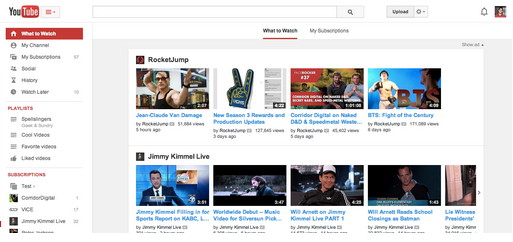
The new design features a center-aligned look, which according to the company, makes content fit neatly on all screen sizes. Plus, the homepage features two navigation options at the top of the screen that enable users to either discover recommended and popular content in the "What to Watch" section, or switch over to the "My Subscriptions" section to find the newest videos from their saved channels.
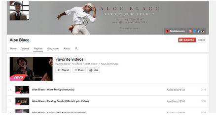
It is also important to note that YouTube has made playlists more accessible, as the redesign allows users to click the guide icon on the right side of the YouTube logo in order to show or hide a menu with quick links to playlists, subscriptions, history and more. In addition, the update features a new page that makes editing playlists easier, as well as the ability for users to check out playlists from any channel through a new playlist tab.