
Catering to Google: Adaptive vs. Responsive Web Design

Go responsive! Make the move now. Responsive is the only way to go if you want to make Google happy.
How many times have you heard or read something like that recently?
With Mobilegeddon 2 (a.k.a. Google Algo) now in full effect, the race to move to responsive is once again on everyone's mind.
Without a doubt, making the move to a site that is mobile-friendly is unquestionable.
More than 50 percent of all Web searches are made on a phone. And since millennials are now the primary demographic, keeping your website easily accessible, fast and simple to navigate is not something you can afford to ignore
Google recognizes this enough to be pushing mobile-friendliness all around. We can see this from the initial Mobilegeddon push and their recent Accelerate Mobile Pages (AMP) project.
Now, in light of all of this, this next question might seem like an odd one to ask, but I'll ask it anyway:
Is responsive the best solution?
After much of your own research, you're probably answering with a resounding "yes." But you might be surprised to learn that even Google says that responsive Web design is not always the best option I repeat, even Google thinks that responsive Web design is not always the best option.
I'll let that sink in...
Now while you're sitting there wondering how this could be the case, just take a look at the options given to us by Google itself (see image).
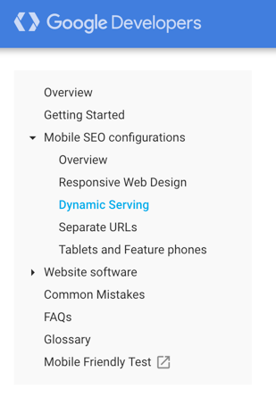 Notice the three choices there:
1. Responsive design
2. Dynamic serving (a.k.a. adaptive design)
3. Separate URLs (mobile site that is separate from desktop)
So while responsive design is the most common choice, the second choice mentioned and one that is growing in recognition is dynamic serving or adaptive design.
While responsive design has some obvious benefits, adaptive design builds on the benefits given by responsive while adding a few more to optimize your site. Plus, it's an option Google endorses for a mobile-friendly website.
Responsive Versus Adaptive Design: How Are They Different?
By now, I'm sure you're familiar with the concept of what responsive is.
A responsive site adjusts or responds to screen size by shifting the elements that appear so that they can be viewed in a way that is pleasant for viewing.
The idea of adaptive design is less common, but not all that difficult to understand.
Adaptive design is like Responsive 2.0
The difference between these two is that adaptive design is responsive design, but it also incorporates what is called dynamic serving - the ability to serve different, optimized content based on the device type.
While responsive responds to screen size, dynamic serving (adaptive) adjusts based on the device.
That equates to more control of what content shows up on what device.
Adaptive Gives You More Control
Essentially, this means that the content you display on a phone can be easily changed and optimized for a mobile viewer, while the desktop version of your site can yield content that suits someone on such a device.
For example, a local bakery might decide to use dynamic serving so that they can edit the mobile version of their site by adding a click-to-call button that stands out and makes it easy for customers to call in orders. But when a customer is viewing the same content on a desktop this click-to-call button would not longer appear because that option would be useless.
Now, let's make it clear.
You can do this with standard responsive design, but the workarounds for it are a pain. With adaptive design, and depending on the platform you use, this type of content editing can be a breeze.
Adaptive Design Allows For Faster Mobile Speeds
The added benefit to adaptive design, though, is that adaptive sites can load faster on a mobile device.
This is due to the way an adaptive site serves up content versus a responsive site.
When you switch to just standard responsive design, that means that all of the HTML, CSS, JavaScript, images, and so on still needs to load on a mobile phone.
While many phones are fast at loading a site, there can still be a lag in speed - one that Google keeps an eye on. For example, something as seemingly small as images could wreak havoc on pagespeed.
With an adaptive site, however, this isn't the case. With the dynamic serving feature, a site will load only the mobile version of a site instead of dumping the entire payload on a phone.
What does that mean?
Faster mobile loading speeds and a better user experience.
Landing Pages Built on an Adaptive Platform Convert Better
At least, that is what one study has shown.
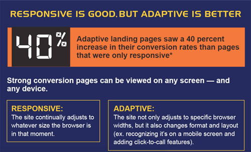
G/O Digital is a digital marketing agency that decided to analyze all of its data from 2015.
They analyzed the data of responsive versus adaptive for landing pages that year, and found landing pages built on an adaptive platform converted 40 percent better on mobile.
That's a pretty decent hike in conversion rate. However, since adaptive gives you control to edit the content and layout by device, this isn't that surprising.
By altering the content on mobile you are given the upside of tweaking things so that you can appeal to a mobile viewer and thus help convert them to whatever you goal is.
How's that for an upside?
What Does Google Think About Adaptive, and Will It Start to Push for It?
As mentioned before, Google lists only a few options for making a site mobile-friendly.
While responsive design is considered by many the most obvious fix for people, adaptive design can be an easier transition if you're using a platform that isn't WordPress and it adds features that are more onpoint with Google recent mobile optimization push.
The fact that you can edit the content on a mobile device to better suit a user on a phone, while also increasing page speed, means your site is on track with what Google really wants.
Namely:
A better user experience on mobile phones.
This mobile revolution that Google is leading is rather new. Mobilegeddon is only a year old, and as time goes one and Google studies the mobile web even more, there is the chance that a push toward adaptive design is in our future.
Will that really be the case?
Only time will tell. About the Author
Itai Sadan founded Duda to help small businesses connect with potential customers anywhere, anytime and anyplace. Itai started the company from his garage in Mountain View, CA, with his high school friend, Amir Glatt, who is now CTO. Prior to founding Duda, Itai was a director at SAP where he managed the SAP Discovery System program and was in charge of relationships with IBM, HP and Fujitsu.


