Three Top Site Designs from 2013 for Inspiration

Like a fine wine, Web design is getting better with age. There's strong evidence that the digital design industry is raising its standards, moving from boxed design (or wine) to experience-driven approaches where ease and elegance matter.
Playing tribute to many 2012 trends (e.g. responsive design, expansive background images, etc.), 2013 design focused on user experience, balancing aesthetics and function to appease the most refined digital palates. This year, designers worked diligently to meet and exceed user demands and preferences, while improving their brands' bottom lines by leveraging design elements to build trust, send users deeper into sites and convert at increased rates. The top websites featured here are, of course, not the only digital properties that top our virtual list, but their uses of flat styles and responsive approaches, as well as polished parallax navigation and merchandising presentation tactics make them three that kept users top-of-mind and ones that pushed the digital envelope in their own right.
SERVICE PROVIDER
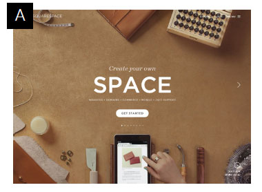
Matt Basham, a visual designer at 99designs, believes the most popular trends of 2013 have been flat design and the use of video - as well as subtly animated images - in creative and unique ways. One brand that nailed flat design and subtle animation was DIY website building platform Squarespace. The hand shown at the bottom of Image A (seen below) scrolls through the tablet as a user views the landing page (similar animation can be seen throughout the website). The fact that Squarespace places the animation in the same location on every page keeps the experience consistent, manages user expectations and puts them atop our list for one of the best service provider websites of 2013. Additionally, Squarespace uses a parallax content slider so users have a "presentation deck" like experience, which walks visitors through what services they provide in a compelling and informative manner. (Editor's Note: See what Website Magazine's own Creative Director Jesse Erbach has to say about the current use of flat design, design trends for 2014 and how Apple is changing everything at wsm.co/jerbach.)
ECOMMERCE MERCHANT
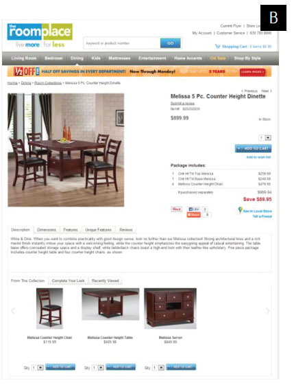
The RoomPlace, a Midwest furniture retailer, did a total re-launch of its website in 2013 with the help of MarketLive. It's a solid example of using design to improve the user experience and key business metrics. Within three months of the re-launch, revenue was up 20 percent, average order values (AOVs) increased by 25 percent and conversion rates improved by 26 percent. Let's explore some of the design features that made this possible. MarketLive Director of Commerce Strategy Scott Compton credits the new bundling option for the higher AOVs (see Image B). Showing the complete set of furniture available helps shoppers see how a finished room would look and inspires them to purchase more. Cross selling is also presented at the bottom of each product, suggesting additional accessories and room décor to complete the look of any given piece or bundle. The add to cart button is located directly below these cross sells, as well, encouraging placement in the cart immediately, according to Compton. As for conversions, MarketLive added zoom features to product images, enabling customers to get a closer look and increase buying confidence. It should also be noted that since furniture is unique in that customers like to touch, feel and, well, kick the tires a bit, according to The RoomPlace Director of ECommerce Todd Williams, the 100-year-old brand provided many purchase options to complete a sale (e.g. research in store and buy online, research online and buy in store).
INFORMATION PUBLISHER
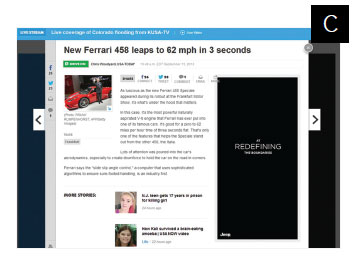
Traditional media publishers (e.g. newspapers, magazines) typically follow similar design layouts when publishing online, often limiting the creativity of designers and cluttering pages with stories, ads and suggested articles. USAToday. com's 2012 redesign broke the digital design and media mold by creating a truly interactive site that was responsive and organized. A year later, their traffic is up 26 percent, according to Compete.com data. USAToday. com is similar to using an iPad as stories are presented in an overlay of the homepage (almost like a modal box or popup - see Image C). Similar to how a user would scroll to a next page on a tablet, readers click through to the next article, which slides in horizontally. The user experience is different than most would expect from a news website, but it's easy to familiarize yourself with the concept. Additionally, USA Today provides strong social integrations with Facebook, Twitter, email and comment features on every story. Oftentimes, media publishers can also fall into the trap of including too many social widgets, which USA Today avoids with this minimalistic approach. In the end, experience matters. Just like upscale restaurants have to cater to wine connoisseurs with options and presentation, designers have to design for a discerning user who expects function and aesthetics to work effortlessly, whether they know it or not.