Best Practices for Measuring the Performance of a Responsive Website


:: By Jeff Porter, Webtrends ::
Lots of companies - and more so every day - are spending time and money to develop responsive design websites. The go-forward goal is commonly to provide a consistent experience across devices for all visitors. And while your responsive site may spur quality SEO, how do you know if your new site is delivering the improved performance you expected?
If you've yet to launch your new responsive site, it's critical to understand your current site's performance. You'll need to establish a baseline for accurate measurement pre and post launch. To get this solid performance baseline, make sure you collect some data on how the current site performs with different devices and screen resolutions for at least the last few weeks before you go live with the new responsive site. Use analytics to understand devices and their performance - it's wise to track Device Type, Model and Screen Resolution. By combining these dimensions with your key performance and conversion measures, you can see performance by segment. With this baseline data, you'll be able to tell where your new site is performing well and where you have additional opportunities to improve the experience.
Tagging
It's also crucial to put together a responsive design reporting strategy. The best practice for multi-experience measurement is to pass a parameter that indicates which experience the user is served.
Let's say you define three experiences:
- Mobile (Breakpoint @ 320p width)
- Tablet (Breakpoint @ 768p width)
- Desktop (Breakpoint @ 1224p width)
You'll then create a custom parameter and populate the value with the site experience delivered:
- Parameter.layout=Mobile
- Parameter.layout=Tablet
- Parameter.layout=Desktop
One question analysts and marketers often ask is, "Why not just measure by device type?"
Tracking important metrics by device is useful (and important for establishing that baseline mentioned previously), but a recent poll of our clients indicated that almost all sites allow mobile users an option to use the desktop site, and 10 to 20 percent of users do in fact crossover to the desktop experience. To be able to track crossover traffic, you need to be able to report on both the device and experience. It's important to know how many users are opting out and where they opt out from. This information can help you determine where your mobile experience can be optimized.
If possible, be sure that the parameter is being set by looking at the template actually being shown to the user rather than by trying to reproduce the tests being made by the responsive design system. This way, any errors in the responsive design system will show up in your analytics reporting, and you won't need to update your analytics tagging every time you fine tune the responsive design criteria.
Reporting
By combining your custom parameter with additional dimensions and measures available in your analytics reports you can build a detailed picture of performance by site type, device, screen resolution, key performance measures, etc.
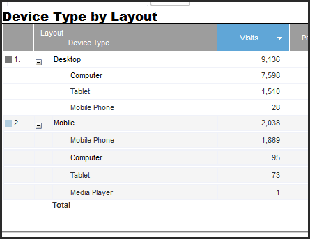
When you combine your experience parameter with device type, you'll see and important view of intersections. For example, you'll notice if you're getting appreciable traffic in the mobile layout from tablets or mobile phones being served the tablet experience - and because implementation of responsive design differs, this can be valuable data to help you analyze and optimize your site experience.
Example view of an analytics report:
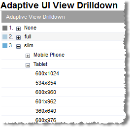
If you are serving different experiences based on landscape or portrait orientation, you can organize your report to show both the orientation and the experience or resolution. Here's an example:
Just like all new sites, pages or experiences, make sure you plan ahead for what you want to measure on a responsive site and make sure your tagging and reporting are in place to be able to give you exactly the information you'll need.
Jeff Porter bio:
Jeff Porter is a Senior Manager, leading the Technical Account and Client Success Managers at Webtrends. With 15 years of experience, Jeff leads a team solely focused on helping clients achieve digital marketing success. Jeff previously held positions at 800.COM and MTI Interactive Marketing.


