Bootstrap 3: Flat, Mobile First and Responsive


Popular grid-based, front-end development framework Bootstrap, unveiled a new version (Bootstrap 3) over the weekend and by all accounts it's built to impress - both the aesthetic of the modern designer, as well as those enterprises whose audiences just love their smartphones.
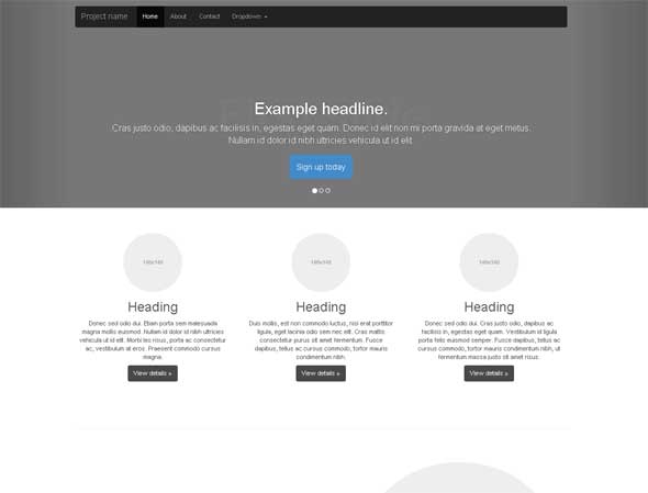
Version 3 offers both visual and code-based changes worthy of note. What will be immediately obvious to the astute designer is that the user interface itself eschews style for functionality by adopting a "flat design" style. Flat design essentially aims to eliminate the use of excessive shadows, textures and gradients, opting instead for a minimalist (simple) look which highlights the interface and its inherent functionality.
But perhaps what willprove most interesting (and ultimately important) about the release is that Bootstrap is now "mobile first" and responsive by default. The idea behind "mobile first" is that it forces designers and developers to think about how a mobile site will expand to larger screens, instead of the other way around (a website designed for the desktop experience, can be best viewed on mobile/smartphones).
Bootstrap, which was originally developed at Twitter but spun out into its own organization, has increased in usage among developers since its release, and it's likely the attention to the current trends (mobile first and flat design being just two). So, how popular is Bootstrap? According to recently released data from source-code search engine Meanpath, 1 percent of the 150 million websites in its index now use Bootstrap.


