How Adobe Used CSS to Sweeten Cupcakes! in the Browser

Recently, I got the chance to work with the Food Network on Cupcakes! - an app that pulls together recipes, ideas, tips and photos featuring everyone's favorite chefs. But the team also wondered - what if we could create the same experience in a browser that shined a light on its visual, tasty content?
We got to it and focused on three main areas in the app: color, texture and shape - with a keen eye on how bakers would directly act with the experience.
Playing with color - Canvas Blend Modes
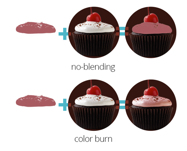
Though we often think of the Web as a blank canvas, code isn't exactly like paint - we can't simply mix one color with another to get a shade in between. However, we can get pretty close with Canvas Blend Modes, which define how layer colors mix with one another, just like the Photoshop function of the same name - adding some more subtle complexity to the color on the page.
Here, we're using the blend mode color-burn by setting the globalCompositeOperation property like this: context.globalCompositeOperation = 'color-burn';
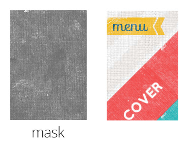
Adding Texture - CSS Masking
If you're familiar with computer graphics, you've probably heard of clipping and masking, which hide visual portions of an element. This function, usually carried out in something like Photoshop, can now be made possible in CSS, allowing us to play with the texture of things like the navigation buttons.
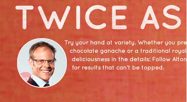
Beyond divs - crafting shapes
Previously, text wrapping on the Web has always meant wrapping around boxes of content. With Shapes, which recently was updated, you can wrap text outside or inside any shape by using just a few simple CSS properties. By using this wrapping method, the text and visuals can naturally fall into place in a more interesting way. Look at Alton Brown's headshot - and how the text curves around it.
Bottom line - increasing usability
One other important thing was that we really wanted to make sure this experience could shine on any screen size. That's why we used Adobe Edge Reflow to set break points visually. When you open up the Web app and change the size of your browser, you'll notice that it's responsive.
What's also neat is that our teams tried to think beyond just the browser. By using the Web Speech API and LeapMotion API, we built in functionalities that allow cooks with batter-splattered hands to use speech and gesture to get to the next recipe step.
Here is the demo of the full experience (it's available only on Chrome and Safari for now). And if you're interested in trying out the code for size, it's available on GitHub. I look forward to seeing how you take the tips and tricks we used and expand on the code.

