
Party of Three: Search, User and Mobile Friendly Design

Designers and developers have the unique challenge of catering to end-users while also keeping SEO best practices top-of-mind.
As if that were not complicated enough, mobile websites have been thrown into the mix as a demanding focal point in digital strategy.
As end-users become increasingly vocal about the features they prefer, Google and Bing have also been surprisingly forthcoming about what their search engines expect from mobile websites. In doing so, those companies have proved that many of the same features and functionality their search engines require are on par with what end-users expect and demand.
1. A speedy experience.
Studies have shown that slower loading pages result in higher bounce rates and less engagement. A 2012 Walmart report, for example, found that the overall average website load time was lower for its converted visitors (3.22 seconds) compared to its non-converted visitors (6.03 seconds). Similarly, an Equation Research study found that 40.3 percent of smartphone users are unlikely to revisit a company's mobile site after being dissatisfied with its performance, while 26.8 percent of smartphone users are less likely to make future purchases from the company across any channel.
Faster pages receive better search rankings, and mobile is no different. The problem, however, is that many responsive websites are delivering the same content that was designed for traditional desktop sites on mobile devices, which results in slow-loading mobile experiences. According to Lorenz Jakober, senior product manager of cloud computing solutions provider Akamai, developers can speed up websites by reducing HTTP requests, total page size (bytes) and accelerating rendering. There are also offerings like Akamai's Aqua Ion Mobile platform that can help. Aqua Ion is a situational performance solution, providing an integrated suite of delivery, acceleration and optimization technologies, which work to optimize website performance across a wide range of use cases.
2. An uninterrupted experience.
Many factors can interrupt website visitors' experiences, especially on mobile devices. Among the worst offenders are app download interstitials, unplayable videos and faulty redirects.
App download interstitials, for instance, are not only disruptive to the user experience, but can also be difficult to navigate. This is especially true when pop-up windows don't have clear and large exit functions. After all, mobile screens are small and some of us suffer from "fat-finger" syndrome, making it tough to click on a small "X" to close a window.
Also guilty of disturbing the user experience are unplayable videos and inaccessible content. Since most smartphones don't support Flash, many consumers are left wondering why some websites have not adopted another technology. While they are asking themselves that, they are quickly leaving sites in search of digital properties that do cater to their current needs.
In the virtual eyes of search engines, serving content that results in page errors, both on the traditional and mobile Web, can be problematic. Errors that interrupt the user experience can lead to a high bounce rate, which indicates to Google and Bing that they did not serve the best match to the end-user query. Since search engines pride themselves on an ability to deliver the right content to the right people at the right time (earning loyalty in the process), page errors are a direct attack on their digital egos.
3. A desktop experience extension.
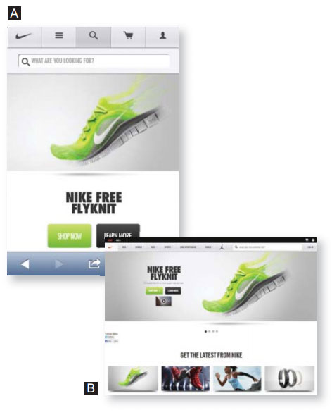
Most end-users want their mobile experiences to rival the traditional desktop experience, and this is particularly true for consumers that use smartphones as resources during their shopping experiences. Due to this, designers are tasked with transferring the often-robust ecommerce experience on a traditional desktop seamlessly to a variety of mobile devices. As you can imagine, this can be a difficult feat. According to Bobby Emamian, co-founder and CEO of mobile development agency Prolific Interactive, a failure to provide a high-quality shopping experience will result in end-users abandoning their carts and checkout pages. To meet consumers' expectations, merchants must provide the ability to interact with products quickly, move through the checkout process effortlessly and access user-generated content while on the go.
In the images on the previous page, Nike successfully transforms its desktop experience (image B) to the small screen (image A), providing limited, but direct ways to interact with the "hero" For example, throughout Nike's mobile customer journey, the options to find a store or get help are consistent and available. There is also sharing functionality built in, so social shoppers can show off the product on popular social networks. The entire experience is intuitive, clean and designed for the device being used. See more brands catering to users and search engines on the go and who's doing mobile design right.
It is clear to see that all visitors really want from mobile websites are the same features and functionality that they have been expecting from traditional sites for years. Since search engines essentially work for searchers, their site rankings tend to reflect how user-friendly a website really is.


