Helping Users Recover from Errors

:: By Martin Greif, EVP of SiteTuners ::
A site should be relatively error-free. The operative word there is "relatively." Having zero errors is unreasonable - setting aside the fact that it's tough to get everything right internally, errors on a site happen because of external reasons, too:
¬ù+ People mistype things all the time
¬ù+ Sites link to you the wrong way some of the time
¬ùSite owners and the staff they employ should definitely try their best to minimize errors. That said, when they do get served up on a site, the error pages should be helpful, and they should gain back some of the trust lost. There are four core principles to creating error pages that help users recover:
¬ù 1. Be descriptive
¬ù 2. Remind the visitor why they like you
¬ù3. Help the users with their tasks
¬ù4. Let the user conduct searches
¬ù1. Be Descriptive
+++Immediately let the user know what went wrong
¬ùError pages on the Web typically contain these items:
¬ù404: this is the page not found. It is the Justin Bieber of error pages, the one that people recognize and hate.
¬ù401: this tells you that you're not authorized to view the page. This is more like The Moffats - annoying, but they are hardly ever seen, and most people don't know them.
¬ù405 and 417: method not allowed, and expectation failed. For errors, these are the independent bands a neighbor hipster likes; one really needs to dig quite a bit find them, but when they do encounter them, they're terrible.
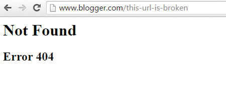
¬ùVisitors shouldn't have to think about what a 404 or a 401 is; brands should tell them what went wrong in plain and simple language. In other words, don't do what blogger.com does (see image).
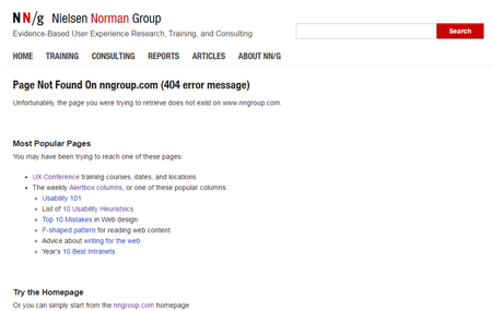
Do something closer to what Nielsen does (see image).
¬ùWeb professionals might know the difference between a 404 and a 405, but most visitors probably don't work in online marketing. They don't and shouldn't have to care about the field's jargon; companies should apologize to them about the error in layman's terms, then try and earn back their trust.
¬ù2. Remind Them Why They Like You
+++Add branding if it works to recover trust
¬ùA lot of brands think of well-designed error pages as "cute"¬ù 404 pages. That's not exactly the case. You can be "memorable" if it fits the brand, as Blue Fountain Media shows (see image).
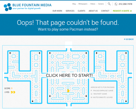
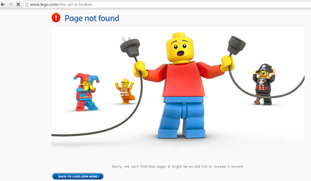
¬ùGranted, most brands aren't going to get away with that type of branding. It only works because it fits with the branding of a site designed for a slightly more tech-savvy crowd, and the 404 Pacman game actually makes visitors think about the site's Web design, which is what the company is all about, after all. Likewise, LEGO can get away with a memorable 404 error page (see image). For everyone else, brands probably shouldn't bank on getting away with a page like those.
¬ùRemember, by the time the user processes a 404 page, they're annoyed, and they trust the site less. The rule of thumb is, only brand an error page if it'll help to recover user trust. For those of us whose websites are not about iconic toy building blocks, the error page needs to do one thing really well: help users recover.
¬ù3. Help Users with Their Tasks
+++Provide common paths
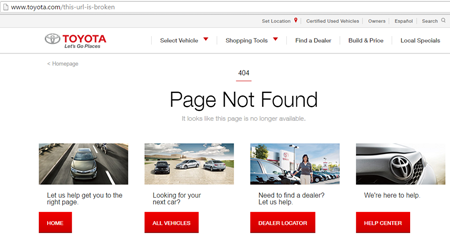
¬ùLet's talk about visitor recovery. The way brands can help users recover from errors is by providing them paths to things they are likely to need. That is, lead them to common paths used on the site. Ideally, this would be backed by Web analytics data for a site's top pages, or a survey tool for the top user tasks. Toyota, for example, does pretty well with providing possible tasks for the user (see image). Marketers should know what actions users typically take on a site, and provide paths to those. If done well, they should see the exit rate on 404 pages go down, which will mean that they're helping users recover from errors.
¬ù 4. Let Them Search
+++Embed a search box
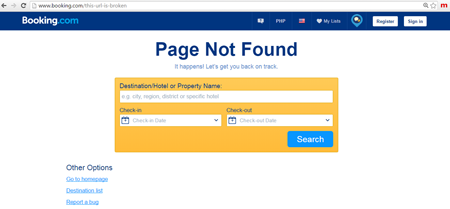
¬ùSometimes marketers can provide plain links to the top pages and tasks, and that will be enough for users to find what they need. Other times, when they want something a bit more complex, they need more help than that. That's where the search box comes in. The search box can be a Google-type appliance on a site. It can be a search bar above or below the common paths. Or, in the case of Booking.com, it's something a little bit more involved (see image).
¬ù Whatever form the search box takes, if marketers combine it with the common paths a user is likely to take, they'll increase the chances of visitors sticking around after they've hit a snag.
Putting It All Together
Marketers should absolutely track how many errors their website serves, and try and limit that number. Do periodic checks of internal links, and fix any broken ones Likewise, check for link rot. Ensure that the proper 301 redirects are in place for permanent URL changes and 302 redirects are there for temporary URL changes.
For those errors that marketers cannot control, they need to help their users recover. If you apologize and let the users know what happened in language that they can easily understand, remind them why they went to you in the first place, provide paths to the most commonly used pages or tasks on the website and allow them to use search without leaving the error page, you're that much more likely to help users recover. That means you still get a shot at getting them to convert.
¬ùMartin Greif brings 25-plus years of sales and marketing experience to SiteTuners, where he is responsible for driving revenue growth, establishing and nurturing partner relationships and creating value for SiteTuners' broad customer base.