Profile Inspirations for the Big 4 Social Networks

In today's digital age, it is important for every business to broaden its audience reach by maintaining a presence on four of the 'Net's most popular social networks - Facebook, Twitter, Google+ and LinkedIn.
However, posting engaging content and interacting with fans is just one part of the equation when it comes to maintaining a successful social presence, with the other part of the equation being design. In fact, often times, brands focus solely on posting a variety of content to social networks and forget about optimizing the real estate on their profile altogether.
Luckily, Website Magazine has found some of the best examples of social profiles on the Web to help provide some inspiration for future profile-redesign projects. Check them out below:
There is a large amount of space to work with on Facebook Pages, most notably, the 851 x 315 px cover photo that is featured at the top of every profile. Although most brands have a Facebook presence, few utilize the social network's design aspects quite like the brands below.
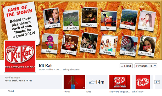
Kit Kat
This sweet company takes fan engagement to a whole new level by prominently featuring fans on its cover photo.
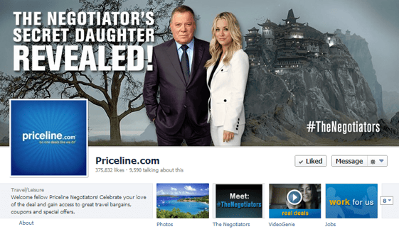
Priceline
This travel company has streamlined its marketing initiatives by using its Facebook cover photo to promote its ongoing "Priceline Negotiator" campaign. Moreover, the image features a specific hashtag so that fans can take their conversations from Facebook to Twitter without missing a beat.
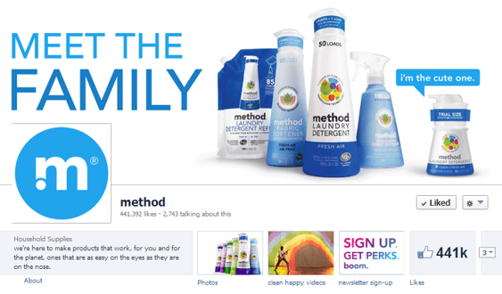
Method
Method maintains a clean design by featuring and identifying its line of products on a white background in the company's cover photo.
Designing a Twitter profile can be tricky, because this micro-blogging social network displays profile pictures directly in the middle of the 520 x 260 px header images. As if creating a design that works with two images wasn't hard enough, Twitter profiles also leave room for background images, which can appear differently on computer screens depending on resolution. However, the trick is to make all these elements come together into one large design.
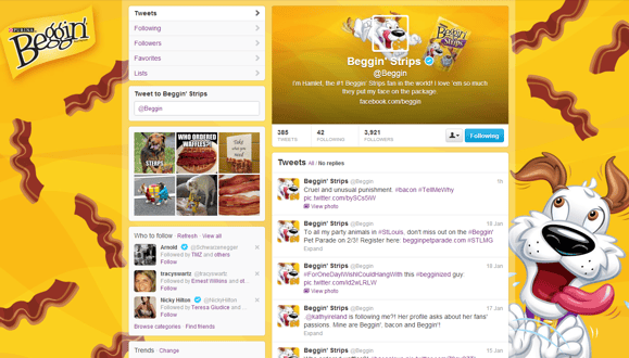
Beggin' Strips
Purina's Twitter account for the delectable doggie treat, Beggin' Strips, uses strategic placement to make its profile picture and header image appear as one design.
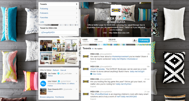
IKEA USA
While IKEA USA's Twitter header and background image flow together nicely, the company keeps its branding initiatives strong by featuring the company's icon as its profile picture.
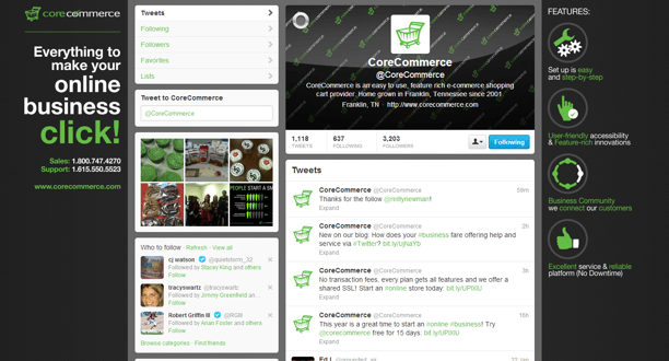
Corecommerce
Corecommerce does a really good job at maintaining a simple profile design on Twitter that still attracts attention with the use of bright colors. Additionally, the company uses its background design to let prospective clients know exactly what type of services they can expect from the Corecommerce platform.
Google+
Although Google+ hasn't taken off in the way that social sites like Facebook and Twitter did, it is still vital for companies to maintain a profile on this network - to boost their SEO initiatives, if for nothing else. The main design elements to focus on when optimizing a Google+ profile include the large 250 x 250 px profile picture and the even larger cover photo, which measures 890 x 180 px.
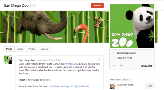
San Diego Zoo
The San Diego Zoo has an unfair advantage when it comes to design, because its entire business is built on animals, and who doesn't like looking at pictures of animals? That being said, the zoo still took some time to create a cover photo and profile image that feature a variety of the zoo's inhabitants - mammals, birds and amphibians.
Instagram
For proof that simple is sometimes better, look no further than Instagram's Google+ profile design.
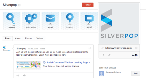
Silverpop
This cover photo has been leveraged to visually feature the types of services that Silverpop offers.
Brands attract a whole different type of audience on LinkedIn, which is a good thing. However, optimizing the design on LinkedIn Company Pages can be a bit of challenge because brands want to attract attention yet stay professional at the same time, all with a limited amount of customizable space. That being said, the focus for these pages should be the 646 x 220 px main cover photo, because this is the first thing people see when arriving at a Company Page.
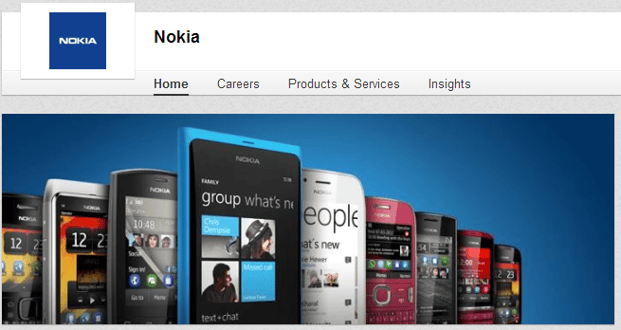
Nokia
Nokia uses its cover photo for featuring a variety of its products on a simple background.
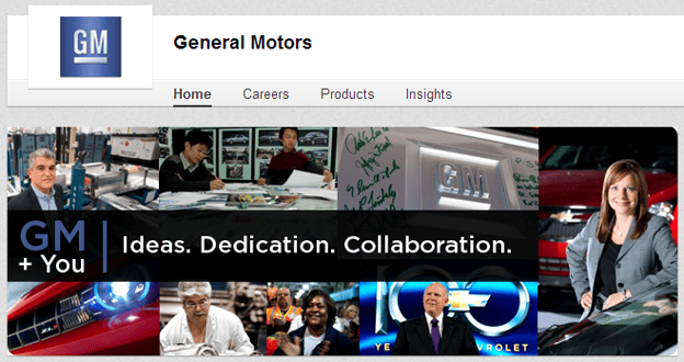
General Motors
This automobile company optimized its cover photo specifically for LinkedIn by keeping the focus on people.
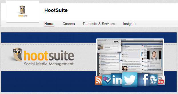
HootSuite
Just like Nokia, HootSuite does a solid job of featuring the type of services it offers without being too flashy or over-promotional.