
Making Color Considerations for Mobile Design


Web design is a key part of any successful company's marketing strategy. It's rare nowadays to find a thriving business that doesn't have a well-oiled, expertly designed website that turns potential customers into loyal clients, and question marks into dollar signs.
With the modern age of smartphones, tablets, and other Wi-Fi-enabled devices, this idea has spread pretty seamlessly into the mobile market as well. Most sites these days offer mobile versions in addition desktop versions of their websites, as well as apps that complement both to create a smooth navigation experience for users.
It's done so much now that, to those who don't know what goes into setting it up, it seems easy as pie. The design process is fairly simple, if you are accustomed to the nature of the mobile market, and the way it interacts with Web design. To this end, here are a few points to consider when designing a mobile site.
Colors Should Enhance, Not Define Messages
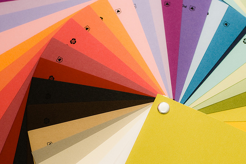
Image via Flickr by thedalogs
Thanks to the limited space issue, mobile sites generally focus on a certain aspect of the main site, with options to navigate to more in-depth areas. Before you even start to think about the design and color of your mobile design, you should determine which messages are most important to get across on this platform.
When you focus on the fundamental message and overall purpose of your mobile site, you will be able to keep them as top priorities. You'll also be less likely to let the design take away from the message. Because there are so many variables when it comes to viewing mobile sites, the content found on the sites should stand on its own.
Mobile vs. Desktop Design
Most companies want their mobile Web design to mirror their desktop design. It creates a sense of unity between the two platforms. It's important that they are similar, not identical.
Coordinate, Don't Match Full-Sized Sites
Due to their very nature, mobile and desktop website designs should be different from each other. A mobile version of a website should be designed for best viewing on smaller devices, with coordinated color schemes and similar layouts, to make them easier for users to identify and navigate.
While the idea is to coordinate the desktop site as seamlessly as possible, it's easier said than done when it comes to accommodating for various mobile devices. Mobile screens are simply not as powerful as desktop monitors. They're used differently too; many mobile users set the contrast and brightness settings low to accommodate for use in the sunlight and to conserve energy.
Keep this in mind when you're deciding on design principles, and use high-contrast colors with clear designs that will display coherently regardless of the device settings.
Not all Devices are Created Equal
As mobile technology progresses, screen resolutions and color support have improved at breakneck speed. Compared to devices that emerged five or 10 years ago, today's mobile devices are astoundingly more advanced.
You want to make sure that the mobile version of your website is readable, and the design is kept intact. To do this, be certain to design it in such a way that varying levels of mobile phone technology will display it with minimal color distortion. A few ways to do this are by using dark font on light backgrounds, and steering clear of abstract colors that aren't represented consistently across all devices.
Be Wary of Gradients and Background Images
Considering the varying levels of color presentation available on mobile devices, certain gradients and background images can prove to be problematic. Generally speaking, background images should be used sparingly, if not avoided all together, to prevent creating a confusing, cluttered viewing experience.
In addition to screen resolution and color variance, gradients and background images are tricky when used in such small design spaces as smartphone and tablet screens to begin with. Keep in mind the size of the space you're working with as you're designing your mobile sites.
Implications of Responsive Design on Colors
As opposed to designing a website for a specific device, responsive design is an approach that aims to create websites that provide ideal viewing experiences - easy reading and navigation - for all devices including mobile phones and desktop computers. A website designed with responsive design techniques is able to adapt to any device it's viewed from, using flexible images, proportion-base grids, and media queries.
With media queries, designers can create multiple layouts using HTML documents and selectively provide style sheets based on various features including color. When these style sheets are loaded to a browser, they adapt to the device they're being viewed on and present the information on the website accordingly. While other design methods offer a more customizable approach, this one offers flexibility.
Never before has there been such a need to create miniature versions of websites as there is today. The mobile landscape is forever changing and advancing, and Web designers will have to keep one step ahead of the curve to keep up. Remember these principles, and your mobile design efforts will quickly pay off.
Author Bio: Calvin Sellers is a mobile technology and social media writer from Tampa, FL. He hopes to provide valuable information in his articles that can help people streamline their lives using technology. Currently he is conducting a head to head battle between the keyboard of the Blackberry Q10 and capacitive touchscreen keyboards from a user-performance perspective. Follow him on Twitter @CalvinTheScribe.


